

Use a WCAG 2.2 checklist built around the nine new success criteria before you touch anything else, since WCAG 2.2 is the current W3C Recommendation and most legacy 2.1 sites already miss its A/AA additions. Start with focus visibility (2.4.11 and 2.4.13), dragging alternatives (2.5.7), target size (2.5.8), consistent help (3.2.6), redundant entry (3.3.7), and accessible authentication (3.3.8). Run automated tools like axe-core alongside manual keyboard and screen-reader passes, because several of these checks simply cannot be caught by a scanner.
TL;DR:
- Most teams fail the new focus visibility, drag alternative, target size, and help order criteria, which require manual testing beyond automated tools.
- Addressing these issues at the component level, such as fixing sticky header focus or increasing target padding, yields widespread improvements across the site.
- Regression in focus restoration, target sizing, and help consistency should be prioritized first during WCAG 2.2 compliance upgrades.
- Automated tools reliably flag target size and focus obscuring, but human testing is essential for drag alternatives and help order consistency.
- Incorporating accessibility fixes into design systems ensures scalable, ongoing conformance rather than one-off patching.
Table of Contents
- Quick WCAG 2.2 Checklist for Your Next Sprint
- The Complete WCAG 2.2 Checklist by Principle
- How Do You Test Automated vs. Manual WCAG 2.2 Checks?
- Implementation Tips Engineers Actually Need
- Migrating from WCAG 2.1 AA to WCAG 2.2 AA
- Why WCAG 2.2 Compliance Is Product Quality, Not a Checkbox
- Canonical Resources Worth Bookmarking
- Sources
- FAQ
Quick WCAG 2.2 Checklist for Your Next Sprint
If you’re triaging a backlog this week, don’t start with a full audit. Start with the handful of items that break the most pages and take the least engineering time to fix. These are the six new criteria most teams fail on first pass, mapped to the fastest possible test.
- 2.4.11 Focus Not Obscured (Minimum), Level AA: Tab through every template and confirm sticky headers or cookie banners never fully cover the focused element. Test with keyboard only, no mouse.
- 2.4.13 Focus Appearance, Level AAA (but audit anyway): Check that the focus indicator has enough contrast and size to be seen against every background color on the page. Inspect with browser devtools’ contrast checker.
- 2.5.7 Dragging Movements, Level AA: Try every drag interaction (sliders, reorderable lists, map pins) using single clicks or taps instead of dragging. If there’s no alternative, it fails.
- 2.5.8 Target Size (Minimum), Level AA: Measure interactive targets in devtools; any target smaller than the recommended minimum size without adequate spacing needs a fix or an exception.
- 3.2.6 Consistent Help, Level A: Confirm help links, chat widgets, or contact info appear in the same relative order across every page in the flow.
- 3.3.7 Redundant Entry, Level A: Walk through any multistep form and verify previously entered information either auto-fills or doesn’t need retyping.
- 3.3.8 Accessible Authentication (Minimum), Level AA: Try pasting a password and using a password manager on your login form. If paste is blocked, that’s an automatic fail.
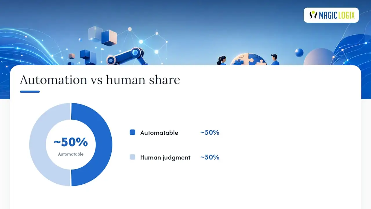
Automated tools flag roughly half of these reliably. Target size and focus obscuring can be partially detected by scanners like axe-core, but dragging alternatives, consistent help order, and redundant entry require a human walking the actual user flow. Treat automation as your first filter, not your final answer.
Pro Tip: Assign each ticket a “detection method” tag (automated, manual, or both) when you file it. It saves your QA team from re-running checks that a CI pipeline already covers, and it tells engineers exactly what proof to attach before closing the ticket.
The Complete WCAG 2.2 Checklist by Principle
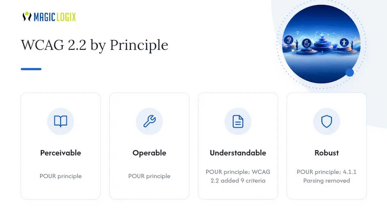
WCAG organizes every success criterion under four principles: Perceivable, Operable, Understandable, and Robust, known collectively as POUR. WCAG 2.2 didn’t restructure this framework. It added nine criteria inside it and removed one, 4.1.1 Parsing, because modern browsers already handle most markup parsing errors gracefully and the criterion was producing noisy, low-value audit failures. Here’s the full working checklist, organized the way your ticket backlog should be.
Perceivable
1.4.3 Contrast (Minimum), Level AA. Text needs a 4.5:1 contrast ratio against its background (3:1 for large text). Automated tools catch this reliably with a color contrast analyzer. Manual check: zoom to 200% and verify contrast holds on hover and focus states, not just default rendering. Common failure: designers test contrast on the base color swatch but never check disabled or placeholder text, which frequently dips below 3:1.
1.4.10 Reflow, Level AA. Content must reformat to a single column at 320 CSS pixels wide without horizontal scrolling or loss of function. Automated scanners can flag horizontal scrollbars but can’t judge whether content is still usable. Manual test: resize your browser to 320px wide (or use devtools’ responsive mode) and tab through every interactive element. Remediation tip: fixed-width tables and side-by-side comparison layouts are the most common offenders; wrap them in a horizontally scrollable container only as a last resort, and provide a linearized fallback where possible.
1.4.11 Non-text Contrast, Level AA. Icons, form field borders, and UI component boundaries need 3:1 contrast against adjacent colors. This is where a lot of “clean” minimalist design fails audits, because thin gray borders on white backgrounds often sit at 1.5:1 or lower.
Operable
2.4.7 Focus Visible, Level AA (legacy, still widely failed). Every focusable element needs a visible indicator. The most common failure in 2026 is still outline: none in a reset stylesheet with no replacement style added back. Automated tools flag missing outlines instantly; the manual step is confirming the replacement indicator is actually visible against every background color the component appears on.
2.4.11 Focus Not Obscured (Minimum), Level AA. New in 2.2. When an element receives keyboard focus, at least part of it must remain visible, not fully hidden behind a sticky header, cookie banner, or chat widget.
- Tab through the page from the top, watching for any element that disappears completely under fixed-position UI.
- Pay special attention to the last few items in navigation menus and the first few form fields below a sticky header.
- Fix with
scroll-margin-top(orscroll-padding-topon the scroll container) sized to match your sticky header’s height, so the browser’s native scroll-into-view behavior stops short of the obstruction.
Automated tools generally cannot detect this reliably because it requires knowing the rendered position of the focus ring relative to overlapping elements at the moment of focus. Budget this as manual QA time.
2.4.12 Focus Not Obscured (Enhanced), Level AAA. The stricter sibling of 2.4.11, requiring the entire focused element to stay visible, not just part of it. Most teams targeting AA can skip formally testing this, but fixing 2.4.11 correctly usually gets you most of the way there anyway.
2.4.13 Focus Appearance, Level AAA. Defines minimum size and contrast requirements for the focus indicator itself: at least a 2 CSS pixel outline with 3:1 contrast, or an area equivalent to a 2-pixel border around the whole element. Even at AAA, it’s worth checking, because thin 1-pixel focus rings on light gray buttons are a near-universal design system flaw.
2.5.7 Dragging Movements, Level AA. New in 2.2. Any function that requires a dragging motion, sliders, drag-to-reorder lists, map panning, must have a single-pointer alternative that doesn’t require dragging.
- Identify every drag interaction on the site: sliders, kanban boards, image carousels with drag-scroll, signature pads.
- For each one, test whether the same action is achievable with a tap, click, or arrow key.
- Common fix: add explicit up/down or increment/decrement buttons next to a slider, or make list items reorderable via a context menu instead of drag-only.
Signature pads and free-hand drawing tools are explicitly exempted, since the drag itself is the essential function. Everything else needs an alternative.
2.5.8 Target Size (Minimum), Level AA. New in 2.2. Interactive targets need at least 24 by 24 CSS pixels, unless the target is inline within a sentence, has equivalent functionality available elsewhere on the page, or the small size is essential to the function (like a map pin).
- Inspect element dimensions in devtools for every button, icon link, and form control.
- Check spacing between adjacent small targets, since sufficient spacing can offset a target that’s technically under 24px.
- Fix by increasing padding rather than the visual icon size, which preserves your design while satisfying the criterion.
Automated tools like axe-core can measure rendered dimensions directly, making this one of the more automation-friendly new criteria.
2.5.1 Pointer Gestures, Level A (legacy). Multipoint or path-based gestures (pinch-zoom, swipe) need a single-pointer alternative. Still commonly missed on custom image galleries and mobile-first carousels built without keyboard or tap fallbacks.
Understandable
3.2.6 Consistent Help, Level A. New in 2.2. If a help mechanism (contact link, chat widget, FAQ link, phone number) appears on multiple pages, it must appear in the same relative order each time.
- List every page in a user flow (checkout, account settings, onboarding).
- Screenshot the header and footer of each and compare help-mechanism placement.
- Fix at the template level rather than page by page, since this is almost always a layout component issue, not a content issue.
This one is nearly impossible to catch with automation since it requires comparing intent and placement across pages, not scanning a single DOM.
3.3.7 Redundant Entry, Level A. New in 2.2. Information a user already entered in the same process shouldn’t need to be entered again, unless re-entry is essential (like re-typing a password for confirmation) or the earlier information is displayed for the user to copy.
- Walk a multistep form start to finish.
- Note every field that repeats information from an earlier step (shipping address reused for billing, email reused for account creation).
- Fix by auto-filling from session state, offering a “same as above” checkbox, or displaying the prior value for reference.
3.3.8 Accessible Authentication (Minimum), Level AA. New in 2.2. Login processes can’t rely solely on a cognitive function test (remembering a password, solving a puzzle, transcribing a code) unless an alternative exists, or the test supports assistive tech like password managers and paste.
- Try pasting into every password field on the login form.
- Try filling the form with a password manager’s autofill.
- If either is blocked by JavaScript that clears the clipboard or disables paste, that’s a fail. Remove the blocking script; there’s rarely a legitimate reason for it.
This criterion exists specifically because historically, plenty of login forms blocked paste and autofill under the mistaken belief it improved security, when it mostly just locked out people using password managers or assistive input tools.
3.3.2 Labels or Instructions, Level A (legacy, still frequently failed). Every form field needs a programmatically associated label, not just placeholder text. Automated tools catch missing <label> or aria-label attributes easily; the manual check is confirming the label’s wording actually explains what to enter, not just that one technically exists.
Robust
4.1.2 Name, Role, Value, Level A. Custom UI components (dropdowns, tabs, modals built from <div> elements) need accessible names, correct ARIA roles, and states that update as they change. This is where the ARIA Authoring Practices Guide becomes essential reading, since it documents the exact role and state combinations expected for two dozen common widget patterns. Automated tools catch missing roles reliably; they cannot verify that a role is the correct one for the widget’s actual behavior; that needs a screen reader pass with VoiceOver or NVDA.
Note on 4.1.1 Parsing: WCAG 2.2 removed this criterion entirely, but that doesn’t mean malformed markup is now acceptable. Duplicate IDs and unclosed tags still cause real assistive technology failures; they’re now captured more precisely under 1.3.1 Info and Relationships and 4.1.2 Name, Role, Value. Don’t treat the removal as a green light to skip markup validation.
How Do You Test Automated vs. Manual WCAG 2.2 Checks?
No single tool clears a WCAG 2.2 checklist end to end, and treating automation as sufficient is the single most common compliance mistake teams make. Tools like axe-core 4.8 and later already include rules for target size and several other 2.2 criteria, but roughly half of the new criteria require a human judgment call that no scanner can make.
Automated scanners excel at anything measurable in the DOM: contrast ratios, missing alt text, missing form labels, duplicate IDs, and rendered element dimensions for target size checks. They fail at anything requiring context: whether a drag interaction has a real alternative, whether help links appear in a consistent order across pages, or whether a focus indicator is genuinely obscured by a sticky header at the moment of interaction.
| Test type | Tool or method | What it catches | What it misses |
|---|---|---|---|
| Automated scan | axe-core, Lighthouse, browser devtools | Contrast, missing labels, ARIA misuse, target dimensions | Context-dependent criteria, drag alternatives, help order |
| Keyboard walkthrough | Manual, Tab/Shift+Tab/Enter/Arrow keys | Focus order, obscured focus, unreachable controls | Nothing reliably; this is the gold-standard manual test |
| Screen reader pass | NVDA, VoiceOver, JAWS | Name/role/value accuracy, announcement clarity | Visual contrast, target sizing |
| Zoom/reflow test | Browser resize to 320px, 200% zoom | Reflow failures, content loss at small viewports | Cognitive load, help consistency |
| Multi-page flow audit | Manual, screenshot comparison | Consistent help placement, redundant entry | Single-page issues |
For CI integration, run axe-core rules on every pull request as a fast gate, focusing on contrast, labels, and structural ARIA issues that shouldn’t ship regardless of context. Save broader scans, including experimental rules and full-page Lighthouse accessibility audits, for nightly builds, since they run slower and occasionally flag false positives that would block a PR unnecessarily.
Manual test recipes worth scripting into your QA checklist: a full keyboard-only walkthrough of every new template before merge, a zoom-to-200%-and-resize-to-320px pass on any page with tables or comparison layouts, a multi-page help-order check whenever a new step gets added to an existing flow, and an authentication test that specifically tries pasting a password and using a password manager’s autofill before every login-form deployment.
Implementation Tips Engineers Actually Need
Reach for semantic HTML before you reach for ARIA. A native <button> gives you keyboard focus, the correct role, and Enter/Space activation for free. A <div> with role="button" gives you none of that until you write the JavaScript yourself, and it’s easy to miss an edge case. Save ARIA for widgets that genuinely have no native equivalent, like a combobox or a tab panel, and lean on the APG for the exact pattern rather than improvising.
Sticky headers are the most common source of 2.4.11 failures, and the fix is usually two lines of CSS, not a redesign:
- Add
scroll-margin-topto focusable elements, sized to your header’s rendered height. - Test with keyboard navigation after adding it, since the fix needs verifying against the actual sticky header height, not an estimate.
- For modals and off-canvas menus, restore focus to the triggering element when the overlay closes, rather than letting focus fall back to the document body.
- Avoid
tabindexvalues greater than zero; they create a separate tab order that almost always conflicts with visual layout.
For target sizing, increase touch-area padding rather than shrinking your design to fit a 24px icon. A 16px icon with 8px of padding on every side clears 2.5.8 without changing how the interface looks. Inline text links inside a paragraph are exempt from the minimum size rule entirely, since forcing every inline link to a 24px tap target would break normal reading flow.
- Prefer semantic elements (
<button>,<nav>,<label>) over ARIA-only substitutes wherever a native option exists. - Size touch targets by adjusting padding, not artwork.
- Restore focus after closing any modal, drawer, or dropdown, rather than leaving it on the removed trigger.
- Never disable paste or autofill on password or one-time-code fields.
- Offer a “same as shipping” or auto-fill option anywhere a form asks for information collected earlier in the same flow.
Pro Tip: Build focus-restoration and scroll-margin fixes into your design system’s base modal and header components, not into individual pages. One fix at the component level prevents the same bug from reappearing in every new feature that reuses that component.
Migrating from WCAG 2.1 AA to WCAG 2.2 AA
Moving a mature codebase from 2.1 to 2.2 AA doesn’t require re-auditing everything you’ve already fixed. It requires layering nine new checks on top of an existing conformance baseline, and the fastest path runs through your design system rather than page by page.
- Run a one to two week triage. Focus exclusively on the six practical priority items: focus obscuring, drag alternatives, target size, consistent help, redundant entry, and accessible authentication. Log every finding with a page URL, screenshot, and the specific criterion it violates.
- Fix at the component level first. Global tokens and shared components deliver disproportionate returns, since a single fix to your button component’s minimum tap target or your modal’s focus-restore logic propagates to every page that uses it, instead of requiring dozens of individual page fixes.
- Address page-specific issues second. Once component fixes ship, remaining findings are usually isolated: a one-off drag interaction on a single settings page, a help link out of order on one legacy template.
- Write QA acceptance criteria tied to each new success criterion, so future pull requests get tested against 2.2 automatically instead of relying on a one-time audit that goes stale within a quarter.
- Get stakeholder signoff on a documented conformance statement, referencing which criteria were tested, which level was targeted, and any documented exceptions, before calling the migration complete.
Why WCAG 2.2 Compliance Is Product Quality, Not a Checkbox
Treating this WCAG 2.2 checklist as a legal chore misses the point. Every one of the nine new criteria exists because real users hit real walls: focus disappearing behind sticky headers, drag-only sliders nobody using a switch device could operate, login forms that silently blocked password managers. Fixing these issues fixes usability problems for people who don’t identify as having a disability too. Tired parents one-handing a phone. Someone on a shaky hotel Wi-Fi connection navigating by keyboard because their touchpad just died.
At Magic Logix, we treat accessibility fixes the same way we treat any other website redesign decision: as design-system work with compounding returns, not one-off patches. A focus-restoration fix built into your modal component once protects every feature built on top of it going forward. That’s the same logic behind good psychology-informed design: remove friction at the structural level, and conversion and satisfaction gains follow without needing a redesign every quarter. Teams that keep pushing WCAG 2.2 fixes to “later” usually end up paying for the same bug three times, once per feature that copied the broken pattern.
— Hassan
Canonical Resources Worth Bookmarking
Keep the WCAG 2.2 Recommendation open as your normative reference, since it’s the definitive wording for every criterion. Use W3C’s “What’s new in WCAG 2.2” for a fast delta overview, WebAIM’s WCAG 2 Checklist for practical test mapping, and freeCodeCamp’s WCAG 2.2 guide for hands-on code examples.
If your team lacks the engineering bandwidth to run this checklist properly, Magic Logix’s web development services can handle remediation and ongoing maintenance, so accessibility fixes ship as part of your normal release cycle instead of sitting in a backlog. That matters just as much for teams rebuilding a site from scratch through web design as it does for teams patching an existing one.
Sources
FAQ
What Are the WCAG 2.2 Requirements?
WCAG 2.2 requires meeting all applicable success criteria at your target conformance level (A, AA, or AAA), including nine new criteria added specifically in this version. Most organizations target Level AA, which includes six of the nine new criteria: focus not obscured, dragging movements, target size, consistent help, redundant entry, and accessible authentication.
Can You Provide a Checklist for the WCAG 2.2 Guidelines?
Yes: prioritize the six new AA criteria first (focus obscuring, drag alternatives, target size, consistent help, redundant entry, accessible authentication), then work through the full POUR structure covering contrast, reflow, focus visibility, labeling, and semantic markup. WebAIM’s checklist and this article’s full breakdown both map each criterion to concrete manual and automated tests.
What Are the New WCAG Guidelines for 2026?
There’s no new WCAG version released for 2026; the current Recommendation remains WCAG 2.2, published as a W3C Recommendation with the nine success criteria it introduced. Teams working toward compliance in 2026 should treat 2.2 AA as the active target rather than waiting for a future version.
Can You Provide a List of WCAG Guidelines?
WCAG organizes its guidelines under four principles, Perceivable, Operable, Understandable, and Robust, each containing multiple success criteria at Level A, AA, or AAA. The W3C’s normative text lists every criterion in full; this article’s checklist groups the most commonly tested ones by principle with practical test steps for each.