
A PPC landing page is a standalone page built for one job: converting the traffic from a single paid ad into a lead or a sale. It has no navigation menu, no competing offers, and no distractions from the promise made in the ad. Dedicated landing pages convert at a median rate of roughly 10.9% for paid search, compared with about 6.6% across channels broadly.
Three things separate the winners from the money pits: a single, unmissable call to action, tight message match between ad copy and headline, and a page that loads fast on a phone. Get those three right and everything else, including your Quality Score, tends to follow.
- Single CTA focus: one action, stated once, repeated visually.
- Message match: the headline should feel like a continuation of the ad, not a new topic.
- Mobile speed: most paid clicks arrive on a phone, and slow pages bleed conversions before anyone reads a word.
Pages with one clear call to action convert at around 13.5% versus 10.5% for pages offering five or more competing choices. That gap alone often justifies rebuilding a page from scratch.
Key Takeaways
High-converting PPC landing pages succeed by matching the ad’s exact promise, offering one clear action, and loading fast on mobile devices.
| Point | Details |
|---|---|
| Ditch the homepage | Dedicated landing pages convert at roughly 10.9% versus 6.6% for generic pages across channels. |
| One CTA wins | Single-CTA pages convert at about 13.5% versus 10.5% for pages with five or more choices. |
| Cut the navigation | Removing site navigation from landing pages has driven conversion lifts of up to 336% in specific studies. |
| Speed affects cost | Google factors page speed and mobile usability into Quality Score, which directly influences CPC. |
| Test with real volume | Low-traffic pages should run sequential single-change tests instead of formal A/B splits. |
| Build it as one system | Magic Logix designs landing pages, tracking, and paid media together using the same intent map. |
Table of Contents
- Why Dedicated PPC Landing Pages Outperform Generic Pages
- The Anatomy of a High-Converting PPC Landing Page
- Design and Copy Best Practices: An Actionable Checklist
- How to Match Your Ad to the Landing Page
- Technical Must-Haves: Speed, Mobile UX, and Core Web Vitals
- A/B Testing and Optimization That Actually Move the Needle
- Annotated Examples and Templates That Work
- Measurement and Analytics: Getting Attribution Right
- Common Mistakes and Red Flags That Kill PPC Conversions
- How Magic Logix Builds High-Converting PPC Landing Pages
- Segmentation and Personalization Strategies for PPC Landing Pages
- Legal and Compliance Considerations for PPC Landing Pages
- What Actually Moves the Needle in 2026
- Get a PPC Landing Page Built for Conversion, Not Just Design
- Sources
- FAQ
Why Dedicated PPC Landing Pages Outperform Generic Pages
Sending paid traffic to your homepage is one of the most expensive habits in advertising, and a shockingly common one. Homepages are built to serve everyone: new visitors, returning customers, job seekers, investors. A PPC landing page is built to serve one person, in one context, with one goal.
The conversion math backs this up. Dedicated landing pages for paid search post a median conversion rate near 10.9%, versus 6.6% for the average page pulling in traffic from all channels. That’s not a marginal edge. It’s the difference between a campaign that pays for itself and one that quietly drains budget.
There’s a second, less obvious cost: Quality Score. Google Ads factors landing page experience directly into your score, weighing content relevance, mobile usability, and load speed. A weak landing page experience pushes your Quality Score down, which pushes your cost-per-click up. You end up paying more for the same clicks simply because the page behind the ad doesn’t hold up.
Here’s the compounding effect most advertisers miss:
- A low Quality Score raises CPC on every keyword in the ad group, not just the ones tied to a weak landing page.
- Higher CPC shrinks your budget’s reach, meaning fewer total clicks for the same spend.
- Fewer clicks to a page that already converts poorly means your cost per acquisition climbs twice, once on the click and once on the conversion.
Picture two identical ad campaigns, same keywords, same budget. One sends traffic to a generic services page. The other sends traffic to a dedicated landing page for paid search built around the exact offer in the ad. The second campaign typically sees both a lower CPC (from a better Quality Score) and a higher conversion rate. That’s the double win a purpose-built page delivers, and it’s why optimizing PPC campaigns for maximum ROI almost always starts with the landing page, not the bid strategy.
The Anatomy of a High-Converting PPC Landing Page
Think of a landing page as a short argument, not a design document. Every element exists to move the visitor one step closer to clicking the button. Remove the wrong element and the argument falls apart.
Here’s what belongs on the page, and why:
- Headline: mirrors the ad’s promise almost word for word. This is the single biggest lever for message match, and it sits at the very top of the page, above everything else.
- Subheadline: adds the detail the headline can’t fit, like pricing, timeline, or the specific outcome the visitor gets.
- Hero visual: a product shot, a short demo clip, or an image showing the outcome, never a generic stock photo of people shaking hands.
- Primary CTA button: appears above the fold and again at the bottom of the page, using the same wording both times so there’s no confusion about what happens next.
- Supporting proof: a client logo bar, a specific number (projects completed, years in business, average result), or a short testimonial placed just below the fold.
- Form or next step: as few fields as the offer allows. Every extra field is a small tax on your conversion rate.
- Trust signals: security badges, guarantees, or association logos, placed near the form where hesitation peaks.
Your hero section and the first scroll should answer three questions before the visitor has to think: what is this, what do I get, and what do I do next. If someone can’t answer all three within two seconds of landing, the page has already lost some of them.
The HubSpot playbook on landing page construction backs this structure, emphasizing message match, a clear single action, and mobile readiness as the non-negotiables. Where most builders stop, though, is the persuasion layer underneath the visible elements.
Pro Tip: The button label matters more than most marketers assume. “Get My Free Quote” consistently outperforms “Submit” because it restates the benefit at the exact moment of decision. Behavioral research on persuasion architecture and microcopy shows that small language shifts near the CTA can move conversion rates more than a full visual redesign.
Layout order matters almost as much as content. Lead with the promise, back it with proof, then ask for the action. Reversing that order, asking first and proving later, is the single most common structural mistake on landing pages built in a hurry.
Design and Copy Best Practices: An Actionable Checklist
Most landing page failures trace back to a handful of avoidable decisions. Run through this checklist before you launch, or use it to audit a page that’s already underperforming.
Structure and navigation:
- Remove the site navigation entirely. Pages with the main nav stripped out have shown conversion lifts of up to 336% in specific studies, because every exit link you remove is one less way for a visitor to wander off before converting.
- Keep the page to one goal. If you’re tempted to add a second offer “just in case,” don’t. Split it into a separate campaign and page instead.
- Limit form fields to what the offer genuinely requires. Name and email for a whitepaper; more detail for a sales quote, but never more than the value of the offer justifies.
CTA placement and wording:
- Place the primary button above the fold and repeat it after any major proof section.
- Use first-person, benefit-driven language (“Start My Free Trial”) instead of generic verbs (“Submit,” “Continue”).
- Make the button visually distinct from every other element on the page, ideally the only saturated color on the screen.
Imagery and social proof:
- Do: use real product screenshots, real team photos, or outcome-focused visuals.
- Don’t: use generic stock photography that could belong to any industry.
- Place testimonials or client counts near the CTA or form, where doubt is highest, not buried at the bottom of the page.
Headline structure:
- Lead with the outcome, not the feature. “Cut Your Ad Spend Waste by Half” beats “Advanced PPC Analytics Platform.”
- Keep it under 10 words where possible. Long headlines lose visual weight and get skimmed past.
Pro Tip: On mobile, tap targets under 44 pixels tall cause mis-clicks and frustration, which is one of the quieter reasons form completion rates drop on phones. Widen your buttons and form fields before you touch anything else on a mobile-heavy campaign.
Reviews of landing-page building tools like Unbounce consistently flag the same pattern: marketers who strip pages down to one offer and one action see better results than those who try to maximize every square inch of screen space. Less really is more here, and the data agrees.
How to Match Your Ad to the Landing Page
Message match is the invisible thread connecting your ad to your landing page. When a visitor clicks an ad promising “20% Off Your First Order” and lands on a page headlined “Welcome to Our Store,” that thread snaps, and so does their trust. Aligning headline, offer, and visual tone between ad and page is one of the fastest, cheapest fixes available to any PPC advertiser.
Building message match systematically means treating it as a mapping exercise, not a one-off copywriting task:
- Group your keywords by intent (transactional, informational, branded) before writing a single line of ad copy.
- Write one landing page per ad group, not one page per campaign. A campaign with five ad groups often needs five distinct pages, or at minimum five distinct headline variants.
- Mirror the ad’s exact offer language on the page headline, down to the number or discount if one is mentioned.
- Carry the ad’s visual theme (color, product shot, tone) onto the landing page so the click feels continuous rather than jarring.
- Route branded search traffic to pages built around trust and comparison, transactional traffic to pages built around the offer, and informational traffic to pages built around education with a lower-commitment CTA.
A few quick comparisons make the difference concrete:
- Poor match: Ad says “Free 14-Day Trial,” page headline says “The Best Marketing Software.” Fix: change the headline to “Start Your Free 14-Day Trial Today.”
- Poor match: Ad targets “affordable landing page design,” page opens with enterprise pricing. Fix: lead with a starting price or a value-tier message instead.
- Good match: Ad promises “Same-Day Quote,” page headline reads “Get Your Same-Day Quote in Under 5 Minutes,” with the form directly beneath it.
This same discipline applies outside standard search campaigns, too. Solo-ad and affiliate-style traffic behaves differently from search clicks, and landing page guidance built specifically for solo-ad campaigns is worth a look if that channel is part of your mix.
Technical Must-Haves: Speed, Mobile UX, and Core Web Vitals
Mobile now carries the bulk of paid-search clicks for most advertisers, which means your landing page is really a mobile page that happens to also render on desktop. Design for the thumb, not the mouse.
Mobile-first requirements:
- Buttons and form fields sized for thumb taps, not cursor precision, generally 44 pixels or taller.
- Single-column layouts that don’t require pinching or zooming to read.
- Forms that trigger the correct mobile keyboard (numeric for phone numbers, email keyboard for email fields).
Speed and Core Web Vitals:
Google folds page speed directly into landing page experience scoring, which in turn affects your CPC. Prioritize these in order:
- Largest Contentful Paint (LCP): get your hero image or headline rendering fast; heavy hero videos are a common culprit when this metric slips.
- Cumulative Layout Shift (CLS): lock in image and ad dimensions so the page doesn’t jump around as it loads.
- Interaction to Next Paint (INP): keep third-party scripts and tracking pixels lean so the page responds instantly to taps.
Developers auditing a slow page should start with image compression and script loading order before touching anything structural. A deeper walkthrough on boosting page speed covers the technical steps in more detail.
Pro Tip: Lazy-load everything below the fold and add a preconnect tag for your form or CRM domain. These two changes alone often shave meaningful time off load speed without touching your design at all.
A/B Testing and Optimization That Actually Move the Needle
Not every test is worth running, and not every result is worth trusting. Prioritize by potential impact, not by what’s easiest to change in your page builder.
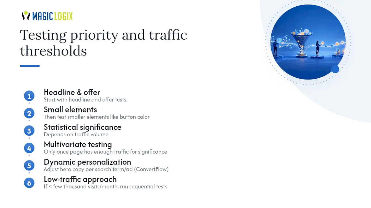
Start with headline and offer tests before touching smaller elements like button color. A hypothesis-driven test might read: “Changing the headline from a feature statement to an outcome statement will increase form completions by making the value clearer within the first two seconds.”
Multivariate testing and dynamic personalization, adjusting hero copy based on the visitor’s search term or referring ad, make sense once a page has enough traffic to reach significance across multiple variables simultaneously. Tools like ConvertFlow are commonly used for this kind of dynamic text replacement, letting a single page template adjust its headline per ad group.
Statistical significance depends on traffic volume, and this is where many small advertisers go wrong. Ending a test after 200 visits because one variant looks like it’s “winning” is a coin flip dressed up as data. If your page gets fewer than a few thousand visits a month, skip formal A/B splits and instead run sequential tests, changing one element, giving it a few weeks, and comparing conversion rate against your historical baseline. It’s less elegant, but far more honest than declaring victory on a tiny sample.
Fixing what behavioral economics calls the “continuity problem,” the gap between what the ad promises and what the page delivers, tends to produce the largest single-test lift of anything on this list.
Annotated Examples and Templates That Work
Different offers call for different page structures. A free trial signup doesn’t need the same layout as a whitepaper download, and neither needs what a flash sale requires.
SaaS free trial: Lead with a product screenshot and a one-line outcome statement. Copy the pattern of putting the signup form directly in the hero, no scrolling required, since trial signups convert best with the lowest possible friction.
E-commerce sale page: Lead with the discount and a countdown timer if the offer is time-limited. Copy the urgency cue, but keep it honest; fake countdown timers that reset on refresh erode trust fast once visitors notice.
Lead-gen whitepaper: Lead with the problem the whitepaper solves, not the whitepaper itself. Copy the pattern of naming the pain point in the headline, then positioning the download as the solution.
Two wireframes cover most use cases:
- Hero-focused template: headline, subheadline, form or CTA, and a single trust element, all visible without scrolling. Best for high-intent transactional traffic where the visitor already knows what they want.
- Long-form template: hero section followed by a benefits breakdown, proof section, FAQ, and a final CTA. Best for higher-consideration offers like enterprise software or services requiring more education before a click feels safe.
Each element in these templates addresses a specific hesitation. The FAQ block on a long-form page exists to handle objections before they become a reason to leave. The trust element in the hero exists because cold traffic from an ad has no prior relationship with your brand and needs a reason to believe you within seconds.
Pro Tip: When adapting a template across ad groups, change only the headline, hero image, and proof point per version. Keeping the underlying structure fixed while swapping message-match elements is faster to build and easier to test than redesigning from scratch for every campaign.
Measurement and Analytics: Getting Attribution Right
A landing page that converts well but reports poorly is nearly as costly as one that doesn’t convert at all, because you can’t scale what you can’t measure accurately.
Set up tracking in this order:
- Tag every ad with consistent UTM parameters (source, medium, campaign, and content) so traffic is identifiable in GA4 regardless of which page it lands on.
- Install the Google Ads conversion tag directly on the confirmation or thank-you page, not the form page, so only completed conversions count.
- Configure GA4 events for micro-conversions (scroll depth, video plays, form starts) alongside the macro-conversion event, giving you visibility into where visitors drop off.
- Consider server-side tagging if you’re losing significant data to ad blockers or iOS tracking restrictions, especially for higher-value offers where every conversion counts.
A few pitfalls show up constantly during audits. Mismatched attribution windows between Google Ads and GA4 make campaigns look worse or better than they actually are, so keep both platforms set to the same window. Missing event parameters, like forgetting to pass the form’s offer name, muddy your reporting when you’re trying to compare page variants. Cross-domain tracking breaks whenever the landing page and the thank-you page or CRM sit on different subdomains without a linker configured.
Finally, connect your ad spend, your analytics conversions, and your CRM’s closed-deal data. Ads and GA4 tell you what converted; only your CRM tells you what actually became revenue. Without that final link, your calculated cost per acquisition and lifetime value numbers are guesses dressed up as metrics.
Common Mistakes and Red Flags That Kill PPC Conversions
A quick audit against this list catches most of what’s silently killing conversion rates:
- Sending traffic to the homepage: Fix by building a dedicated page per ad group, even a simple one.
- Multiple competing CTAs: Fix by cutting every button that isn’t the primary action.
- Long forms for low-commitment offers: Fix by asking only for what the next step truly requires.
- Slow mobile load times: Fix by compressing hero images and lazy-loading below-the-fold content.
- Message mismatch between ad and headline: Fix by rewriting the headline to mirror the ad’s exact promise.
- Missing or buried proof elements: Fix by moving a trust signal or client count near the CTA.
None of these fixes require a full rebuild. Most take an afternoon and can be tested against the current version before you commit.
How Magic Logix Builds High-Converting PPC Landing Pages
Building a page that performs isn’t guesswork when there’s a repeatable process behind it. Magic Logix follows a structured sequence on every landing page engagement:
- Discovery: understand the offer, the audience, and what’s currently underperforming.
- Intent mapping: group keywords and ad groups by buyer intent before any design work starts.
- Wireframe: lay out the persuasion architecture, headline, proof, CTA, before visual design begins.
- Build: develop the page with speed and mobile responsiveness built in from the first line of code.
- Test: launch with a clear hypothesis and a measurement plan already in place.
- Iterate: refine based on real conversion data, not assumptions.
Having worked across more than 35,000 projects, Magic Logix has seen the same message-match and speed issues resurface across industries, which is exactly why intent mapping happens before wireframing rather than after. The general effect of this sequence is straightforward: better-matched pages tend to lift Quality Score, which brings CPC down, which improves CPA without needing a bigger ad budget.
Segmentation and Personalization Strategies for PPC Landing Pages
Not every visitor arriving from your ads is the same person with the same need, and treating them identically leaves conversions on the table. Segmentation means building distinct page experiences for meaningfully different audience groups, rather than hoping one generic page speaks to everyone.
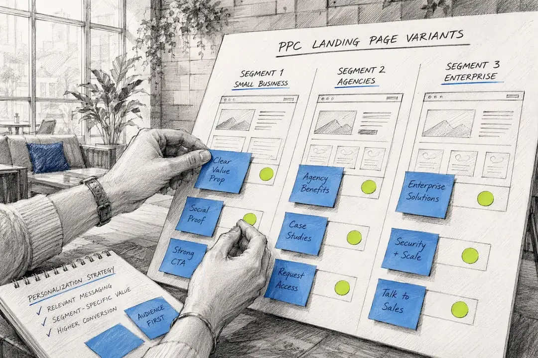
Start with the segments that already exist in your ad account: campaign, ad group, device, and geography. A visitor clicking a “same-day service” ad in one city shouldn’t land on a page that mentions a different region or a multi-week timeline. Dynamic text replacement, a feature available in most landing page platforms, can swap the headline or city name automatically based on the ad group that sent the click, without requiring a separate page for every variation.
Behavioral segmentation goes a step further. First-time visitors from a cold audience typically need more proof and explanation before converting. Retargeting traffic, people who already visited your site once, can skip straight to the offer since trust is partly established. Building two page variants, one longer and more persuasive for cold traffic, one shorter and more direct for warm traffic, often outperforms a single one-size page for both.
Personalization examples across ecommerce and service businesses show the same underlying pattern: the highest-performing variants change the message to match what the visitor already knows or wants, not just the visual design. That’s a meaningfully different exercise from standard A/B testing, since you’re not looking for one winning page. You’re building several pages that each win for their specific segment.
Legal and Compliance Considerations for PPC Landing Pages
Every landing page collecting a visitor’s information carries legal obligations that are easy to overlook when you’re focused on conversion rate. A privacy policy link should appear on every page with a form, even a short one, stating what data you collect and how it’s used. Placing it in small text near the form footer satisfies both legal expectation and user trust without disrupting the page’s visual hierarchy.
If your traffic includes visitors from the European Union or the United Kingdom, GDPR requirements apply regardless of where your business is based. That typically means a clear consent mechanism for any tracking cookies or marketing pixels, and an explicit opt-in for the form itself rather than a pre-checked consent box. Consult a qualified legal professional to confirm what applies to your specific traffic mix and data handling, since requirements vary by the visitor’s location and the type of data collected.
Beyond privacy law, advertising platforms enforce their own landing page policies. Google Ads, for instance, requires that landing pages match the claims made in the ad and prohibits misleading urgency tactics like fake countdown timers or inflated “limited spots” claims. Violating these policies can trigger ad disapproval or account-level penalties, which is a far more expensive problem than a slightly lower conversion rate.
Accessibility is worth folding into this same compliance mindset. Sufficient color contrast, readable font sizes, and properly labeled form fields aren’t just good practice. They reduce legal exposure under accessibility standards that increasingly apply to commercial websites, while also widening the pool of visitors who can actually complete your form.
What Actually Moves the Needle in 2026
Most advertisers still chase design polish when the real gains sit in message match and mobile speed, the least glamorous, highest-leverage levers available. Personalization and dynamic content are worth building toward, but only after the fundamentals hold. With limited resources, fix the headline-to-ad connection first, then the mobile load time, before spending a single hour on a redesign. Everything else, testing, personalization, layout experiments, compounds on top of that foundation or gets wasted without it.
Get a PPC Landing Page Built for Conversion, Not Just Design
Everything in this guide, message match, speed, single-CTA focus, testing discipline, takes time to execute well, and most in-house marketing teams are already stretched managing the ad accounts themselves. Magic Logix builds and tests PPC landing pages as part of a connected paid media engagement, so the page, the tracking, and the ad strategy are built by the same team instead of stitched together after the fact.
That connected approach is the real advantage over building landing pages in isolation: your ad copy, your page headline, and your conversion tracking all get built with the same intent map from day one, instead of a designer guessing at what the ad promised. Services span landing page design, conversion tracking setup, CRO testing, and paid media alignment, all pointed at the same CPA goal. If your current pages are sending clicks to a homepage or bleeding conversions to slow mobile load times, explore Magic Logix’s digital marketing services for business growth and request a review of your current landing page setup.
Sources
- PPC Landing Page Design: Tips and Best Practices (2026) – Shopify
- PPC Landing Page Optimization: High-Converting Google Ads Guide
- Google Ads Landing Page Best Practices (2026) | ConversionStudio
- How to Make the Perfect PPC Landing Page (+ Examples) – HubSpot
- Conversion optimisation: 2026 psychology & ROI guide | ConvinceLab
FAQ
How much should I pay for a PPC landing page?
Costs vary widely based on complexity, from a few hundred dollars for a template-based page to several thousand for a fully custom, tested page built by an agency like Magic Logix as part of a broader campaign engagement.
What does SEO and PPC mean?
SEO refers to earning organic search visibility over time through content and technical optimization, while PPC means paying for immediate ad placement on platforms like Google Ads, with landing pages serving as the conversion point for that paid traffic.
What is the best platform for building PPC landing pages?
There’s no single best platform for every business. Purpose-built landing page tools offer speed and testing features, while a custom-built page integrated with your broader marketing stack, the approach Magic Logix takes, gives tighter control over tracking and message match.
What does PPC stand for in Google Ads?
PPC stands for pay-per-click, an advertising model where you pay only when someone clicks your ad, making the landing page behind that click the deciding factor in whether the spend turns into revenue.
How long should a PPC landing page be?
Length depends on the offer’s complexity: a hero-focused, short page suits high-intent transactional offers, while a longer page with a benefits breakdown and FAQ suits higher-consideration purchases that need more education before converting.