
Aim for WCAG 2.2 Level AA as your compliance target, then act immediately: run an automated scanner like Lighthouse, axe DevTools, or WAVE, and follow it with a five-minute keyboard and screen-reader smoke test. That combination catches the failures that matter most, fastest. The rest of this article gives you the checklist and the repeatable workflow to back it up.
TL;DR:
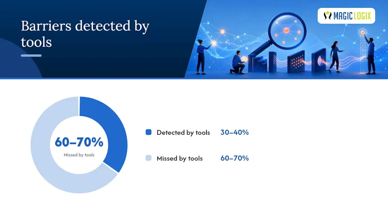
- Automated accessibility scans detect only around 30 to 40 percent of issues, requiring manual keyboard, screen-reader testing, and human judgment to identify most barriers.
- Ensuring full keyboard navigation and focus visibility is essential, with focus trapped inside modals and skip links provided to facilitate mobile and keyboard users.
- Proper use of alt text, contrast ratios, and captioning significantly improves perceivability, but issues relying solely on color or inaccessible media controls remain common failures.
- Regular testing at each deployment and quarterly audits, combined with detailed bug triaging and documentation, are necessary to maintain compliance over time.
- Embedding accessibility into design and development workflows, along with team training, helps prevent regression and makes compliance an ongoing habit.
Table of Contents
- Website Accessibility Checklist You Can Run Right Now
- Perceivable: Images, Contrast, Captions, and Media Checks
- Operable: Keyboard Navigation, Focus, and Touch Targets
- Understandable: Headings, Labels, and Error Handling
- Robust: ARIA, Live Regions, and Assistive Tech Compatibility
- How Often Should You Test for Accessibility?
- Turning Audit Results Into Fixed Bugs
- Documenting Your Accessibility Compliance Posture
- Who Actually Builds Websites This Way?
- Why Accessibility Has to Be a Habit, Not an Audit
- Sources
- FAQ
Website Accessibility Checklist You Can Run Right Now
Every item below maps to a specific WCAG success criterion, so you know exactly what you’re testing and why it counts. Fix Level A issues first. These are outright blockers that stop some users from completing a task at all. Level AA gaps come next, since that’s the tier most legal and procurement standards actually require.
- Alt text on every image. Decorative images get
alt=""; informative ones get a description of what they convey, not just what they show. Maps to WCAG 1.1.1. - Labels on every form field. A placeholder is not a label. Confirm with a screen reader: does it announce the field’s purpose before you type?
- Color contrast of 4.5:1 for body text, 3:1 for large text. Check any page with a browser DevTools contrast panel.
- Full keyboard reach. Press Tab until focus reaches the last interactive control on the page. If you get stuck anywhere, that’s a trap.
- Logical heading structure. Run a heading outline (most screen readers have one built in). Headings should read like a table of contents, not a random list of font sizes.
- Captions on video, transcripts on audio. Confirm captions are synced, not auto-generated garbage nobody reviewed.
- Visible focus indicator. Tab through the page. If you can’t tell where you are, that’s a fail on its own.
- ARIA live regions announce dynamic changes. Add an item to a cart or submit a form, then confirm a screen reader says something.
- Touch targets sized and spaced appropriately to meet WCAG 2.2 criteria. This addresses common mobile failures that usually require CSS adjustments rather than JavaScript changes, as detailed in Inclusense’s WCAG 2.2 breakdown.
- Accessible authentication. No cognitive test (like solving a puzzle or transcribing a distorted image) should be the only way to log in.
Automated scanners will catch some of this instantly. Others, especially anything involving meaning, context, or how a screen reader actually announces something, require a human. That split isn’t a footnote. It’s the entire reason a checklist alone isn’t a compliance strategy.
Statistic: Automated tools typically detect only 30 to 40 percent of accessibility barriers on a given page. The other 60 to 70 percent surface only through keyboard testing, screen-reader passes, and human judgment.
Perceivable: Images, Contrast, Captions, and Media Checks
Perceivable means information has to reach the user through more than one sense channel. If your site only communicates through color, or through images with no text alternative, you’ve already failed the first of the four WCAG principles: Perceivable, Operable, Understandable, and Robust, together known as POUR.
Start with alt text. A photo of a golden retriever on an adoption page needs alt text describing the dog, not “image1234.jpg.” A purely decorative border graphic needs alt="" so screen readers skip it entirely instead of announcing useless file names. Getting this right also pays off in image SEO, since search engines read the same alt attributes assistive technology does.
Contrast is where most sites quietly fail without anyone noticing. WCAG requires a 4.5:1 ratio for normal text and 3:1 for large text (18pt bold or 24pt regular and up). Chrome DevTools has a built-in contrast checker in its color picker, and WebAIM’s contrast checker works well for quick spot checks.
- Caption every video, and sync the captions, not just attach them.
- Provide transcripts for audio content.
- Avoid background music or noise that competes with spoken narration.
- Give media players accessible, keyboard-operable controls, not custom sliders with no labels.
Pro Tip: Switch your monitor to grayscale for five minutes and browse your own site. Any information you can no longer distinguish was relying on color alone, and that’s a Perceivable failure waiting to be reported.
Operable: Keyboard Navigation, Focus, and Touch Targets
Unplug your mouse. That’s the test. If you can’t complete your site’s primary flow, checkout, signup, search, with only a keyboard, you have an Operable problem, and it’s usually the single most disruptive category of bug for screen-reader and switch-device users.
- Tab through the entire page. Every interactive element should be reachable, and the order should follow the visual layout, not the DOM chaos underneath it.
- Check focus visibility. If you removed a default focus outline in CSS without replacing it, put it back. This is one of the most common self-inflicted accessibility failures on modern sites.
- Test modals and dialogs. Opening one should trap focus inside it, and closing it should return focus to the element that opened it. A modal that lets you tab out to the page behind it is a broken pattern.
- Add a skip link. Users shouldn’t have to tab through forty navigation items to reach the main content on every single page load.
- Check touch targets on mobile. WCAG 2.2 now requires interactive elements to be at least 24×24 CSS pixels or have adequate spacing around smaller ones, a criterion aimed squarely at cramped mobile navigation bars.
- Test dragging interactions. Anything that requires a drag gesture (sliders, reordering lists) needs a non-drag alternative, another new requirement in WCAG 2.2.
Pro Tip: Focus traps hide in the strangest places, usually third-party widgets. Test your chat widget, cookie banner, and any embedded booking calendar separately. Vendors rarely test keyboard access, and you inherit their bugs the moment you embed the script.
Understandable: Headings, Labels, and Error Handling
Understandable content means a user can predict what will happen and figure out what went wrong when it doesn’t. That starts with structure. Semantic headings (<h1> through <h6> used in order, not chosen for font size), landmark regions (<nav>, <main>, <footer>), and link text that means something out of context. “Click here” tells a screen-reader user nothing when they’re scanning a page by its list of links, which many do.
- Give every form input a programmatic label, tied to the field with a
for/idpairing or wrapped properly. - Write error messages that state what’s wrong and how to fix it, not just “Invalid input.”
- Never rely on color alone to indicate an error. Pair the red border with text or an icon.
- Avoid requiring users to re-enter information already submitted elsewhere in the same process, a new expectation under WCAG 2.2’s Redundant Entry criterion.
- Offer accessible authentication alternatives to CAPTCHA puzzles that demand visual pattern recognition.
Run a screen reader through your own checkout form once. If the reading order jumps around, or a label announces the wrong field, you’ve found a bug no automated scanner would have caught.
Robust: ARIA, Live Regions, and Assistive Tech Compatibility
The first rule of ARIA is simple: don’t use it if native HTML already does the job. A <button> is keyboard-operable and announces its role automatically. A <div> styled to look like a button and given role="button" needs you to manually wire up keyboard handling, focus management, and state, and most implementations get at least one of those wrong.
Common ARIA mistakes worth watching for:
- Redundant roles, like
role="button"on an actual<button>element. - Missing
aria-expandedstates on accordions and dropdown menus. - Live regions (
aria-live="polite"or"assertive") that either never fire or fire so often they drown out everything else. - Custom widgets, tabs, comboboxes, date pickers, that ignore the WAI-ARIA Authoring Practices keyboard patterns.
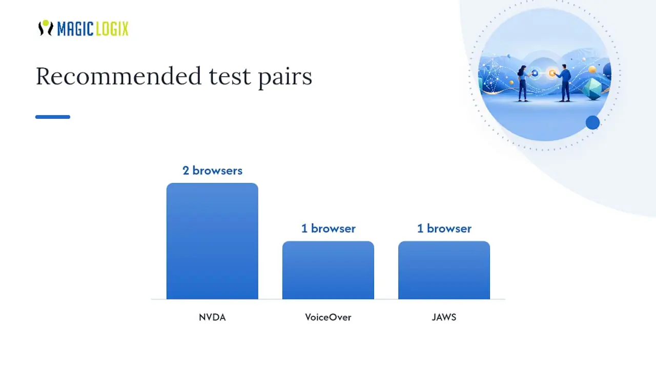
Test across a real matrix: NVDA with Chrome or Firefox, VoiceOver with Safari, and JAWS with Chrome if your organization licenses it. Screen readers don’t behave identically, and a fix that works in one can silently break in another.
Pro Tip: If a component needs more than a day of ARIA wiring to behave correctly, that’s usually a signal to bring in someone who specializes in accessible component design rather than guessing your way through the ARIA spec.
How Often Should You Test for Accessibility?
A defensible testing workflow blends three layers, run on a schedule, not just once before launch.
- Automated scans, every pull request. Run Lighthouse, axe DevTools, and WAVE in CI so obvious regressions, missing alt text, contrast drops, get caught before merge. Remember these tools only catch roughly 30 to 40 percent of total issues, so treat a clean scan as a floor, not a finish line.
- Manual spot checks, every deploy. Keyboard-only pass through your top three user flows, plus one screen-reader pass with NVDA or VoiceOver on anything that changed.
- Full audit, quarterly or at major releases. Define scope explicitly: homepage, top landing pages, checkout or signup, and any custom components. Document each finding with its specific WCAG success criterion, a severity rating, and reproduction steps.
Statistic: Combining automated scanning with manual keyboard and screen-reader passes catches far more than either method alone, since automated coverage tops out around 30 to 40 percent of what a real audit needs to find. Manual testing with a screen reader routinely surfaces failures automated scans miss entirely, dynamic updates that never get announced, or forms where the label exists visually but never gets exposed to assistive technology programmatically.
If your team is short on developer bandwidth for building these checks into your pipeline, tools built around AI-assisted developer workflows can help automate the repetitive parts of test setup and code review, freeing your team to focus on the manual passes that actually require human judgment.
Turning Audit Results Into Fixed Bugs
An audit that just sits in a spreadsheet fixes nothing. Triage by three factors: severity, how completely a bug blocks the task, frequency, how many users hit it, and impact, how essential that task is to your business. A keyboard trap on your checkout page outranks a missing alt attribute on a footer icon every time.
- Write every ticket with reproduction steps, the exact WCAG criterion violated (like 2.1.1 or 1.4.3), and a suggested technique, such as an ARIA reference or an HTML technique code.
- Separate quick fixes (add a label, fix a contrast ratio) from component-level remediation (rebuild a broken custom dropdown using proper ARIA patterns).
- Ship the quick fixes first. They’re cheap and they reduce real user pain immediately.
- Add automated checks to CI for every fix you ship, so the same bug can’t silently return to the next release.
Regression is the silent killer of accessibility programs. A component fixed in March can break again in September when someone refactors it without realizing what they removed.
Documenting Your Accessibility Compliance Posture
No one can honestly claim a website is 100 percent accessible forever. What you can defend is a documented, ongoing effort, and that documentation matters as much as the fixes themselves if your compliance posture is ever questioned.
- State your target conformance level explicitly: WCAG 2.2 Level AA, not a vague “we care about accessibility.”
- Keep versioned audit reports, not just a single PDF from launch day.
- Publish an accessibility statement that names your target standard, a remediation roadmap, and a contact channel for reporting barriers.
- Maintain a VPAT or an internal WCAG mapping document as ongoing evidence, updated whenever you remediate a finding.
- Log remediation dates and follow up with a regression check a few weeks later.
Regular audits and training logs, per W3C’s own guidance on WCAG 2.2, demonstrate continuous effort more convincingly than any single clean scan ever will.
Who Actually Builds Websites This Way?
Hassan and shape how this checklist gets applied on real projects rather than treated as a theoretical exercise.
[brand_signal] Accessibility work rarely happens in isolation from the rest of a site’s performance and design goals, which is where [brand_signal], a company with a significant track record of successful projects and positive client testimonials, becomes relevant. On a recent [case_study], the team mapped checklist items directly to sprint deliverables: contrast fixes went into the design system, form labeling went into a component library update, and keyboard testing became a standing item in QA. [internal_data] showed the biggest gains came not from one big audit, but from making these checks routine.
Why Accessibility Has to Be a Habit, Not an Audit
Most teams treat accessibility like a compliance sprint: fix everything before launch, then forget it exists. That approach guarantees regression. The teams that stay compliant embed accessibility checks into pull requests and design reviews from day one, so a broken focus state gets caught by a teammate, not a user complaint six months later.
Training matters more than tooling here. A designer who understands contrast ratios before opening Figma prevents ten bugs a developer would otherwise have to catch later. And testing with actual people with disabilities, not just running NVDA yourself, surfaces friction no checklist fully captures. Start with the quick wins. Then invest in fixing the components properly, once.
— Hassan
Sources
For the standard itself, start with the W3C’s WCAG guidelines and the WCAG 2.2 quick reference for the newest criteria. WebAIM’s checklist and MSU’s basic accessibility checklist offer fast, practical spot-checks. For scanning, Lighthouse, axe DevTools, and WAVE remain the standard trio.
If your next step is fixing what these tools find rather than just cataloging it, a broader digital marketing strategy that folds accessibility into your redesign and content workflow tends to outperform treating it as a one-time cleanup. Some digital marketing companies work with teams on this kind of integration, folding accessibility remediation into site redesigns and ongoing marketing retainers rather than treating it as a separate afterthought project.
FAQ
What Are the Four Principles of Web Accessibility?
Perceivable, Operable, Understandable, and Robust, known together as POUR. Every WCAG success criterion falls under one of these four categories.
How Do You Check If a Website Is Accessible?
Run an automated scanner like Lighthouse, axe DevTools, or WAVE to catch machine-detectable issues, then follow up with a keyboard-only navigation test and a screen-reader pass using NVDA or VoiceOver, since automated tools alone catch only 30 to 40 percent of real barriers.
How Can I Make Sure My Website Is Accessible?
Target WCAG 2.2 Level AA, work through a prioritized checklist covering alt text, contrast, keyboard access, and form labels, and test with real assistive technology, not just automated tools, on a recurring schedule rather than once before launch.
What Are the Four Guidelines of WCAG?
WCAG organizes its success criteria under the four POUR principles: Perceivable, Operable, Understandable, and Robust. Each principle contains multiple testable guidelines and success criteria at Levels A, AA, and AAA.
Which WCAG Level Should I Target?
WCAG 2.2 Level AA is the practical baseline most legal and procurement standards expect, and meeting it also satisfies the earlier WCAG 2.0 and 2.1 AA requirements.