
A website redesign is a complete overhaul of its look, feel, and function, all aimed at hitting your business goals and meeting user expectations. This isn't just about a fresh coat of paint. It's a deep dive into user experience, site performance, and your core strategic objectives to build a site that actually drives conversions and fuels growth.
When a Website Redesign Becomes a Business Necessity
Figuring out the right time to redesign your website is about more than just feeling like the current one looks dated. It’s a strategic business decision, usually prompted by glaring performance problems, shifts in the market, or changes in your own business goals. If you're thinking of a redesign as just a "facelift," you're missing the point. It's a fundamental rebuild of your most important digital asset.
For a lot of businesses, the analytics are the first alarm bell. A high bounce rate, low time-on-page, or a user journey that just plain confuses people are all symptoms of a much deeper issue. If your site isn't actively bringing in leads, selling products, or keeping users engaged, it's failing as a business tool.
The Mobile-First Mandate
Maybe the single most urgent reason for a redesign today is mobile performance. A clunky or unresponsive mobile site isn't just a minor annoyance—it's a massive liability. By Q2 2025, mobile devices drove 62.5% of all global web traffic, a staggering jump from just 20% back in 2013.
This shift has forced a huge change in thinking. In fact, 73% of web designers point to non-responsive design as the number one reason visitors leave a website.
On top of that, sites without a responsive design are 60% less likely to rank on Google's first page. That basically makes them invisible to the vast majority of your potential customers.
Beyond Aesthetics: Brand and Functionality
Your website is the digital face of your brand. If your company has evolved—maybe with a new brand identity, different services, or a new target audience—your website absolutely has to reflect that. An outdated site creates a jarring disconnect, sending a message that no longer matches your company's values or what you're capable of. This is a crucial piece of a wider digital transformation that brings all your touchpoints into alignment.
A redesign becomes a true necessity when:
- Your site doesn't meet current accessibility standards (WCAG), effectively shutting out users with disabilities.
- The technology it's built on is obsolete, making updates a nightmare and opening you up to security risks.
- Your competitors have all updated their digital presence, leaving you looking seriously behind the curve.
A website redesign is not an expense; it is an investment in your brand's future relevance, competitive positioning, and revenue generation. It's the moment you decide to stop letting your website be a passive brochure and start making it an active, high-performing member of your team.
Ultimately, the decision to redesign your site boils down to performance and opportunity. If your website is a barrier to growth instead of an engine for it, the time to act is now.
Defining Your Redesign Strategy and Scope
Kicking off a website redesign without a clear strategy is like trying to build a house without a blueprint. You might end up with something, but it won't be the structure you actually need. The success of your entire project hinges on this initial discovery and planning phase, where you turn vague frustrations into a concrete, actionable plan.
A huge part of this is getting real about the budget from day one. You have to understand the full website creation cost, which goes way beyond the initial design and build. Don't forget to factor in ongoing maintenance, marketing, and content creation right from the start to avoid any nasty surprises down the road.
This upfront work ensures your investment tackles real business problems, not just aesthetic whims. For instance, your analytics might show that your confusing pricing page is where most potential customers give up and leave. Just like that, you've identified a top-tier project goal backed by hard data.
Auditing Your Current Digital Footprint
Before you can map out where you're headed, you need a brutally honest look at where you are right now. A comprehensive audit isn't optional; it's a deep-dive investigation into four critical areas of your existing site.
- Performance Audit: How fast is your site, really? Check your Core Web Vitals and page load times. If your site takes more than three seconds to load, you're bleeding visitors.
- Content Audit: Figure out what content is actually working and what's just collecting digital dust. Identify your superstar pages, along with anything that's outdated, redundant, or just plain failing to connect with your audience.
- SEO Audit: Where do you stand in the search rankings? Analyze your backlink profile, keyword performance, and overall technical SEO health. You have to know what SEO equity you need to protect during the transition.
- UX Audit: Where are people getting stuck? Use tools like heatmaps and session recordings to see how users actually behave on your site. This is where you'll uncover the friction points and moments of confusion that are killing your conversions.
This audit gives you the data-backed foundation for every single decision that comes next. It shifts the conversation from "I feel like we should…" to "The data shows we must…"
You can see below how this often plays out. An outdated site leads directly to a poor mobile experience, which in turn causes you to lose ground in search engine rankings.
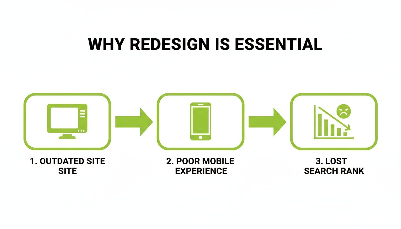
It’s a chain reaction. A failure in one area inevitably pulls the others down with it.
Setting Goals That Actually Matter
Once you have your audit findings, you can start turning those problems into clear, measurable goals. This is where you need to get specific—vague targets like "increase traffic" just won't cut it.
A successful redesign strategy is defined by its KPIs. Instead of aiming for "a better look," aim to "increase mobile conversion rate by 15% in Q3" or "reduce the bounce rate on key service pages by 20% within six months."
This kind of precision gives your team a sharp focus and a clear benchmark for success. It also guarantees that the redesign is tied to big-picture business objectives, like revenue growth or lead generation. The visual identity of your site has to support these goals, creating a seamless experience where your brand’s look and feel are perfectly aligned with its function. If you want to explore how visual identity connects with business structure, our guide on brand architecture offers some deeper insights.
Assembling Your Team and Defining Scope
Finally, it’s time to define the project's scope and get the right people in the room. You have to decide who needs to be involved and at what stage. A solid redesign team usually includes:
- Project Manager: The person who keeps everything on track, on time, and on budget.
- UX/UI Designer: The architect of the user experience and visual design, from wireframes to final mockups.
- Developer(s): The builders who bring the designs to life and implement all the functionality.
- Content Strategist/Writer: The expert responsible for planning, writing, and migrating all your content.
- SEO Specialist: The guardian of your search rankings, ensuring they are protected and improved.
- Key Stakeholders: Decision-makers from marketing, sales, and leadership who have a vested interest.
Managing these stakeholders is absolutely crucial. Appoint one primary point of contact to keep communication flowing and avoid the dreaded "design by committee" scenario. Once the team is set, create a detailed scope document that spells out every single deliverable, feature, and function. This document is your project's constitution—it prevents scope creep and makes sure everyone agrees on what "done" looks like.
Crafting Your Site's Blueprint with IA and UX
Once your high-level goals are set, it’s time to get your hands dirty and move from the "why" to the "how." This is where you build the skeleton and the nervous system of your new website. Think of Information Architecture (IA) as the logical blueprint for your content, and User Experience (UX) as the feeling people get when they navigate that blueprint.
Getting this foundation right is arguably the most critical part of a successful redesign. It’s what separates a site that guides users effortlessly toward their goals from one that just leaves them frustrated and confused.
The financial stakes here are surprisingly high. The global web design market is on track to hit $92.06 billion by 2030, and a huge part of that is businesses fixing bad user experiences. In fact, a staggering 61.5% of redesign projects happen because the old UX just wasn't working.
On the flip side, investing in a great user experience can boost conversions by up to 400%. That’s a powerful return, especially when you consider that 94% of first impressions are design-related. You can dig into more of these numbers in this web design statistics report from Figma.
Mapping the User's Journey
Before you even dream about colors or fonts, you need to map out how people will actually move through your site. This starts with a sitemap—a simple, hierarchical diagram of all your pages. It’s your 30,000-foot view.
But a sitemap alone isn't enough. You have to go deeper by creating user flows. These are visual roadmaps that trace the specific paths a visitor might take to get something done.
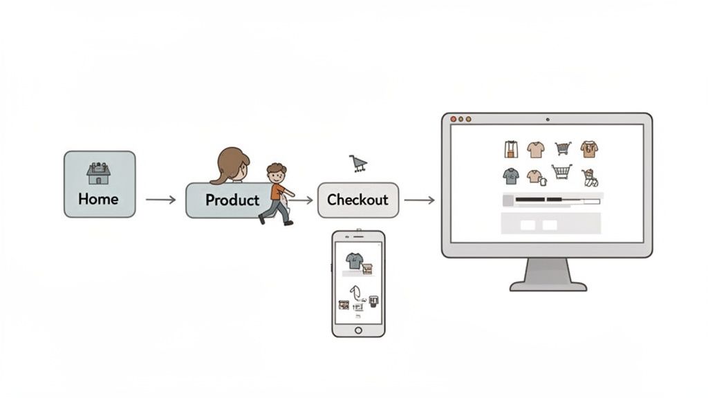
Let's imagine an e-commerce site. A common user flow would look something like this:
- A user lands on the homepage.
- They click on the "Shop" or a product category.
- Next, they filter the results, maybe by "Men's Shoes."
- They find a pair of sneakers they like and click to the product page.
- From there, they add it to their cart.
- Finally, they go through the checkout process and make a purchase.
Mapping these journeys forces you to step into your user's shoes. It helps you spot potential roadblocks or confusing steps long before a single line of code is written. This is also a fundamental piece of building a solid SEO-friendly site architecture that both users and search engines will love.
Wireframing Key Pages for Functionality
With your sitemaps and user flows in hand, the next step is to create wireframes. Think of these as low-fidelity, black-and-white blueprints for your most important pages. They focus completely on structure, layout, and function—intentionally leaving out visual design elements like colors and images.
Wireframing is all about function over form. It lets you solve major usability problems and finalize your page layouts with a pencil and paper (or simple software) instead of expensive code.
This is where you make critical decisions about the placement of buttons, navigation menus, forms, and calls-to-action. By stripping away all the visual noise, you can have focused, productive conversations with your team about what each page needs to do. Changing a wireframe takes minutes; changing a fully coded page can take days.
Validating Your Blueprint with User Research
Never forget: assumptions are the enemy of good UX. Everything you've planned so far is based on educated guesses. Now it’s time to test those guesses with real people. This doesn't need to be a massive, six-figure research project.
Here are a few practical user research methods you can use:
- Customer Interviews: Just talk to five of your ideal customers. Ask them about their goals, their frustrations with your current site, and what they need to accomplish. You'll gain priceless insights just by listening to the words they use.
- Card Sorting: This is a fantastic technique for validating your navigation. Write your main pages or content categories on index cards and ask users to group them in a way that makes sense. You’ll quickly see if your planned IA matches how real people think.
- Prototype Testing: Turn your wireframes into a simple, clickable prototype using a tool like Figma or InVision. Give users a specific task (e.g., "Find the return policy") and just watch. Where do they hesitate? What do they click that you didn't expect?
The feedback you gather here is pure gold. It allows you to refine your blueprint based on actual human behavior, ensuring the final product will be intuitive, effective, and ready to deliver real business results.
Bringing Your Brand to Life with UI Design
Once your wireframes have laid out the skeleton of your new site, it's time to give it a personality. This is where User Interface (UI) design takes over, transforming that functional blueprint into something that not only looks great but also feels right for your brand.
Good UI isn't just about picking pretty colors. It's about visual storytelling. It’s the difference between a website that feels generic and one that feels intentionally crafted to connect with its audience, building trust and making every interaction a pleasure.
Developing Your Visual Style Guide
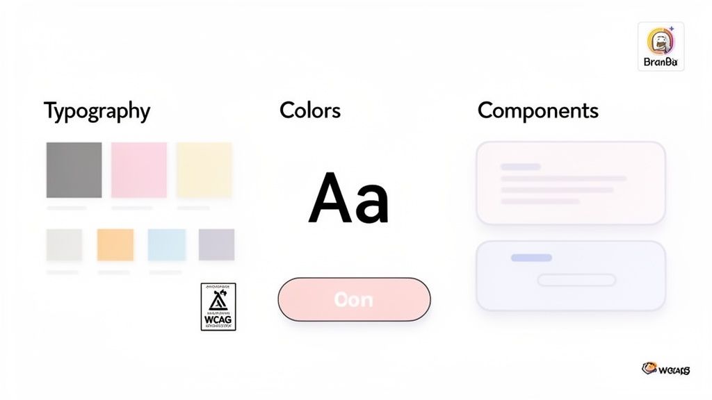
If you want your website to feel cohesive and professional, consistency is everything. That’s why a style guide, or what we often call a design system, is non-negotiable. Think of it as the single source of truth for your site’s visual language, ensuring every designer, developer, and marketer is on the same page.
At a minimum, your style guide needs to define these core elements:
- Typography: Set up a clear hierarchy for your headings (H1, H2, H3), body copy, and links. Your fonts should be on-brand, but more importantly, they must be readable on any screen.
- Color Palette: Lock in your primary, secondary, and accent colors. Don’t forget functional colors for success messages, error alerts, and warnings—these small details create a predictable and less stressful user experience.
- Component Styles: Define exactly how interactive elements look and behave. This includes buttons (in all their states: primary, secondary, disabled), forms, icons, and navigation menus.
A robust style guide does more than just keep things looking neat; it drastically speeds up both design and development. As your site evolves, this document prevents the visual chaos that creeps into so many large-scale projects over time.
This living document is your rulebook for a polished digital presence, and it makes future updates infinitely easier.
Separating Lasting Trends from Fleeting Fads
It's easy to get distracted by the latest design trend, but chasing every new fad is a quick way to make your brand-new site look dated in a year. The real skill is knowing which trends have actual staying power versus which are just momentary distractions.
Lasting trends almost always solve a genuine usability problem or reflect a real shift in how people use the web.
| Design Trend | Why It Has Staying Power |
|---|---|
| Dark Mode | It’s easier on the eyes, saves battery on OLED screens, and offers a sleek aesthetic that a growing number of users actively seek out. |
| Microinteractions | These tiny animations—like a button changing color on hover—give users immediate feedback, making the interface feel responsive and alive. |
| Minimalism & White Space | By reducing clutter, you lower cognitive load. This helps users focus on what's most important: your content and calls to action. |
On the other hand, fads like aggressive parallax scrolling or gimmicky cursors often prioritize novelty over usability, which just ends up annoying users. Before you jump on a trend, always ask: does this actually help the user, or is it just for show?
The Critical Role of Accessibility
A truly great design is one that works for everyone. Accessibility is not a feature you bolt on at the end; it's a core principle that should be baked into your design process from the start. Following the Web Content Accessibility Guidelines (WCAG) ensures your site is usable by people with disabilities, including those who depend on screen readers or keyboard navigation.
This comes down to practical choices, like ensuring there’s enough contrast between your text and background colors, writing descriptive alt text for images, and designing forms that are logical to navigate without a mouse.
An accessible site not only opens your doors to a wider audience but also protects you from potential legal issues and, more often than not, gives your SEO a nice boost. To better understand how visual choices impact user behavior, it's worth exploring the core tenets of psychology in design and applying them to create more inclusive experiences.
Managing Technical SEO and Development for Launch
Once you have a solid blueprint and a design that tells your story, it’s time to bring that vision to life. The development phase is where the rubber meets the road, and the technical choices you make here can either supercharge your redesign or undermine it entirely. Getting the details right—especially around SEO and performance—is what separates a smooth launch from a disastrous one that costs you your hard-earned search rankings.
Before a single line of code is written, a comprehensive SEO audit is non-negotiable. Think of it as taking a complete inventory. This analysis benchmarks where you stand today, giving you a clear map of what to keep, what to fix, and what to improve. It’s the foundation for any technically sound migration.
Choosing Your Content Management System and Tech Stack
Your Content Management System (CMS) is the engine that powers your website. Picking the right one gives your team the freedom to manage content with ease, but the wrong one can become a source of constant frustration and bottlenecks. There’s no single "best" platform; it all comes down to your needs for flexibility, scalability, and day-to-day usability.
For many businesses, a traditional CMS like WordPress is still a fantastic choice. Its user-friendly interface and massive ecosystem of plugins make it one of the quickest ways to get a beautiful, functional site off the ground.
On the other end of the spectrum is the headless CMS. This approach separates your backend content from the frontend design, giving developers total freedom to build custom, lightning-fast experiences with modern tools. If you're pushing content to more than just your website—like a mobile app—a headless architecture is incredibly powerful.
Protecting Your SEO Equity During a Redesign
A website redesign is one of the riskiest moments for your SEO. Without a careful plan, years of search engine authority can evaporate overnight if you break URLs or toss out valuable content. Protecting that equity isn't just a "nice-to-have"; it's a critical part of the process.
Your most important weapon in this fight is a complete 301 redirect map. This means cataloging every single URL on your old site and mapping it to its new home on the redesigned site.
A 301 redirect is a permanent instruction that tells search engines, "This page has moved for good." It passes most of the old page's link authority to the new one, which is vital for maintaining your rankings after you redesign a website.
If you skip this, visitors and search engine crawlers will hit 404 "Page Not Found" errors. This delivers a terrible user experience and signals to Google that your site is broken, which will quickly tank your search visibility.
To make sure nothing falls through the cracks, a pre-launch SEO checklist is essential. It acts as your final guardrail before pushing the new site live.
Pre-Launch SEO Checklist for Website Redesigns
This checklist ensures you preserve your SEO authority and set the new site up for success.
| SEO Task | Description | Why It's Critical |
|---|---|---|
| Crawl Old Site | Use a tool to generate a complete list of all existing URLs. | You can't redirect what you don't know exists. This forms the basis of your redirect map. |
| Map 301 Redirects | Match every old URL to its corresponding new URL. | Preserves link equity and prevents users and search engines from hitting 404 errors. |
| Preserve SEO Elements | Migrate title tags, meta descriptions, and H1s for high-value pages. | Maintains keyword relevance and click-through rates from search results pages. |
| Implement Schema Markup | Add structured data for products, articles, and local business info. | Helps search engines understand your content better and can result in rich snippets. |
Following these steps methodically is your best insurance policy against a post-launch SEO drop.
Engineering for Speed and Performance
In today's web, speed isn't a feature—it's the price of entry. A slow website frustrates visitors and gets penalized by search engines. From day one, the entire build process must be obsessed with performance.
This is more important than ever. A one-second delay can crush your conversion rates, and slow-loading images will drive away 39% of users. With the median mobile homepage size ballooning by 202% since 2015, redesigns that prioritize Core Web Vitals are the ones that win. You can discover more about how web trends are driving growth at eDesign Interactive.
Here are a few practical ways to build a fast site:
- Image Optimization: Compress every image and serve them in modern formats like WebP to shrink file sizes without losing visual quality.
- Code Minification: Strip out unnecessary spaces, comments, and characters from your CSS and JavaScript. Smaller files load faster.
- Enable Caching: Set up browser caching so that when someone returns to your site, they don't have to download all the assets all over again.
Pre-Launch Testing for a Flawless Go-Live
Never let your visitors be your beta testers. Before you even think about launching, your new site needs to go through a rigorous testing phase to catch every bug, broken link, and layout issue.
This is where a staging environment comes in. It’s an exact replica of your new site hosted on a private server, where you can kick the tires without anyone watching. Your pre-launch checks should cover:
- Cross-Browser and Device Testing: Manually check the site on Chrome, Firefox, and Safari across desktops, tablets, and phones to ensure it looks and works perfectly everywhere.
- Functionality Testing: Click everything. Fill out every form, test every button, and go through the entire checkout or sign-up process.
- Redirect Validation: Use a crawling tool to check your list of old URLs and confirm that every single one correctly 301 redirects to its new page. No exceptions.
Optimizing and Iterating After You Go Live
The moment your new site goes live isn't the finish line; it’s really just the starting block. The real work of turning a great design into a powerful business asset begins right now. If you just launch it and walk away, you're leaving a massive amount of value on the table.
This next phase is all about measurement, analysis, and continuous improvement. It’s time to circle back to those specific KPIs you defined way back in the strategy phase. Now, you finally get to see if they're moving in the right direction.
Monitoring Your Key Performance Indicators
Your first move should be to set up a dashboard to track the metrics that actually matter. It's easy to get lost in a sea of data, so stay focused on the specific KPIs tied to your redesign goals. These are your vital signs.
For an e-commerce site, this might mean closely watching the add-to-cart rate on key product pages or the checkout completion rate. If you're a B2B service company, you’ll be far more interested in the demo request form submission rate or how many people are downloading your gated content. Tools like Google Analytics 4 are essential here, letting you build custom reports that put your primary goals front and center.
Analyzing Real User Behavior
While quantitative data tells you what is happening, it's the qualitative tools that reveal why. This is where you graduate from looking at numbers to understanding human behavior, uncovering the little friction points that analytics alone can't possibly explain.
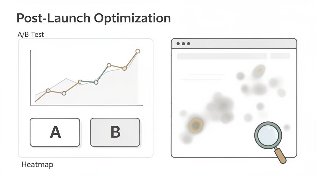
- Heatmaps: These tools create visual overlays on your pages, showing exactly where users click, scroll, and move their cursors. A heatmap might reveal that nobody is clicking a critical call-to-action, maybe because it's placed just below the average fold.
- Session Recordings: There's nothing quite like watching anonymized recordings of actual user sessions to see precisely where they get stuck. You might observe users repeatedly trying to click a non-interactive element, instantly revealing a glaring UX flaw you'd otherwise miss.
A website redesign is not a one-and-done project. It is a living asset that should evolve based on real user feedback and performance data. The launch is just the first iteration of many.
This constant feedback loop is what separates good websites from great ones. It transforms the project from a static build into an ongoing process of refinement that adapts to your users' real-world needs.
Embracing a Culture of Testing
Once you've identified some areas for improvement, it's time to start experimenting. Instead of making changes based on a gut feeling, use A/B testing to prove which version performs better. This is how you systematically squeeze more performance out of your investment, one test at a time.
You can test almost anything, and you should:
- Headlines: Does "Build Your Future" or "Start Your Free Trial" get more clicks?
- Button Colors: Does a high-contrast green button convert better than a subtle blue one?
- Page Layouts: Does a single-column layout outperform a two-column design on your main service pages?
Each test gives you a definitive, data-backed answer. Over time, these small, incremental wins compound into significant gains in conversions and revenue. This commitment to ongoing optimization is the final, crucial step to truly maximize the ROI when you redesign a website.
Common Questions About Redesigning a Website
Even the most thorough redesign plans come with a few nagging questions. It's perfectly natural. Before you dive headfirst into a project, you need to know exactly what you’re getting into.
We hear the same handful of questions from business owners all the time. Let's tackle the big three right now.
How Long Does a Website Redesign Take?
This is the million-dollar question, and the honest answer is: it depends. For a small to mid-sized business with a fairly standard website, you're typically looking at a 3 to 6 month timeline from kickoff to launch.
However, if we're talking about a large, complex enterprise site—one with custom-built features, heavy backend integrations, and a massive amount of content—that timeline can easily extend to 6–12 months, sometimes even longer. The biggest factors are always the project's scope and how quickly stakeholders can provide feedback and sign off on key decisions.
How Much Does It Cost?
Just like the timeline, the cost can vary dramatically. A straightforward redesign for a small business website might land in the $5,000 to $15,000 range. For a mid-sized company needing more custom work and strategic input, that number often falls between $15,000 and $40,000.
For large-scale enterprise projects that demand custom development, deep integrations, and a comprehensive content strategy, it's not uncommon for the investment to exceed $75,000. This is why a crystal-clear scope of work is non-negotiable for getting an accurate quote.
Will I Lose My SEO Rankings?
Losing your hard-earned search rankings is a legitimate fear, but it doesn't have to be a reality. It's true that you might see a small, temporary dip in rankings immediately after launch. This happens while Google's crawlers work to understand and index your new site structure.
The key is to manage this transition meticulously. With a proper SEO migration plan—which absolutely must include a complete 301 redirect map, preserving your most valuable content, and optimizing for Core Web Vitals—you won't just recover. You'll set the stage for even better long-term search performance.
At Magic Logix, we build digital experiences that drive measurable growth. See how our strategic approach can transform your online presence at https://www.magiclogix.com.