Microinteractions are the tiny, single-purpose interface responses that confirm, guide, and humanize user actions. A button that pulses when tapped, a checkmark that draws itself after a form submits, a toggle that snaps into place. Used correctly, they reduce uncertainty and improve task success. The rest of this guide covers how they’re built (the four-part anatomy), where they earn their place, the numbers that govern timing, and how you prove they’re actually working.
TL;DR:
- Timing most microinteractions should be between 100 and 300 milliseconds to ensure quick perception without feeling sluggish.
- Inconsistent timing across different components, such as varying save durations, can erode the perceived coherence of the product.
- Designers must implement reduced-motion variants and test accessibility to prevent excluding users with vestibular sensitivities or impacting keyboard navigation.
- Over-animating every microinteraction can cause motion fatigue, while poor timing or animation that blocks input deteriorates user experience.
- Measuring success relies on task completion, error rates, and user confidence, rather than isolating the impact of individual microinteractions.
Table of Contents
- What Microinteractions in UX Actually Solve
- The Four-Part Anatomy: Trigger, Rules, Feedback, Loops
- What Are the Best Microinteraction Examples for Product Teams?
- How Fast Should a Microinteraction Run?
- Which Tools Help You Prototype Microinteractions?
- How Do You Measure If a Microinteraction Is Working?
- What Mistakes Should You Catch Before Shipping?
- Magic Logix’s Take on Microinteractions and Engagement
- Delight vs. Clarity: The Rule I’d Bet On
- Where to Read More on Microinteraction Design
- Sources
- FAQ
What Microinteractions in UX Actually Solve
A microinteraction exists to answer one question: “Did that work?” Every tap, swipe, or keystroke creates a moment of doubt, and the interface’s job is to close that gap before the user starts wondering whether the app froze. This is why NN/g frames microinteractions as tools that convey system status, prevent errors, and communicate brand personality, all at once, in under a second.
The mental model is simple: users build expectations from prior software experience, and a microinteraction either confirms those expectations or corrects them. When you tap “like” on a post and the icon fills with color instantly, your brain files that as normal. When nothing happens for two seconds, you tap again, and now you’ve triggered a double action the backend has to untangle.
Microinteractions earn their place in five common situations:
- Confirmation — a form field turns green when an email address is valid.
- Status — a progress ring shows how far a file upload has gotten.
- Guidance — a subtle bounce on an icon hints that it’s tappable.
- Error prevention — a password field shakes gently instead of just displaying red text.
- Delight — a small animation rewards a rare, meaningful action, like completing onboarding.
Where microinteractions stop and macro-interactions begin comes down to scope and duration. A microinteraction is single-purpose and resolves in a fraction of a second, usually tied to one component. A macro-interaction, like a multi-step checkout flow or a page transition, involves navigation and multiple screens. Decorative animation is a different animal entirely; it exists to please the eye, not to communicate state, and it has no trigger tied to a user action. If an animation plays regardless of what the user does, it isn’t a microinteraction. It’s decoration wearing a microinteraction’s clothes.
The Four-Part Anatomy: Trigger, Rules, Feedback, Loops
Every well-built microinteraction breaks down into four components, a framework that traces back to Dan Saffer’s original work and remains the industry’s canonical structure. Documenting all four in your component specs is what separates a microinteraction that scales across a design system from one that gets rebuilt inconsistently by every engineer who touches it.
Trigger is what starts the interaction. It can be user-initiated (a tap, a hover, a scroll past a threshold) or system-initiated (a background sync completing, a session about to expire). Specify both the trigger type and its exact condition. “On tap” is incomplete. “On tap, after the field loses focus, if validation has run” is a spec.
Rules determine what happens once triggered: what changes, in what order, and under what conditions it changes differently. This is where edge cases live. What happens if the user triggers the action twice in rapid succession? What if the network call fails mid-animation? Rules are the part teams skip, and it’s the part that causes the most support tickets later.
Feedback is the visible, audible, or haptic signal that tells the user something happened. A color shift, a sound, a vibration, a shape change. Feedback should always match the weight of the action; a destructive delete deserves more visual weight than a “saved” toast.
Loops and modes govern repetition and exceptions. A loop is what happens if the trigger fires again (does a “copied” tooltip reset its timer or stack?). A mode is a temporary rule change, like a “do not disturb” state that suppresses notification microinteractions entirely.
| Component | Question it answers | Quick example |
|---|---|---|
| Trigger | What starts it? | Tap on a “save” button |
| Rules | What happens, and when does it change? | Show spinner if save takes over 300ms; show error if it fails |
| Feedback | How does the user know? | Button morphs into a checkmark |
| Loops/Modes | What if it repeats or conditions change? | Second tap while saving is ignored, not queued |
What Are the Best Microinteraction Examples for Product Teams?
The most useful way to catalog microinteractions is by the user goal they serve, not by visual style. Below are patterns grouped by problem, most of which you can adapt directly into a component library.
Feedback and confirmation. These patterns answer “did my action register?”
- Button state change — a “submit” button darkens on press and disables during processing, preventing duplicate submissions.
- Toast notifications — a brief, dismissible message confirming an action (“Link copied,” “Item added to cart”) that disappears without requiring a tap.
- Success checkmark animation — a draw-on checkmark after a payment or form completes, which research on inline validation and conversion patterns ties to measurably lower form abandonment.
- Toggle switches with motion — the slider physically travels rather than snapping, giving tactile confirmation of the new state.
System status. These patterns manage expectations during waiting periods, which is where perceived performance is won or lost.
- Skeleton loaders — gray placeholder shapes that mimic the eventual layout, reducing the perceived wait compared to a blank screen or spinner.
- Progress rings and bars — used for uploads, downloads, or multi-step processes where duration is somewhat predictable.
- AI “thinking” states — a pulsing dot or streaming cursor that indicates a language model is generating a response. This pattern barely existed a few years ago and is now standard across chat-based products; it needs its own recovery affordance if generation stalls or fails, since users read a stuck cursor as a crash, not a delay.
- Streaming text output — rather than waiting for a full AI response, text appears token by token, which lowers perceived latency even when total generation time is unchanged.
Error prevention and undo. These patterns catch mistakes before or right after they happen, which is cheaper than a support ticket.
- Inline validation — a field checks format as the user types (or on blur) rather than waiting for a full-form submit to reveal five errors at once.
- Undo affordances — a temporary “Undo” link after a delete or archive action, giving users a few seconds to reverse a mistake instead of relying on a confirmation dialog that interrupts flow.
- Shake or color-flash on invalid input — a password field that shakes gently when the wrong format is entered, paired with a specific error message rather than a generic “invalid.”
- Confirmation on destructive actions — a brief hold-to-confirm gesture or a two-step tap for irreversible actions like account deletion.
Delight and reward, used sparingly. These patterns exist to make an interface feel considered, not to entertain on every screen.
- Micro-celebrations — confetti or a brief animation on a rare milestone, like finishing a course module or hitting a savings goal.
- Badge or counter increments — a number that ticks upward rather than jumping, giving weight to accumulation (points, likes, streaks).
- Empty-state illustrations with subtle motion — a gently animated illustration on a zero-results page, softening what would otherwise read as a dead end.
Platform matters here. On mobile, haptic feedback (a light tap vibration) often does the work a visual animation would do on web, and it costs less battery. On web, hover states carry more weight because there’s no touch equivalent, so feedback needs to be visible on focus for keyboard users too. For US-based product teams building for a market where App Store and Play Store review scores directly influence acquisition, a well-placed undo affordance or inline validation pattern is frequently cited in reviews as “feels polished,” which is a business outcome, not just a design one.
How Fast Should a Microinteraction Run?
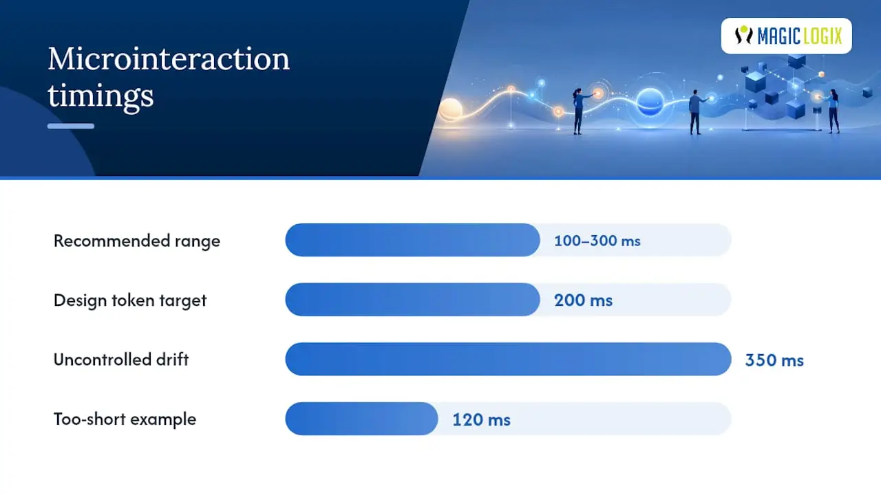
Timing is the single most measurable lever in microinteraction design, and it’s the one teams get wrong most often by guessing instead of setting a rule. Design pattern guidance from The UX Shop recommends most microinteractions complete in 100 to 300 milliseconds. Below 100ms, the eye barely registers a transition happened. Above 400ms, users start to perceive the interface as sluggish, even when the underlying action is fast.
- 100 to 150ms for small, frequent feedback like button presses or toggle switches.
- 200 to 300ms for state transitions like a card expanding or a modal appearing.
- 300ms and up only for larger, less frequent movements, like a page-level transition, and never for something a user triggers repeatedly.
Easing should match the weight of the action. Light, frequent interactions (a checkbox, a like button) suit quick, snappy easing curves like ease-out. Heavier or rarer actions (a modal opening, a panel sliding in) suit slightly slower easing with more give, like ease-in-out, so the motion feels intentional rather than abrupt.
Accessibility isn’t optional polish here, it’s a design rule. Every animated microinteraction needs a reduced-motion variant that respects the prefers-reduced-motion media query, replacing movement with an instant or near-instant state change. Guidance from the UX Design Institute is explicit that focus indicators should never be animated away; a keyboard user tabbing through a form needs to see exactly where they are at all times, and any fade or delay on that indicator is a usability regression, not a style choice. Test every microinteraction in dark mode separately. Colors that read as “success green” in light mode can lose contrast against a dark background, and shadows used for depth cues often disappear entirely.
A 2026 cognitive-affective analysis found that microinteractions’ effect on usability is non-linear: excessive or poorly designed microinteractions actually increase cognitive load rather than reduce it. More motion is not automatically better motion.
Pro Tip: Before shipping any new microinteraction, ask whether removing it entirely would make the interface worse, clearer, or no different. If the honest answer is “no different,” cut it. Every animation you ship is one more thing engineering has to maintain and one more thing that can break on a slow device.
Which Tools Help You Prototype Microinteractions?
Design tools have gotten good enough that most microinteractions can be validated before a single line of production code gets written, which saves engineering cycles and catches timing problems early. Figma’s interactive components let you wire up hover, press, and state-change behavior directly in the design file, which is usually the fastest way to test whether a transition feels right. Framer goes further, supporting more complex sequenced animations and code components for teams that want higher-fidelity prototypes before handoff. Lottie, built on top of Adobe After Effects exports, is the standard for delivering complex vector animations (like AI thinking states or celebration effects) as lightweight JSON files that render natively on mobile and web without bloating app size, a workflow detailed in most modern microinteraction guides.
For production, most microinteractions don’t need a heavy animation library at all:
- CSS transitions and keyframes handle the vast majority of button states, hover effects, and simple transforms with near-zero performance cost.
requestAnimationFrameis the right tool when you need JavaScript-driven animation synced to the browser’s repaint cycle, like a custom progress ring that isn’t achievable with pure CSS.- Debounced validation on input fields prevents an inline-validation microinteraction from firing on every keystroke, which both saves compute and stops the UI from feeling twitchy.
Performance and battery impact deserve real scrutiny, not an afterthought. Animating properties like width or top forces the browser to recalculate layout on every frame, while animating transform and opacity lets the GPU handle it cheaply. Test every microinteraction on a mid-range device, not just the design team’s latest laptop or phone; a subtle animation that’s invisible on a high-refresh-rate display can visibly stutter on hardware three years older.
For handoff, the deliverable isn’t a Lottie file or a Figma prototype alone, it’s a documented token. Centralizing durations and easing curves as design tokens, rather than letting individual engineers eyeball timing, is what keeps a 200ms transition from silently becoming 350ms in one part of the product and 120ms in another.
How Do You Measure If a Microinteraction Is Working?
Microinteractions are hard to isolate statistically because they’re rarely the only variable changing on a screen, which is why the right approach is measuring perceived performance and error rates at the flow level rather than trying to attribute a single conversion lift to a single checkmark animation.
Useful quantitative metrics include:
- Task completion rate before and after introducing a pattern like inline validation.
- Error rate, specifically how often users submit invalid data or trigger an action twice.
- Task time, watching for whether a loading pattern like a skeleton screen actually shortens perceived wait versus a blank state.
- Form abandonment, where mapping specific patterns to outcomes shows undo affordances and inline validation tend to correlate with fewer drop-offs at the exact step they’re placed.
Two experiment structures work well here. An A/B test toggling a single microinteraction (an undo affordance on vs. off, for example) against a completion-rate metric isolates that one pattern’s effect cleanly. A task-based usability session, where you watch five to eight users complete a flow with think-aloud narration, surfaces qualitative signals a dashboard never will, like hesitation before a button tap or confusion about whether a save actually happened.
Controlled task-based testing backs this up directly: interfaces built with microinteractions produced higher user understanding and satisfaction than static equivalents in short, goal-oriented tasks. Session recordings and post-task confidence ratings (“How sure were you that action succeeded?” on a five-point scale) round out the picture, since a user can complete a task quickly while still feeling anxious the whole way through, and that anxiety shows up in support tickets weeks later.
What Mistakes Should You Catch Before Shipping?
The most damaging errors are rarely about a single bad animation. They’re systemic problems that show up across dozens of components at once.
- Over-animating. When every button press, card load, and menu open gets its own flourish, users experience motion fatigue, and the interface feels busier than it is functional.
- Inconsistent timing. A save action that takes 150ms on one screen and 400ms on another erodes the sense that the product is one coherent system.
- Ignoring reduced-motion settings. Shipping without a
prefers-reduced-motionfallback excludes users with vestibular sensitivity and violates a baseline accessibility expectation. - Blocking input during animation. If a user can’t type, tap, or scroll until a decorative transition finishes, the animation has actively made the product slower, not just prettier.
Before release, run through a short checklist: confirm every microinteraction pulls its duration and easing from shared tokens rather than a hardcoded value; confirm a reduced-motion variant exists and was actually tested, not just coded; confirm keyboard focus and screen-reader announcements work independently of the visual animation; and confirm the pattern reads correctly in dark mode, not just the default theme. Encoding these as reusable tokens, rather than re-specifying timing per component, is what keeps this checklist from needing to be run manually on every single release.
Magic Logix’s Take on Microinteractions and Engagement
Magiclogix treats microinteractions as one lever inside a larger engagement system, not a standalone design flourish. When we build or audit a client’s digital product, timing tokens and feedback patterns get evaluated against the same metrics as the rest of the funnel: task completion, drop-off points, and support ticket volume tied to specific flows. A well-placed inline validation pattern that reduces form abandonment does the same job as a paid media optimization; it just operates a layer closer to the interface.
Our approach pairs conversion optimization work with the behavioral principles covered in our piece on psychology in design, because a checkmark animation only earns its place if it’s tied to a metric someone is actually watching. For teams looking to operationalize this across a growing product, our customer engagement strategy template walks through mapping specific interaction patterns to measurable engagement goals, whether that’s activation, retention, or a lighter support queue.
Delight vs. Clarity: The Rule I’d Bet On
Clarity beats delight every time they conflict, and in production interfaces, they conflict more often than most teams admit. A confetti burst that takes 600ms to resolve on a checkout confirmation page might feel charming in a design review, but if it delays the user from seeing their order number, it’s a usability defect wearing a party hat.
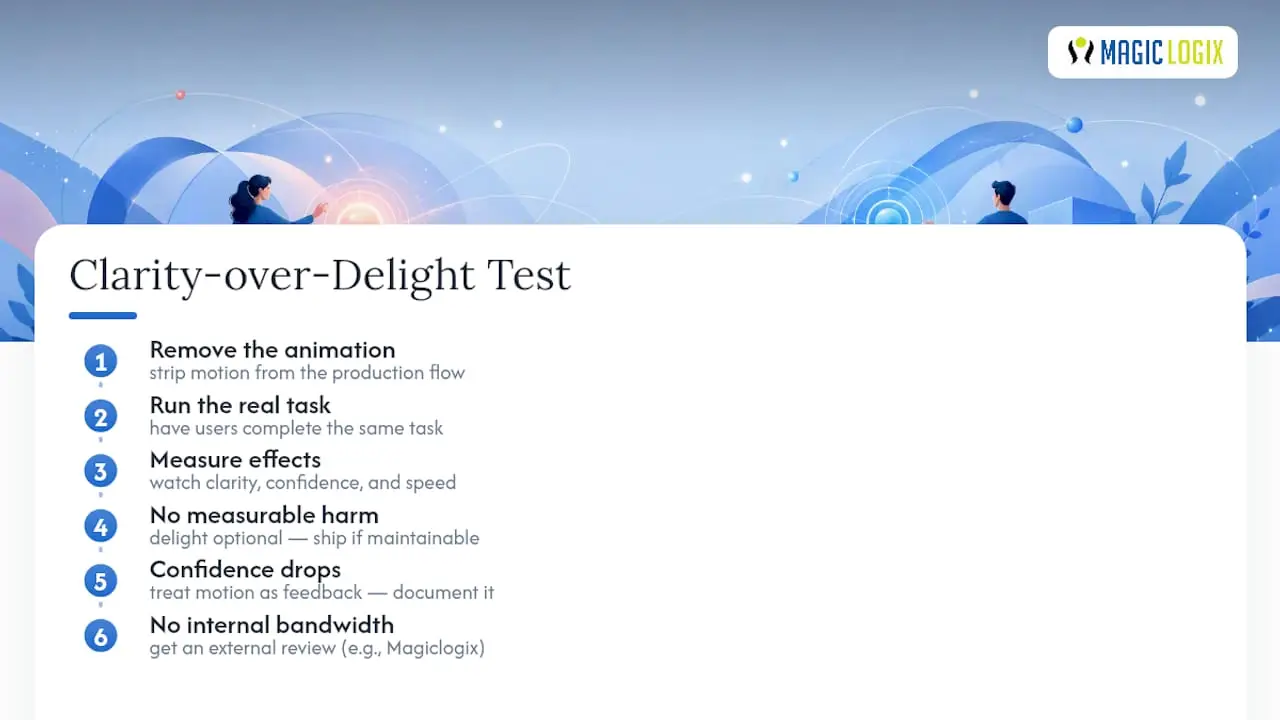
The test I trust most is boring on purpose: strip the animation and watch a real task get completed with it gone. If nothing about clarity, confidence, or speed suffers, the delight was optional, which is fine, ship it if there’s budget for the maintenance. If task confidence drops without it, that motion was load-bearing, and it should have been documented as a feedback mechanism from the start, not an afterthought bolted on after launch.
Teams that don’t have the bandwidth to run this testing loop internally are usually better served getting a second set of eyes on the flow before shipping, which is where a partner like Magiclogix tends to add the most value, not by adding more animation, but by figuring out which ones are actually necessary.
— Hassan
Where to Read More on Microinteraction Design
For the canonical framework this entire discipline builds on, NN/g’s microinteractions article remains the clearest breakdown of trigger, rules, feedback, and loops. The UX Design Institute’s guide covers accessibility practices in more depth, including reduced-motion fallbacks. For tooling, both Figma and Framer publish their own documentation on interactive components, and Shaheer Malik’s guide walks through practical tool tradeoffs. On the research side, the cognitive-affective study on mobile engagement and the task-based usability study are worth reading in full if you want the underlying data behind the timing and usability claims made throughout this guide.
Sources
- Microinteractions in User Experience – NN/g
- The Impact of Microinteractions on User Engagement in Mobile Applications: A Cognitive and Affective Analysis
- Study: microinteractions influence understanding and satisfaction – research paper
- Micro-interactions: The Subtle UX Language for Feedback | The UX Shop
FAQ
What Is the Difference Between a Microinteraction and an Animation?
A microinteraction is triggered by a specific user or system event and communicates status or feedback; a decorative animation plays without being tied to an action and carries no functional meaning.
How Long Should a Microinteraction Last?
Most should complete in 100 to 300 milliseconds; durations past 400ms tend to feel sluggish regardless of what the animation is communicating.
Do Microinteractions Actually Improve Conversion Rates?
Patterns like inline validation and undo affordances are linked to lower form abandonment in conversion-focused research, though the safest approach is measuring completion rate and error rate at the flow level rather than crediting one animation in isolation.
What Are the Four Parts of a Microinteraction?
Trigger, rules, feedback, and loops or modes, a framework defined by NN/g that covers what starts an interaction, what happens, how the user is informed, and what changes on repetition.
Can Too Many Microinteractions Hurt Usability?
Yes. A 2026 cognitive-affective study found the relationship between microinteractions and usability is non-linear, meaning excessive or poorly designed motion increases cognitive load instead of reducing it.