
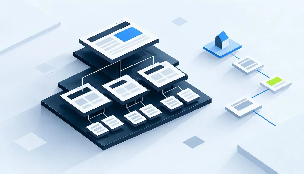
Website information architecture (IA) is the way you organize, label and connect your site’s content so visitors and search engines can find what they need. It covers your hierarchy, your category names, your navigation and your search. A sitemap is one document that comes out of that work. IA is the thinking behind it.
Many owners treat structure as something to fix after the design is done. It works the other way around. Structure comes first, and visual design sits on top of it. This guide walks through the components, a planning process you can run with a small team, navigation rules, and how structure affects SEO.
TL;DR
- Information architecture is the organization, labeling, navigation and search design of a site. A sitemap is only one output of it.
- Four building blocks do the work: organization systems, labeling systems, navigation systems and search systems.
- Plan in this order: inventory your content, learn how users look for it, draft two or three structures, then test them before you build.
- Keep main navigation short, keep hierarchies shallow, and link to important pages from pages that already matter.
- Structure supports SEO by helping crawlers and people understand which pages are central. It does not guarantee rankings.
Table of Contents
- What website information architecture is
- The four components of information architecture
- How to plan your website information architecture
- Navigation best practices that hold up
- How site architecture affects SEO
- Perspective: structure is where growth starts
- Measuring whether your structure works
- Single customer view and information architecture
- Common mistakes to avoid
- A short checklist before you rebuild
- Getting help with your site structure
- FAQ
- Sources
What website information architecture is
Think of IA as the floor plan of a building. Before you choose paint and furniture, you decide which rooms exist, how they connect and what each door is labeled. A site works the same way. The Web Style Guide makes the same point: the underlying structure has to be framed out before interface and graphic design can work well, and if the organization is poor, visual design will not repair it.
In practice, IA answers a handful of plain questions:
- What content and functions does the site need?
- How should those pieces be grouped?
- What should each group be called?
- How will a visitor move from one piece to another?
- How will the structure hold up when you add new pages next year?
For large sites, the same guide lists the aims as organizing content into taxonomies and hierarchies, communicating a conceptual overview, designing core navigation, and setting standards for semantic markup and search optimization.
Information architecture vs. sitemap
A sitemap is a diagram or list of the pages and how they nest. IA is the set of decisions that produced it, plus the labels, navigation rules and search behavior around it. You can have a sitemap with poor IA, for example a tidy tree whose category names mean nothing to your customers.
| Item | What it is | Who uses it |
|---|---|---|
| Information architecture | The organization, labeling, navigation and search logic of the whole site | Strategists, designers, content and SEO teams |
| Sitemap (planning diagram) | A map of pages and their hierarchy | Your team, during planning and build |
| XML sitemap | A file that lists URLs for search engines | Crawlers |
| Navigation menu | The on-page links visitors click | Visitors |
The four components of information architecture
The model most often cited comes from Louis Rosenfeld and Peter Morville. Baymard Institute’s guide and Figma’s overview both describe four building blocks.
1. Organization systems
This is how content is grouped and ordered. The three common patterns are hierarchical (parent and child pages), sequential (one step after another) and matrix (users choose their own path). Baymard notes that a sequential structure suits e-commerce checkout because it avoids overwhelming people with choices, while a matrix lets users decide where to go next.
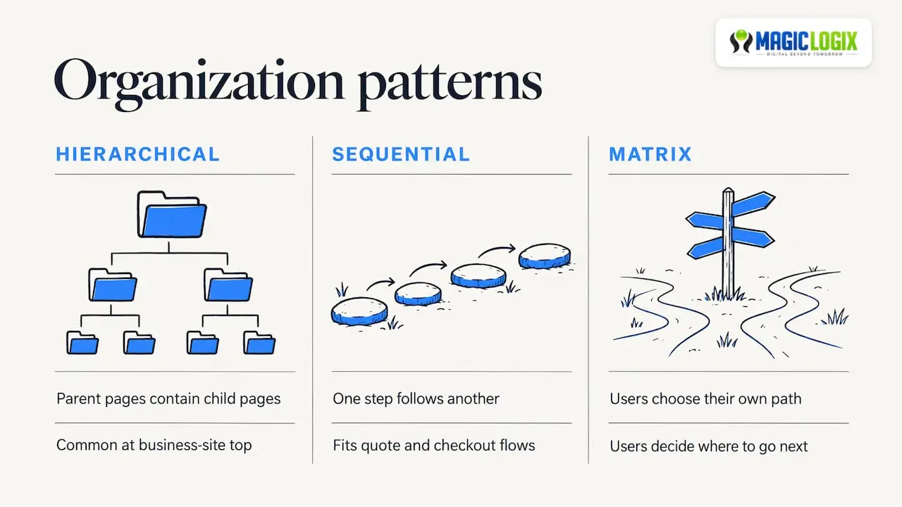
Most business sites are hierarchical at the top, with sequential flows inside them, such as a quote request or a checkout.
2. Labeling systems
Labels are the words on your menus, headings and links. Good labels use the language your visitors use, not your internal department names. Figma’s overview groups labeling under categorization, contextual links, navigational terms, keywords and taxonomy.
A website taxonomy is the controlled set of categories and tags you apply to content. If a services page can sit in three categories depending on who writes the page, your taxonomy needs rules.
3. Navigation systems
Navigation comes in three forms:
- Global navigation: the main menu on every page.
- Local navigation: links within a section, such as a sidebar for one service line.
- Contextual navigation: links inside the content, such as “related guide” links.
4. Search systems
This covers how people look for content with a search box, and how content is indexed by topic, audience or content type. On a site with a few dozen pages, search may be minimal. On a catalog or resource library, it becomes a primary way in.
How to plan your website information architecture
You do not need an enterprise budget to do this well. You need a method and a willingness to test. Here is a sequence that fits a small or mid-sized team.
Step 1: Define context, content and users
YaleSites’ guidance suggests considering three things before you build: context (goals, resources, constraints), content (types, existing structure, governance) and users (audiences, tasks, needs). Figma’s overview frames it the same way and warns that ignoring any one of them adds friction.
Write down answers in plain sentences:
- What are the top three things a visitor should be able to do on this site?
- Who are the two or three audiences that matter most?
- Who owns each type of content, and who approves changes?
Step 2: Run a content inventory
List every page you have: URL, title, type, owner, last update and whether it earns traffic or leads. A spreadsheet is enough. Mark each page keep, merge, rewrite or retire. This step often reveals duplicate pages competing with each other and orphan pages no menu links to.
Step 3: Learn how people look for things
Use what you already have. Your internal site search terms, the questions your sales team hears, support tickets and search query reports all show the words your audience uses. These become your labels.
Step 4: Draft structures with card sorting
In a card sort, you give participants cards, each representing a piece of content, and ask them to group them. In an open sort they name the groups themselves. Figma’s Clara Ujiie recommends card sorting to learn how your audience groups related content. Aim for two or three candidate hierarchies from the results.
Step 5: Validate with tree testing
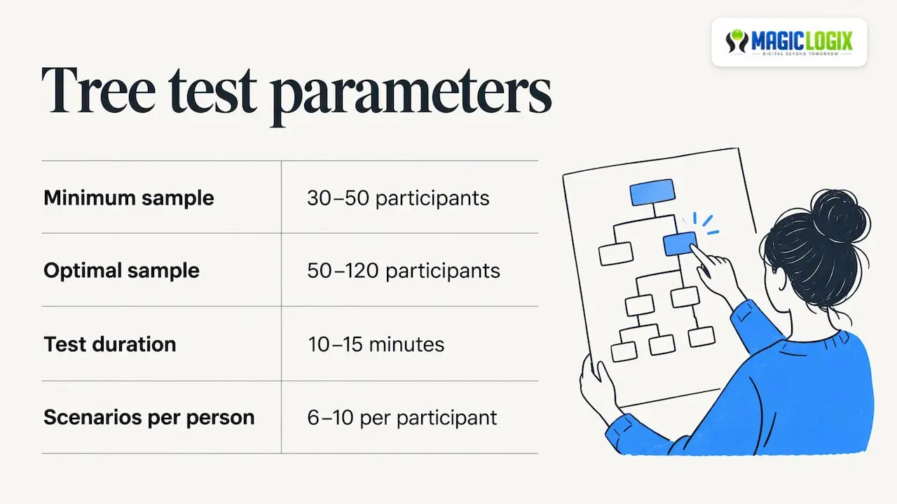
Tree testing shows participants a text-only version of your hierarchy and asks them to find specific items. The U.S. Department of Energy’s usability guidebook says it lets you focus on structure before content and design exist. It suggests a minimum of 30 to 50 participants, with 50 to 120 optimal for seeing patterns, about 10 to 15 minutes per test and 6 to 10 scenarios per participant. The guidebook also notes that many researchers prefer it to closed card sorts because it puts people in a task mindset, which is closer to how they use real sites.
Small teams can run a lighter version with fewer people to catch obvious problems. Treat a small test as a signal to fix glaring labels, not as statistical proof.
Step 6: Document and hand off
Capture the final structure as an annotated sitemap, a navigation specification, naming rules for labels and a short governance note: who can add pages, and where. This is what keeps the structure from drifting after launch.
Navigation best practices that hold up
University web teams publish some of the clearest public guidance, because they manage very large sites with many audiences. Their advice translates well to business sites.
- Keep the main menu short. Case Western Reserve University’s planning guide recommends no more than five or six main items. YaleSites suggests keeping it under five.
- Limit depth and breadth. YaleSites advises no more than 10 child pages per section and avoiding subpages below level three.
- Stay consistent in voice. Case Western advises against mixing topic-based and audience-based labels in the same menu.
- Skip acronyms and jargon in main page titles and navigation labels.
- Do not link straight to downloads from the main navigation. Send people to a page that explains the file first.
Website navigation examples by business type
These are illustrative structures, not claims about any specific company.
| Business type | Sample main navigation | Why it works |
|---|---|---|
| Local service business | Services, Service Areas, About, Reviews, Contact | Maps to how a nearby customer decides |
| B2B services firm | Services, Industries, Resources, About, Contact | Lets buyers enter by need or by sector |
| Online store | Shop (categories), Deals, Support, About | Keeps product discovery in one clear branch |
| SaaS or software | Product, Solutions, Pricing, Resources, Contact | Separates what it is, who it is for and what it costs |
If you need more than five or six items, that usually signals that some labels belong under a parent, or that your content needs a second audience entry point.
How site architecture affects SEO
Information architecture and SEO overlap heavily. A clear structure helps people, and it also tells search engines how your pages relate.
Depth, crawling and internal links
Search Engine Land’s site architecture guide (updated November 2025) says architecture affects crawl depth and crawl budget, and that pages buried beyond four clicks tend to be seen as less important. It recommends reaching important content within three to four clicks of the homepage, placing high-value content higher in the hierarchy and planning for growth so new pages slot in without long chains of subpages.
Google’s own documentation is useful here. Its ecommerce structure guidance says Google generally does not use URL structure to understand a site. It analyzes the links between pages, and the more links a page receives within the site, the more relative importance it signals. An older Google Search Central post on link architecture makes a related point: crawlers rarely type into search boxes or use pulldown menus, so important pages should be reachable by plain links from the home page.
The takeaways:
- Link to your priority pages from the homepage and main navigation.
- Add contextual links between related pages, so authority and relevance flow where they should.
- Do not rely on a search box or script-driven menu as the only path to a page.
- Do not assume that nesting a URL as /services/seo/ is what creates structure. The links do that.
Topic clusters and silo structure
A “silo” is a way of grouping related pages so that they link mostly to each other and to a parent page. In practice, this means one pillar page per core topic, supporting pages beneath it, and links running both ways. It is a planning approach, not a ranking switch. Search engines have not published a rule that rewards strict silos, so use the idea to keep topics coherent, and link across clusters whenever a reader would benefit.
For a deeper look at structure from the SEO side, see our guide to SEO site architecture.
Changing structure without losing traffic
Restructuring changes URLs, and that carries risk. Before you move anything, map every old URL to its new home with a one-to-one redirect plan. Our walkthrough on building a redirect map before migration covers the steps. If the restructure is part of a larger rebuild, how to redesign a website shows where IA fits in the project.
Perspective: structure is where growth starts
We see the same pattern with many business owners: the site looks modern, but the menu reflects the org chart, not the customer’s question. Fixing the paint does not fix that.
Our view is that information architecture is the first design decision, not a cleanup task. When you settle your hierarchy, labels and internal links before layout, design and development have something solid to build on. SEO, AEO and GEO work benefit too, because clear, well-linked topic structure is easier for people and for search and answer systems to interpret. No one can promise rankings or AI citations, and we do not. A coherent structure simply removes avoidable obstacles.
At Magic Logix, our positioning is Digital Beyond Tomorrow: build the foundation correctly now so the next channel, whether search, answer engines or something new, has a clean structure to plug into.
Hassan Bawab
Measuring whether your structure works
A structure is a hypothesis until real visitors use it. Pick a few measures before you launch changes, and compare before and after over a consistent window.
| What to check | How to check it | What a problem looks like |
|---|---|---|
| Task success | Tree test or moderated session with 5 to 8 realistic tasks | People pick the wrong top-level section |
| Findability of key pages | Click depth from the homepage in a crawl | Revenue pages sit four or more clicks deep |
| Orphan pages | Compare crawl results with your page inventory | Live pages that no page links to |
| Internal search terms | Site search report | Frequent searches for things already in the menu |
| Conversion path | Analytics paths to the contact or checkout page | Long, looping journeys before conversion |
The tree-testing guidance above uses directness rates below 50% as a signal to revise a structure, according to one process write-up, but treat any threshold as a rule of thumb. Look at which tasks fail and why, then fix the label or the grouping.
If your goal is more leads from the same traffic, structure and conversion work go together. Our guide to website conversion optimization covers the next layer, and customer journey mapping helps you decide which pages each audience needs to see.
Single customer view and information architecture
The phrase single customer view (also called a unified customer profile or 360-degree view) comes from data and CRM, not from site structure. It means one combined record of what you know about each customer across web activity, email, purchases and service interactions.
The link to IA is practical. The way you organize and label your site determines what behavior you can track and segment. If your pages follow a clear taxonomy, such as consistent categories for services, industries and content types, your analytics and automation tools can group visitors by interest more reliably. If your structure is inconsistent, your data will be too.
Three habits help:
- Use the same category names in your site, your analytics tagging and your CRM fields.
- Keep one URL and one purpose per page, so behavior is attributed cleanly.
- Decide which interactions (form fills, downloads, pricing views) matter, and make sure the structure gives each a distinct, trackable page or event.
Building the unified profile itself is a data project. It starts with finding every system that holds customer data. Structure gives that project cleaner inputs.
Common mistakes to avoid
- Naming sections after internal teams. Visitors do not know your departments.
- Mixing label types. A menu that blends audiences (“For Startups”), topics (“SEO”) and formats (“Videos”) confuses people.
- Creating a page for every keyword variation. This splinters authority and clutters navigation.
- Burying revenue pages. If your main service pages are deep in the hierarchy, move them up.
- Skipping governance. Without a rule for where new content goes, structure decays within a year.
A short checklist before you rebuild
- [ ] Goals, audiences and constraints written down
- [ ] Full content inventory with keep, merge, rewrite or retire decisions
- [ ] Labels drawn from real customer language
- [ ] Main navigation at six items or fewer
- [ ] Two or three candidate structures tested with real users
- [ ] Priority pages within three to four clicks of the homepage
- [ ] Redirect map ready for every URL that moves
- [ ] Governance note: who adds pages, where and how they are labeled
Getting help with your site structure
If you are planning a new site or reworking an existing one, structure is worth settling first. Our team at Magic Logix designs sites with the hierarchy, navigation and internal linking planned alongside the visual design. You can explore our website design and development services, or look at how we approach search engine optimization when the goal is to improve visibility. A consultation is a reasonable way to talk through your content and audiences before you commit to a direction.
FAQ
What is the difference between information architecture and navigation?
Information architecture is the whole structure: how content is organized, labeled, linked and searched. Navigation is one part of it, the menus and links visitors use to move through that structure. You can redesign a menu without changing your IA, but a menu cannot fix a hierarchy that does not match how people think.
What are the four main components of information architecture?
They are organization systems, labeling systems, navigation systems and search systems. Organization decides how content is grouped, labeling names it, navigation lets people move through it and search helps them jump straight to it. The model comes from Rosenfeld and Morville’s work on information architecture for the web.
How many clicks deep should important pages be?
A common guideline is to keep important pages within three to four clicks of the homepage. Search Engine Land notes that pages buried beyond four clicks tend to be seen as less important. Smaller sites can usually do better, with key service pages one or two clicks from the home page.
How many items should a main menu have?
University web standards suggest five or six at most, and some recommend fewer than five. If you need more, group related items under a parent label. Your own tree-test results should outweigh any rule of thumb.
Does URL structure matter for SEO?
Google’s documentation says it generally does not use URL structure to understand a site’s structure and instead looks at how pages link to each other. Clean, readable URLs are still good practice for users, but internal links carry the structural signal.
Sources
- Information Architecture, Web Style Guide 3
- What Is Information Architecture? Figma
- A Guide to Information Architecture UX, Baymard Institute
- Basic Principles of Information Architecture, YaleSites
- Guide to Usability and Analysis Techniques, U.S. Department of Energy EERE
- Planning for Good Information Architecture, Case Western Reserve University
- Site Architecture for SEO, Search Engine Land
- Ecommerce Website Navigation Structure, Google Search Central
- Importance of link architecture, Google Search Central Blog