Picking a business intelligence tool is a massive decision, one that can directly shape your company’s ability to turn raw data into real revenue. This guide is a practical, no-fluff business intelligence software comparison to help you choose the right platform and sidestep those costly implementation mistakes. We'll be looking at the heavy hitters: Microsoft Power BI, Tableau, and Qlik.
Why Your BI Software Choice Matters
Let's be clear: selecting BI software isn't just an IT task. It's a strategic move that defines your company's entire data culture. The right tool empowers everyone to make smarter, faster decisions. The wrong one? It becomes a fast track to low user adoption, frustrating data silos, and a whole lot of wasted money. A thoughtful choice here means your investment pays off in actionable insights and measurable growth.
The global business intelligence market is exploding, on track to hit an incredible $72.21 billion by 2034. That's not just a big number; it's a signal that data analytics is no longer optional for staying competitive.
Core Evaluation Criteria
To make a smart comparison, we need to evaluate each platform against criteria that actually matter to your business. We're zeroing in on:
- Integration Capabilities: How smoothly does it play with your existing tech stack—your data sources, CRM, and marketing automation tools?
- Scalability: Can the software keep up as your data volumes and user base grow, or will performance grind to a halt?
- User Experience (UX): Is the interface intuitive for everyone, from your dedicated data analysts to your marketing managers?
- Total Cost of Ownership: This goes way beyond the sticker price. We’re talking implementation, training, and ongoing maintenance costs.
This guide moves past generic feature lists to give you context for real-world business challenges. If you're looking for more comprehensive evaluations, checking out guides on the Top Business Intelligence Tools can offer a wider perspective. And for more hands-on advice, you can always explore our other digital marketing resources.
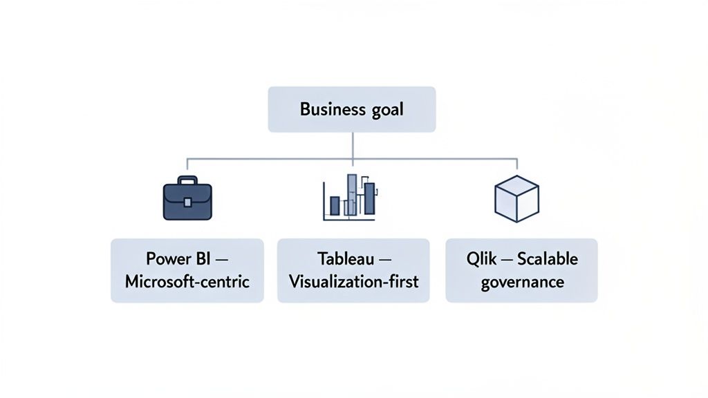
The best BI tool isn't the one with the most features—it's the one that aligns perfectly with your team's skills, integrates smoothly into your tech stack, and solves your specific business challenges.
To help you get started, we've put together a quick cheat sheet matching the top BI tools to common business profiles. It's a great way to quickly see which platform might be the best fit before diving deeper.
Quick BI Software Recommendations by Business Need
| Business Profile | Top Recommendation | Key Strength |
|---|---|---|
| Microsoft-Centric SMBs & Enterprises | Microsoft Power BI | Seamless Office 365 integration and cost-effectiveness |
| Data Visualization & Storytelling | Tableau | Best-in-class interactive visualizations and dashboards |
| Large Enterprises with Complex Data | Qlik | Powerful data governance and associative analytics |
This table should give you a solid starting point. Now, let's break down how these platforms stack up in the areas that truly count.
Comparing the Core Capabilities of Leading BI Platforms
Choosing the right business intelligence platform means looking past the marketing buzz and getting down to what really matters for your daily operations. A tool's true worth shows up in how it handles the fundamentals: data visualization, data prep, governance, and scalability. Let's break down how Microsoft Power BI, Tableau, and Qlik stack up in these critical areas, with an eye toward real-world business scenarios.
This isn't just about ticking off features on a list. It’s about figuring out which platform’s unique strengths align with your team's actual needs, whether you're building slick sales dashboards or trying to manage complex financial data across the entire company.
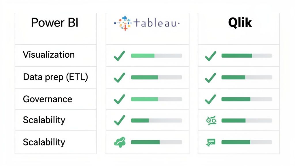
To give you a clearer picture, we've put together a high-level comparison of how these three heavyweights approach the core functions of a BI platform.
Core Feature Matrix: Power BI vs Tableau vs Qlik
| Feature Category | Microsoft Power BI | Tableau | Qlik |
|---|---|---|---|
| Data Visualization | Strong, user-friendly, and deeply integrated with the Microsoft suite. Best for quick report generation and accessibility. | The gold standard for aesthetic, highly interactive dashboards. Its strength is in visual storytelling and deep data exploration. | Focuses on exploratory analysis through its unique "associative" model. Visuals are clean but prioritize function over form. |
| ETL & Data Prep | Excellent, with the built-in Power Query tool. Its graphical interface makes complex data cleaning accessible to non-engineers. | Uses Tableau Prep, a separate but powerful visual tool for building data workflows. It's effective but another product to manage. | The Associative Engine automatically maps data relationships, simplifying some prep. Advanced work requires learning Qlik's scripting language. |
| Governance | Leverages the robust Azure and Microsoft 365 security framework. Great for companies in the Microsoft ecosystem, but can get complex. | Offers strong, centralized control over users and data sources. Excels at enabling "governed self-service" analytics. | Enterprise-grade security with granular, row-level controls. A top choice for highly regulated industries like finance and healthcare. |
| Scalability | Scales seamlessly within the Azure cloud environment. Power BI Premium provides dedicated resources for large datasets and high user loads. | Known for high performance on massive datasets, especially when paired with an optimized data warehouse. Its Hyper engine is built for speed. | The in-memory engine is exceptionally fast for interactive exploration. Performance relies on available RAM, making it blazing fast for analysis. |
This table shows that each tool brings a different philosophy to the table. Let's dive deeper into what these differences mean in practice.
Data Visualization and Reporting
Great data visualization isn’t just about pretty charts; it’s about turning raw numbers into a story that inspires action. While all three platforms are strong here, they each have a distinct personality.
Tableau is widely seen as the artist of the group. Its drag-and-drop interface is incredibly flexible, letting analysts build beautiful, interactive dashboards that practically beg users to explore the data. For a marketing team presenting campaign results, Tableau’s storytelling capabilities are second to none.
Microsoft Power BI, on the other hand, is all about practicality and accessibility, especially if your team lives and breathes Microsoft products. Its visualization tools are powerful and easy to pick up, making it lightning-fast for business users to create solid reports from data they already have in Excel or Azure.
Qlik’s superpower is its Associative Engine. It’s designed to uncover hidden relationships in your data as you click around. While its visuals are clean and get the job done, the main goal is exploratory analysis, not necessarily the polished, presentation-ready finish Tableau is famous for.
For a marketing analyst who lives in Excel, Power BI’s native integration is a game-changer. It removes the friction of data exporting, allowing them to create and share dynamic sales and performance reports directly within their existing workflow in minutes, not hours.
Data Preparation and ETL Capabilities
Before you can visualize anything, your data needs to be cleaned up and organized—a process called ETL (Extract, Transform, Load). A platform with strong built-in ETL tools can save you an enormous amount of time and headaches.
Power BI comes with a fantastic tool called Power Query. It gives you a visual interface to perform complex data transformations without having to write code, which is a huge win for business users. It's perfect for teams that need to merge data from different sources quickly without waiting on a data engineering team.
Tableau’s answer to this is Tableau Prep, a separate but well-integrated product. It provides a visual workflow that lets you see the changes you’re making to your data in real-time. It works well, but it's one more piece of software to manage. When looking at the BI landscape, tools like Looker Studio also offer solid data prep features, showing how critical this step has become.
Qlik handles data modeling in a unique way with its Associative Engine, which automatically maps out connections between different data sets. This can really simplify the initial data prep, but for more custom transformations, you'll need to invest some time in learning its scripting language. To see how these tools fit into a complete data strategy, you can explore our full range of digital marketing and technology solutions.
Governance and Data Security
As more people get access to data, controlling who can see what becomes absolutely critical. Good governance ensures your data is accurate, consistent, and secure across the board.
Qlik has long been a powerhouse for enterprise-level governance. It gives you very fine-grained control over data access, right down to individual rows and columns. This makes it a go-to for big companies in regulated fields like finance or healthcare where security is everything.
Tableau also offers solid governance features through its Server and Cloud platforms, where administrators can manage permissions and data sources from one central place. The goal is to create a "governed self-service" environment—balancing user freedom with administrative control.
Power BI piggybacks on the security framework of the wider Microsoft ecosystem, like Azure Active Directory. This is a huge advantage for companies already invested in Microsoft's world. However, managing all the permissions across different workspaces can get tricky if you don't have a clear strategy from the start.
Scalability and Performance
Your BI tool has to keep up as your business grows. It needs to handle more data and more users without slowing down. Each platform has a different architectural approach to achieving this.
- Microsoft Power BI scales beautifully thanks to its cloud-native Azure foundation. With options like Premium capacity, you can buy dedicated resources to ensure smooth performance even with huge datasets and lots of simultaneous users.
- Tableau is a beast when it comes to performance on massive datasets, especially when it’s connected to a high-performance data warehouse. Its Hyper in-memory engine is built for speed, making queries and interactions feel snappy even with billions of rows of data.
- Qlik’s in-memory Associative Engine is incredibly fast for data exploration. By pre-calculating and storing data relationships in RAM, it delivers almost instant responses as users filter and drill down into their dashboards.
Ultimately, this side-by-side look shows that the "best" tool really depends on your company’s specific situation, existing tech stack, and what you’re trying to achieve.
Evaluating Performance and Tech Stack Integration
A business intelligence tool doesn't live in a bubble. Its true worth is measured by how well it plugs into your existing systems, pulling data quickly and reliably to become your single source of truth. A critical piece of any business intelligence software comparison is digging into how these platforms perform and integrate with the tools your teams already use every single day.
This means looking past the flashy native connectors and getting into the practical, real-world questions. How painful is it to link your Salesforce CRM? Can it keep up with the constant stream of data from a marketing automation tool like Marketo? And, most importantly, how does it hold up when you're querying massive datasets from cloud warehouses like Snowflake or Amazon Redshift? The answers here will make or break user adoption and your ultimate ROI.
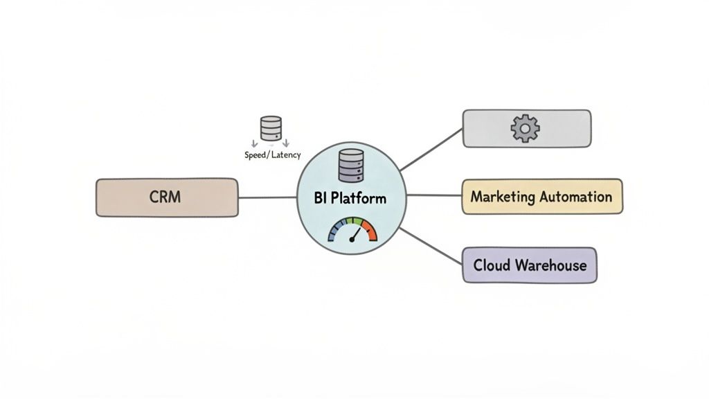
Connecting to Your Marketing and Sales Stack
For marketing and sales teams, direct integration isn't a "nice-to-have"—it's a must. The entire goal is to build unified dashboards that map the customer journey from the first click to the final sale, all without someone having to manually stitch together spreadsheets.
- Microsoft Power BI: It's no surprise that Power BI shines brightest within the Microsoft ecosystem. The native connectors for Dynamics 365 CRM and other Azure services are simply best-in-class. When it comes to outside systems like Salesforce or Marketo, its connectors are solid and widely supported by a massive user community that’s always building custom templates and workarounds.
- Tableau: Tableau boasts a huge library of pre-built connectors through its marketplace. It covers almost every major marketing and sales platform you can think of, including HubSpot, Google Analytics, and Salesforce. Performance with its Salesforce connector is particularly strong, which makes sense given it was acquired by the CRM giant.
- Qlik: Qlik also brings a strong set of connectors to the table. Its key differentiator is often its associative model, which is incredibly powerful for handling complex, multi-source integrations. If you're trying to merge data from a mix of legacy and modern systems, this is a huge advantage.
Performance with Cloud Data Warehouses
Modern data strategies are all built around cloud data warehouses. A BI tool’s ability to query these platforms efficiently—without slowing to a crawl or forcing you into costly data duplication—is a major performance benchmark. This is where you really start to see the architectural differences between the tools.
Tableau, for instance, is famous for its high-speed querying against huge datasets in platforms like Snowflake. Its Hyper in-memory engine and smart query optimization let analysts explore billions of rows interactively with almost no lag. This makes it a go-to for data-heavy organizations that can't afford to wait.
Power BI uses its DirectQuery mode to connect live to data sources. This feature is especially powerful when paired with Azure Synapse Analytics, allowing users to work with enormous datasets without importing them first. While performance depends on the underlying data source, it's exceptionally fast and scalable inside an optimized Azure environment. For any business building out its tech infrastructure, understanding the fundamentals of good web development and integration provides crucial context for these kinds of platform decisions.
For organizations heavily invested in the Microsoft 365 suite, Power BI's integration is more than just a convenience—it's a productivity multiplier. The ability to embed interactive reports directly within Teams channels or share insights via Outlook transforms BI from a standalone tool into a collaborative, everyday workflow.
API Extensibility and Custom Connections
While pre-built connectors handle the common stuff, real flexibility comes from a platform’s API. A good API lets your developers build custom connections to proprietary systems, embed analytics into other apps, and automate reporting workflows.
All three platforms offer extensive APIs, but they each have a slightly different focus. Power BI’s API is fantastic for embedding and automation within the Microsoft Power Platform. Tableau’s API is a favorite for building custom data-driven applications from the ground up. Qlik’s APIs are built for deep enterprise integration, supporting complex governance and security needs. Your choice here really comes down to your development resources and what you want your long-term integration to look like.
Deployment Models and Pricing: What Will This Really Cost?
Choosing the right BI tool isn't just about cool dashboards and fancy features. The decision you make here has real, long-term consequences for your budget and your IT team, all tied to the deployment model and pricing structure. This part of your business intelligence software comparison is where you figure out the total cost of ownership and whether the platform can actually scale with your ambition.
Every major vendor—from Power BI to Tableau and Qlik—offers a different menu of deployment and licensing options. Getting this right is critical.
Where Will Your BI Platform Live? On-Premise vs. Cloud vs. Hybrid
The first big question is where your software will be hosted. This single choice dictates how you handle everything from resources and security to ongoing costs.
An on-premise setup means you're hosting the BI software on your own servers, in your own building. For companies in tightly regulated fields like finance or healthcare, this is often the only way to go. It gives you absolute, iron-clad control over your data and security. But that control doesn’t come free. You're on the hook for a hefty upfront investment in hardware, plus the recurring costs of an IT crew to manage maintenance, updates, and security patches.
On the flip side, a cloud-based (SaaS) model shifts that entire burden to the vendor. You pay a subscription, and they handle the infrastructure, security, and updates. This makes it much easier to get started, with predictable monthly costs and the flexibility to add or remove users as your team changes. The trade-off? You're trusting the vendor’s security protocols and have less direct say over where your data physically resides.
Then there's the hybrid model, which tries to give you the best of both worlds. You can keep your most sensitive data locked down on-premise while leveraging the cloud for less critical analytics or to give remote teams easy access to dashboards. It's a powerful and flexible approach, but be warned: managing two interconnected environments can get complicated fast.
Decoding the Price Tag: How BI Software is Actually Sold
Once you've settled on deployment, you need to dig into the pricing details. BI software is rarely a simple, one-time purchase. The costs almost always break down into two main models.
Per-User Licensing: This is the classic model. You pay a set fee—usually monthly or annually—for every single person who needs access. It's the go-to structure for tools like Power BI Pro and Tableau Creator. For smaller teams, it's wonderfully straightforward. If you have a 50-person marketing team on a $20/user/month plan, you know your annual cost will be a predictable $12,000.
Capacity-Based Pricing: As your organization grows, paying for every user gets expensive. That's where capacity-based models, like Power BI Premium, come in. Instead of paying per head, you buy a block of dedicated computing power. This is perfect when you have hundreds or thousands of employees who only need to view dashboards, not create them. You can give them all access without racking up a massive per-user bill.
Don't just look at the sticker price. When you're calculating the real cost, you have to factor in the hidden expenses. Think about data storage fees, premium connectors for certain data sources, and the cost of training your team. These extras can easily inflate your budget if you aren't paying attention.
Making the Right Choice for Your Use Case
Let's be clear: there’s no single “best” BI tool. There’s only the best tool for a specific job. The right choice always comes down to your company's size, technical maturity, existing data stack, and what you’re ultimately trying to achieve. A smart business intelligence software comparison looks past the feature list to match a platform’s strengths with your actual business challenges.
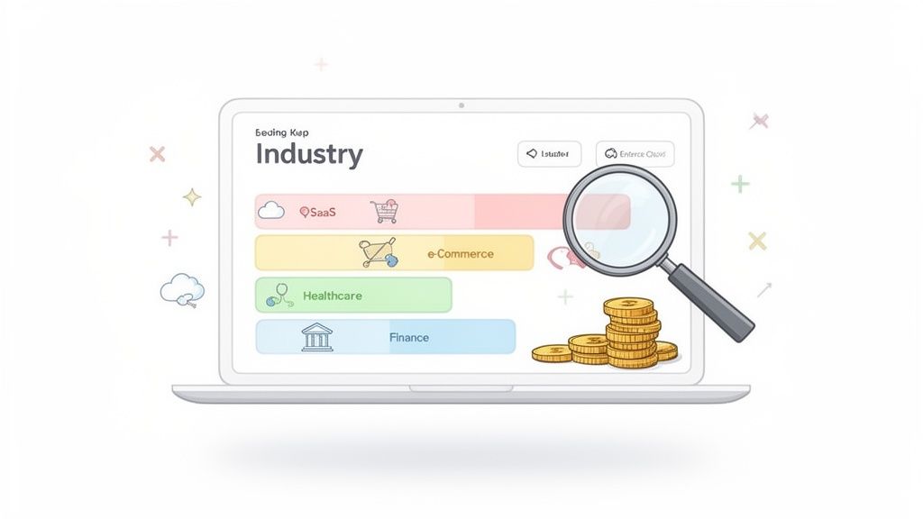
For instance, a fast-moving e-commerce startup trying to nail its sales analytics needs speed and simplicity above all else. A mid-sized company might be more focused on wrangling marketing data from a dozen different sources. And a large corporation? Their priority is almost always going to be rock-solid, auditable governance for financial reporting.
Startups and Small Businesses
For startups, it’s all about agility and cost. The main goal is to get to those "aha!" moments quickly without a huge upfront investment or needing to hire a dedicated data engineering team right out of the gate.
Top Pick: Microsoft Power BI
Power BI's Pro licensing creates an incredibly low barrier to entry. Its familiar, Excel-like interface means even non-technical users can start building useful reports almost immediately. For an e-commerce startup trying to track sales against ad spend, being able to quickly hook into Google Analytics and Shopify, clean up the data in Power Query, and spin up a dashboard is a total game-changer.
Mid-Sized Growth Companies
As a company scales, so does the complexity of its data. Mid-sized businesses often hit a wall trying to consolidate data from every department—marketing, sales, operations—into one reliable source of truth. They need a tool that balances approachability with serious data visualization power.
Top Pick: Tableau
Tableau is king when it comes to creating visually stunning, interactive dashboards that tell a compelling story with data. A marketing team at a mid-sized B2B company could use Tableau to blend Salesforce CRM data with Marketo automation stats, building a complete funnel analysis from lead to close. Its best-in-class visuals make it far easier to present complex findings to stakeholders and get everyone on the same page. To see how impactful visuals can be, check out some of our client success stories and case studies.
Large Enterprises
For huge corporations, data governance, security, and scalability aren’t just features; they're non-negotiable requirements. When you have thousands of users and petabytes of sensitive information, your BI platform absolutely must provide granular control and maintain consistent performance under extreme load.
Top Pick: Qlik
The Associative Engine and enterprise-grade governance in Qlik make it a heavyweight contender for large, complex organizations. Imagine a multinational corporation that needs to give its finance department self-service analytics on global financial data. Qlik’s robust security model ensures that analysts only see the data they’re authorized to, while its powerful in-memory engine keeps performance snappy for deep exploratory analysis.
The BI software market is fiercely competitive and constantly shifting. A tool’s market share often reflects its adoption rate and user community size, which are crucial factors for long-term support and finding skilled talent.
The market share battle really highlights these dynamics. Recent data for BI software comparisons shows Tableau holding a solid 16.4% globally in 2025. While that trails Power BI's 20%, it still keeps it ahead of Qlik's 10%. This is a direct reflection of the evolving needs in a market that's projected to hit $55.48 billion globally by 2026.
This decision tree helps visualize how your core priorities—whether it's cost, control, or a balance of both—can point you toward the right BI deployment strategy.
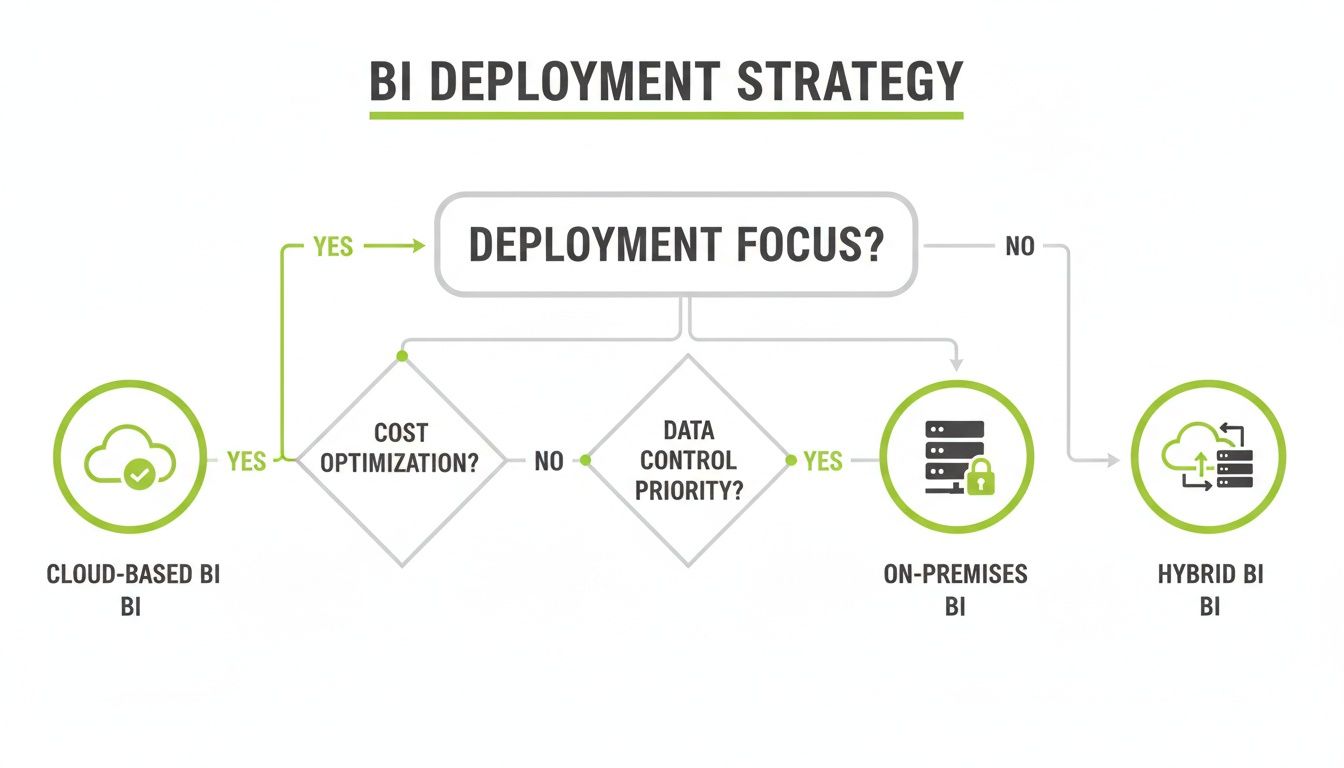
Ultimately, teams hyper-focused on cost will naturally gravitate toward cloud solutions, while organizations that need total control will prefer on-premise setups. This highlights the clear trade-offs you have to weigh when choosing your deployment model.
Got Questions About BI Software? We've Got Answers.
When you're deep in a business intelligence software comparison, a lot of practical questions pop up. Getting straight answers is the only way to feel good about the decision you’re making for your team. Here are some of the most common things we get asked during the evaluation process.
We’ll cover what really sets the top platforms apart, what you can expect to pay, and how these tools play with the marketing and sales software you already use.
What Is the Main Difference Between Power BI and Tableau?
The biggest difference between Power BI and Tableau comes down to who they were built for. At its core, Power BI is designed for accessibility and fits like a glove into the Microsoft world. Its interface feels a lot like Excel, which makes it incredibly easy for business users—not just data analysts—to start building reports right away. If your organization runs on Office 365 and Azure, it's a natural fit.
Tableau, on the other hand, made its name with stunning data visualization and incredible flexibility. It’s really the go-to tool for dedicated data analysts and anyone who needs to tell a compelling story with data. They empower users to create slick, highly interactive dashboards.
So while both are leaders, the choice is often about priorities. Do you want to make data easy for a wide audience (Power BI), or do you need to give specialists the power to do deep, visual exploration (Tableau)?
Power BI is fantastic at bringing data analytics to everyone in a Microsoft-heavy company. Tableau is built for data pros who need to turn complex datasets into beautiful, insightful visual stories.
How Much Does Business Intelligence Software Typically Cost?
There's no single price tag; the cost of business intelligence software can swing wildly depending on how you deploy it and how many people need access. For smaller teams just getting started, cloud-based plans that charge per user are the most common way in.
These subscriptions often run anywhere from $10 to $70 per user, per month. The price usually depends on whether a user is creating reports or just viewing them. For bigger companies, the pricing model often changes to one based on server capacity, either on-premise or in a private cloud. Those deals can easily climb into the tens of thousands of dollars each year. You really have to map out your needs to get an accurate idea of the total investment.
Can I Integrate BI Software with My Existing Marketing Tools?
Absolutely. In fact, smooth integration with marketing tools is a must-have for any serious BI platform. The top players all come with a huge library of pre-built connectors that make linking your marketing and sales platforms a breeze. Some of the most common ones include:
- Google Analytics: To pull in all your web traffic and user behavior data.
- Salesforce: For a direct line into your CRM and sales pipeline metrics.
- HubSpot: To track marketing automation performance and lead generation.
These connectors make it almost a plug-and-play process to get all that data into one central dashboard. If you use niche or custom-built tools, the platforms also offer powerful APIs (Application Programming Interfaces) to build your own connections. This is where working with an expert partner can be a game-changer, helping you hook up complex data sources and make sure your entire tech stack is working together perfectly.
Making sense of these integrations and picking the right BI platform is a heavy lift. Magic Logix specializes in building the kind of cohesive data strategies that turn a BI tool into a real competitive advantage. See how we can help by visiting us online.