Animations in an email are a double-edged sword. On one hand, a well-placed GIF or a slick CSS effect can stop a subscriber mid-scroll and demand their attention. On the other, a clunky, irrelevant animation can send them straight to the unsubscribe button.
The difference between delight and disaster comes down to animation type, audience, and campaign goal. They aren't just flashy decorations; they are strategic tools.
The Role of Animations in Modern Email Marketing
In a perpetually crowded inbox, standing out isn't just a goal—it's a survival tactic. This is where animations can really shine, cutting through the noise to elevate your message. But there’s a fine line between an engaging experience and an irritating one, and crossing it can have real consequences.
A great animation can show off a product's different colors in a single glance or subtly guide a reader’s eye toward your main call-to-action. It can bring a moment of delight that makes your brand memorable.
But get it wrong, and you're in trouble. An animation that's too large, too fast, or just plain pointless will slow your email's load time, create a jarring user experience, and could even get you flagged as spam. This guide is all about navigating that divide, so you can use motion to your advantage.
Balancing Creativity with Data
Any animation you add to an email needs a job to do. Before you even think about opening an editor, you have to ask what its purpose is. What problem is it solving?
- Product Demonstration: A simple, looping animation can be the perfect way to show how a product works or cycle through its features without taking up a ton of space.
- Highlighting Offers: A subtle shimmer or pulse effect on a discount code will draw the eye far more effectively than a static-colored box ever could.
- Brand Personality: Fun, on-brand animations help build a real connection with your audience. It shows you don’t take yourself too seriously.
- Driving Action: Sometimes all a user needs is a gentle nudge. An animated arrow pointing to your "Shop Now" button can be surprisingly effective.
The most effective animations are those with a clear purpose. They should solve a problem, whether it’s saving space, explaining a complex idea visually, or simply adding a touch of delight that reinforces your brand identity. The goal is to enhance the message, not become the message.
Setting the Stage for Success
We’re going to move past the simple “should I or shouldn’t I?” debate and give you a practical framework for making smart decisions. We'll get into the technical pros and cons of the most common animation formats you'll encounter.
- Animated GIFs: The old reliable. GIFs are the workhorses of email animation thanks to their universal support, but they come with real trade-offs in color quality and file size.
- Animated PNGs (APNGs): Think of these as the higher-quality cousin to the GIF. They offer much better transparency and color palettes, but email client support is still spotty.
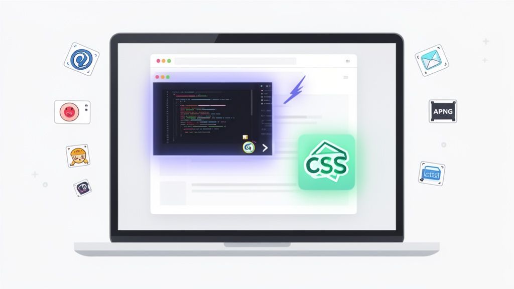
- CSS Animations: These are lightweight, code-based effects perfect for things like interactive button hovers. They look crisp and load instantly, but they won't work everywhere.
- Lottie & AMP for Email: This is the advanced option, allowing for complex, scalable vector animations. The results can be stunning, but they only work in a limited number of supported email clients.
By understanding what each of these tools does best, you can finally align your creative ideas with the technical realities of the inbox. And if you need to take a step back, our guide on a successful email marketing strategy provides the foundational context.
Our focus here is making sure every animation you create is a calculated move that boosts your results—not just a gimmick.
Picking the right animation format for your email is probably the most crucial choice you'll make. This isn't just about making things move; it's about performance, compatibility, and whether you ultimately delight or annoy your subscribers.
Get this wrong, and you could end up with a bloated email that won’t load or an animation that simply doesn't play for half your audience. The key is to first define the job your animation needs to do. Is it a product demo? A subtle highlight for a button? Or just a dash of brand personality? Your answer points you to the right tool for the job.
The Old Faithful: Animated GIFs
There’s a reason animated GIFs are everywhere in email: they just work. From Gmail to Apple Mail, their near-universal support makes them the safest bet you can make. They are perfect for simple, looping visuals—think showing off a product in different colors or a quick, attention-grabbing banner.
But that reliability comes with some hefty trade-offs. GIFs are stuck with a 256-color palette, which is why you often see that grainy, blotchy look (called color banding) on complex images or gradients. They also fake transparency, often leaving a clunky white or colored halo around your subject.
And then there's file size. A poorly optimized GIF can easily hit several megabytes, killing your email's load time and frustrating anyone on a spotty connection. The trick is to keep them short, sweet, and simple.
The High-Quality Contender: APNGs
If you want the visual pop of a GIF without the quality issues, Animated PNGs (APNGs) are your answer. They solve the biggest GIF headaches by supporting 24-bit color (that’s over 16 million colors) and true 8-bit alpha transparency. What you get are crisp, vibrant animations with perfectly smooth edges. No more blocky halos.
So what's the catch? Email client support. While APNGs look fantastic in Apple Mail and a handful of other clients, they fall flat in major players like Gmail and most Outlook versions. In those inboxes, your subscribers will only see the very first frame. This makes APNGs a fantastic choice if you know your audience is heavy on Apple devices, but it's a gamble for a broader send.
This is where you have to weigh the potential reward against the risk. Is a beautiful animation for some worth a static image for others? This decision guide can help frame that choice.
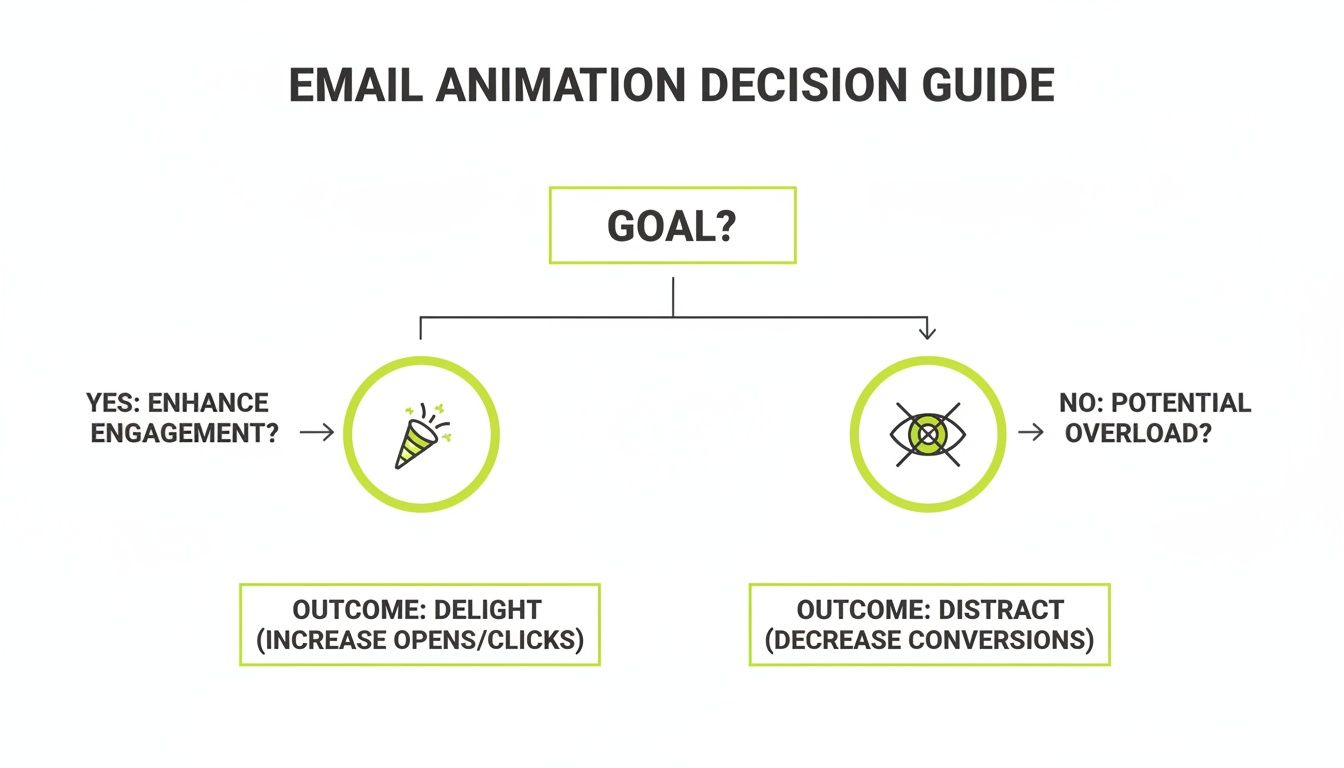
As the chart shows, the goal is always to enhance the experience. If your animation doesn't have a clear purpose, it's just noise.
The Lightweight Powerhouse: CSS Animations
For interactive effects that are feather-light, nothing beats CSS animations. These aren't image files at all; they're snippets of code that tell the email client how to move or change elements already in your HTML. Because it’s just code, the file size is minuscule, and the animations are always perfectly sharp on any screen.
I've found them incredibly effective for small, purposeful movements:
- Button Hover Effects: Making a CTA button pulse or change color when a user hovers over it. It’s a simple, powerful nudge.
- Animated Dividers: Using a subtle, moving line to break up content sections.
- Fade-in Text: Letting a key headline or offer fade into view to grab immediate attention.
The real magic of CSS animations is their interactivity. They respond to what the user is doing—like hovering or clicking—which makes the email feel more responsive and alive, far less intrusive than a GIF looping endlessly.
Of course, the compatibility question comes up again. Most modern webmail clients handle CSS animations beautifully, but many desktop clients, especially Outlook, will ignore them entirely. You absolutely must design your elements to look complete and on-brand even if the animation never fires.
The Cutting-Edge: Lottie and AMP
When you need to pull out all the stops, you’re talking about Lottie and AMP for Email. Lottie animations are JSON-based vector files, which is a fancy way of saying you can create incredibly complex, scalable, and interactive animations that have shockingly small file sizes.
Think of dynamic charts that build as the user scrolls, or detailed character animations that tell a brand story. That’s the kind of experience Lottie delivers. The big hurdle is that they require the AMP for Email framework to work, and right now, that's only supported by Gmail, Yahoo Mail, and Mail.ru. For everyone else, you’ll need a static fallback image, making this a highly specialized tool for campaigns where you can segment your audience by email client.
Email Animation Format Comparison
Choosing the right format can feel overwhelming, so I've put together a table to quickly compare the pros and cons of each option. This should help you match the tech to your specific campaign goal.
| Format | Best For | File Size | Email Client Support | Pros | Cons |
|---|---|---|---|---|---|
| GIF | Simple, looping animations; product showcases; banners. | Medium to Large | Excellent | Universal support; easy to create. | Limited to 256 colors; no true transparency; large file sizes. |
| APNG | High-quality visuals with gradients and transparency. | Medium to Large | Limited (Apple Mail, etc.) | 16M+ colors; full alpha transparency. | Not supported in Gmail/Outlook; falls back to a static image. |
| CSS | Interactive hover effects; subtle UI animations; text effects. | Tiny | Good (most webmail) | Extremely lightweight; interactive; crisp on all screens. | No support in many desktop clients (Outlook); requires coding. |
| Lottie/AMP | Complex, interactive vector animations; data visualizations. | Small | Very Limited (AMP only) | Tiny file sizes for complex animations; scalable; interactive. | Requires AMP for Email; very limited client support; needs a fallback. |
Ultimately, there's no single "best" format. The most successful email animations are born from a clear understanding of the campaign's goal, the audience's inboxes, and the limitations of the technology itself.
When Animations Boost Clicks and Conversions
Let's be clear: the real power of email animation isn't just making things move. It's about making people act. When you use it with precision, a simple animation can turn a static message into a dynamic experience that guides your subscriber's eye and practically begs for a click. The secret is tying that motion directly to a strategic goal.
Beyond just looking good, animations can be a serious tool in your email campaigns to significantly improve email open rates and drive conversions. Think of them as signposts. A subtle pulse on a “Shop Now” button or a quick GIF showing off a key product feature can communicate value much faster than a dense block of text ever could.
Highlighting Key Information and Offers
One of the best ways to use animation is to grab immediate attention and pull it toward the most important part of your email. In a crowded inbox, people scan—they don't read. A well-placed animation can stop that scan dead in its tracks and focus their gaze exactly where you want it.
Picture a Black Friday email. Instead of just listing your discount, what if an animation mimicked a scratch-off card that partially reveals the deal? This creates a sense of curiosity and mystery, compelling users to click through to see the full offer. You've just turned a passive announcement into a tiny, engaging experience.
In that same vein, a furniture brand could use a funny GIF of a dog gleefully jumping on a new couch to announce a free shipping offer. The motion is unexpected and delightful, making sure the real value proposition is both seen and remembered. It’s not just about what you offer; it’s about how you present it.
Demonstrating Product Value Instantly
This is where animations truly shine—by showing, not just telling. Describing a reversible jacket in a paragraph is one thing, but a two-second GIF that shows it being flipped from one side to the other? That communicates the benefit instantly. This is how email animations become a powerful sales tool, answering customer questions before they even have a chance to ask them.
Think about these real-world scenarios where motion brings instant clarity:
- Software Features: A short animation can walk a user through a new feature in your app. For example, Stripo uses a GIF to show how its Smart Elements feature simplifies email creation, offering a mini-tutorial right there in the inbox.
- Product Variations: A brand like Adidas can use a looping GIF to cycle through all the available colorways of a new sneaker. This saves a ton of space and shows the customer the full range at a single glance.
- How-To Guides: A winery could use animated text to introduce a new vintage, making the product's story feel much more alive and premium than a static description.
This kind of visual demonstration is where you can see some dramatic lifts in performance. The numbers speak for themselves. One MarketingSherpa report noted a 42% increase in click-through rates, a 103% lift in conversion rates, and a 109% jump in revenue from strategic GIF use. Other research shows that short, 2-5 second loops can boost click-throughs by up to 22%, and animated video thumbnails consistently beat static play buttons.
The takeaway is clear: when an animation’s purpose is to add clarity, demonstrate value, or create intrigue around your call-to-action, it directly contributes to a higher conversion rate. If you're new to this metric, our guide explains in detail what a conversion rate is and how to measure it.
The secret isn’t just adding motion; it’s adding meaningful motion. A 3-second GIF of a new software feature in action is useful. A flashing, generic "SALE" banner is just noise. To make sure your animations are actually driving growth, always A/B test them against a static version. Let your audience tell you what really works.
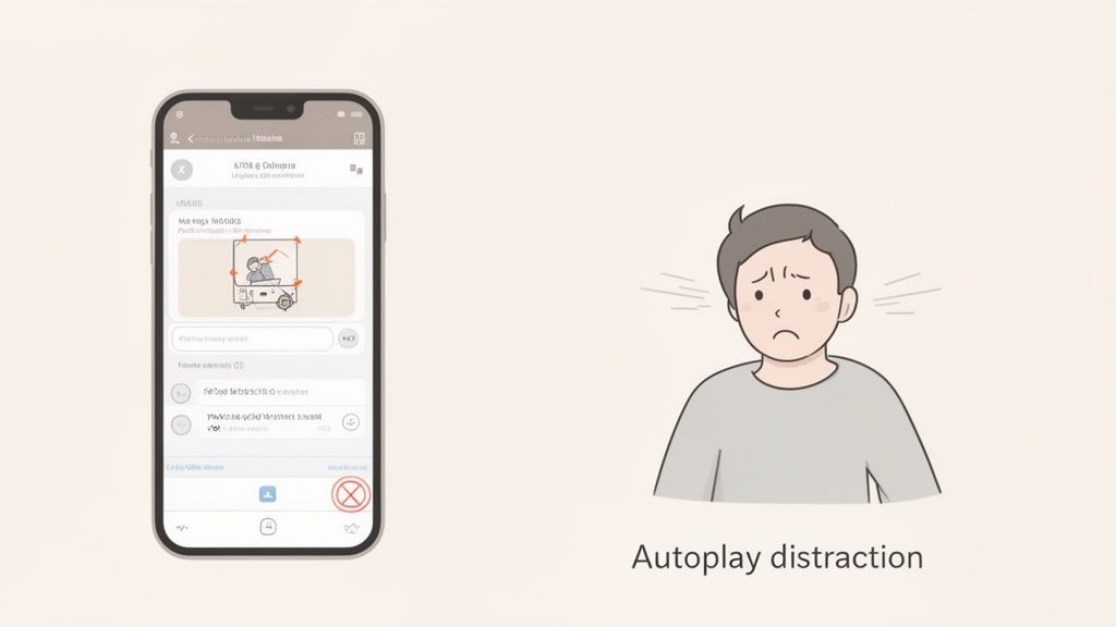
The Hidden Risks of Using Animations in Emails
Let’s be honest. While a perfectly timed animation can bring a little magic to your email, a clumsy one can do some serious damage. For every subscriber you delight with a bit of motion, you might just be pushing another one to hit the delete button. This is the fine line we all walk when thinking about adding animation to our campaigns.
The biggest issue is that most people are just trying to power through their inboxes. An autoplaying animation can feel like an unwelcome billboard, demanding attention they aren't ready to give. It’s an interruption, plain and simple.
This isn’t just a gut feeling; you can see the annoyance show up in the data. Research has consistently shown that animated emails can trigger a surprisingly negative reaction compared to their static counterparts.
The Data Behind the Distraction
It’s easy to think more visual flair is always a win, but the numbers tell a more cautious story. One detailed user sentiment study really broke it down, and the findings were eye-opening.
When animation was added, user responses got a lot more negative. Emails with animation received 1.7 negative words on average, compared to just 1.2 negative words for the static versions.
What’s even more telling is how the positive feedback dropped off. Animated emails only pulled in 1.3 positive words, while static emails got 1.6. That’s a 40% jump in negative sentiment and a 30% drop in positive sentiment just from adding motion.
When the researchers tallied the overall feeling, static emails had a net positive score. The animated ones? They plummeted into negative territory—a staggering 165% decline. You can dig into all the details in this animation sentiment study yourself.
This data forces us to ask a tough question: Is the potential upside of an animation worth the very real risk of turning off a big chunk of your audience?
Sacrificing Clarity for Flashiness
Beyond just annoying people, one of the biggest risks with animation is losing clarity. A clean, professional static image delivers its message instantly. An animation, on the other hand, needs time to unfold. If your subscriber only gives it a quick glance, they could miss the entire point.
This is a huge problem if the animation's first frame isn’t self-explanatory. We've all seen them. Worse yet, many email clients—especially older versions of Microsoft Outlook—will only show the very first frame of a GIF. If that frame is blank or doesn't have your core message, your email is a complete dud for that subscriber.
Think about these common traps:
- Hiding the CTA: If your animation loops too fast or is visually chaotic, it can easily pull focus away from the button you actually want people to click.
- Increasing Cognitive Load: Instead of making a message simpler, a bad animation makes it harder to understand. You’re forcing the user to work just to figure out what you’re trying to say.
- Looking Unprofessional: A grainy, choppy, or low-quality GIF can make even a premium brand feel cheap. The technical limits of some formats can completely undermine the brand identity you’ve worked so hard to build.
The goal of an email is clear communication. If motion gets in the way of that, it’s a liability, not an asset. Always prioritize the message over the medium.
In the end, trust is your brand's most valuable currency. A clean, direct, and professional static image almost always protects that trust. A distracting animation puts it on the line. Before you add any motion, ask yourself if it genuinely makes the message better or if it’s just adding noise. More often than not, simplicity wins.
Data-Driven A/B Testing for Email Animations
After all the talk about the power of animation in email, it's time for a reality check. The flashy promise of higher engagement doesn't always materialize. In fact, the only way to know for sure if an animation will resonate with your audience is to test it. The data might just surprise you.
Relying on industry hype alone is a risky move. Sure, some case studies will show you massive wins, but others tell a completely different story—one where animations do nothing at all or, even worse, actively harm performance. This is why a rigorous, data-driven A/B testing process isn't just a best practice; it's essential for protecting your ROI.
When Static Images Win the Race
It might sound counterintuitive, but sometimes the best animation is no animation at all. The common assumption that motion inherently grabs more positive attention is often proven false by real-world testing. This isn't just a theory; it’s backed by objective data from large-scale experiments.
One fascinating analysis revealed that animated GIFs frequently failed to deliver any measurable boost. In a test sent to over half a million recipients, the static image version actually performed slightly better. The email with the GIF saw a 4.40% click-to-send ratio, while the version without the GIF achieved a 4.51% ratio. You can explore the full results of this GIF A/B test to see exactly how the numbers played out.
An outcome like that forces every marketer to question their assumptions. Why would a static image ever outperform a dynamic one? The answer usually comes down to context, audience, and execution.
Structuring an Effective A/B Test
To get clear, actionable insights, you have to structure your tests correctly. Just dropping a GIF into an email and hoping for the best won't give you reliable data. A proper test isolates the animation as the only variable.
Here’s how you set it up properly:
Create Two Identical Versions: Your control (Version A) and your test (Version B) emails must be exactly the same. We're talking subject line, copy, layout, and call-to-action. The only difference should be the static image in Version A versus the animated one in Version B.
Define Your Success Metric: What are you actually trying to achieve? Is it a higher click-through rate (CTR)? More conversions on your landing page? Better engagement time? Pin down your primary KPI before you even think about hitting send.
Ensure Statistical Significance: Split your audience randomly and make sure each group is large enough to produce statistically significant results. A test on 100 people is just an anecdote; a test on 100,000 provides real, actionable direction.
Once your test wraps up, don’t just glance at which version "won." You need to dig deeper into the results to understand the why behind the numbers. A well-structured A/B test provides crucial insights that can inform your entire strategy, much like a good marketing automation platform comparison helps you choose the right tools for the job.
The goal of A/B testing isn't just to find a winner. It's to understand your audience's behavior. A "failed" test that shows an animation underperformed is incredibly valuable—it just saved you from hurting your metrics on a full campaign send.
Interpreting the Results Beyond the Clicks
So, what happens if your A/B test comes back flat? No real difference in CTR between the static and animated versions. What does that tell you? It could mean a few things.
The Animation Was Too Subtle: If the motion was barely noticeable, it probably wasn't impactful enough to change user behavior one way or the other.
The Subject Matter Was Serious: An animation in an email about a sensitive topic or a complex B2B service can feel out of place, even unprofessional.
Your Audience Is All Business: Some subscriber lists simply want a straightforward, no-frills approach. They're in their inbox for information, not entertainment.
Ultimately, testing is about replacing your assumptions with hard evidence. The data from your own audience is the only truth that matters. Instead of blindly following trends, let your subscribers tell you what they actually want to see in their inboxes.
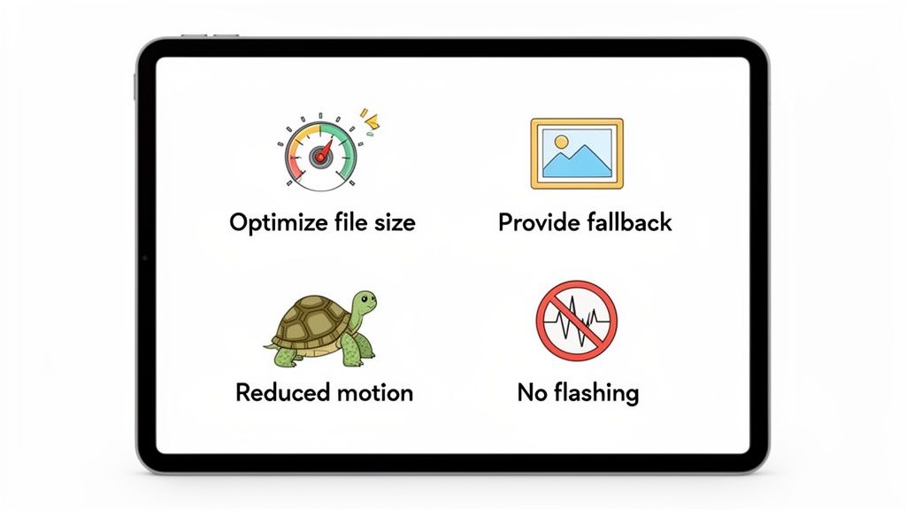
Best Practices for Implementation and Accessibility
Making something move in an email is the easy part. The real challenge is making sure that animation works for everyone, everywhere, without crippling the email itself.
Getting these details right is what separates a delightful experience from a frustrating one. It all comes down to being strategic and responsible, with a laser focus on clear communication above all else.
First things first: you have to be relentless about file size. A huge animation will kill your email's load time, which can tank your engagement and even cause deliverability issues.
As a hard rule, your animation files should never exceed 1MB. Honestly, you should be aiming for a target well below 500KB. This ensures a fast, smooth experience, even for subscribers on spotty mobile connections.
This same discipline applies to your fallbacks. A huge chunk of email clients still won't play your beautiful animation—I'm looking at you, Microsoft Outlook. Most of these clients will simply display the very first frame of a GIF.
That first frame is your safety net. It must work as a complete, compelling static image that gets the entire message across. If your main call-to-action only shows up on frame three, a significant portion of your audience will never see it.
Designing for Accessibility
Beyond just the technical side, successful email animation hinges on accessibility. Your work needs to be inclusive and safe for every single user, including those with disabilities. This isn't just about being a good person; it's a core part of responsible marketing that builds genuine trust.
Here are the absolute non-negotiables:
- Avoid Rapid Flashing: Never, ever create an animation that flashes or strobes more than three times per second. This is a serious health risk, as it can trigger photosensitive seizures. Stick to slower, smoother transitions.
- Respect User Preferences: When using CSS animations, always include the
@media (prefers-reduced-motion: reduce)media query. This simple piece of code checks if a user has enabled reduced motion settings on their device and lets you disable or simplify the animation for them. - Provide Clear Alt Text: Just like any other image, your animation needs descriptive alt text. This is crucial for users on screen readers or those who have images turned off. We dive deeper into this in our guide on how to write great alt tags for SEO.
Remember, the animation should only ever be a supporting player. The core message of your email must be fully understandable from the text alone. If someone can't see the animation, they shouldn't miss the point.
When you bake these practices into your workflow, you can use animation to truly delight your audience without worrying about performance or accessibility nightmares. It's about striking that perfect balance between creative flair and a user-first mindset—the hallmark of any great email campaign.
FAQ
Whenever we talk about adding animation to emails, the same handful of questions always pop up. It’s no surprise, really. Diving into motion means thinking about file size, which email clients will play nice, and how to do it all without alienating part of your audience.
Getting these right is the difference between a campaign that delights and one that flops. So, let's get you some straight answers.
What Is the Ideal File Size for an Animated GIF in an Email?
Let's be blunt: keep your animated GIF well under 1MB. If you can get it below 500KB, even better. This isn't just a suggestion; it's a hard-and-fast rule for a reason.
Massive files are the fastest way to a bad user experience. They make your email load at a crawl, which leads to frustrated subscribers and a one-way ticket to the trash folder. Worse, an overly large email might get "clipped" by clients like Gmail, hiding your amazing content and call-to-action completely.
Always, always compress your GIFs. Use an online tool. You can also slash the file size by keeping the animation loop short, reducing the frame count, and sticking to a limited color palette.
Will Animations Work in All Email Clients Like Outlook and Gmail?
No, and this is probably the most critical thing to burn into your memory. Support for email animations is all over the map.
- Animated GIFs have the best track record. They’ll work flawlessly in most webmail clients like Gmail and Yahoo, and on mobile devices using Apple Mail or Android. They are your safest bet.
- Microsoft Outlook (versions 2007-2019) is the big one you need to worry about. These desktop clients are notorious for only showing the very first frame of a GIF. That’s it. No motion.
This makes it absolutely essential that the first frame of your GIF works as a standalone static image. It has to convey the core message on its own, because for a chunk of your audience, that's all they will ever see.
If you're thinking about more advanced formats like CSS animations or APNGs, just know that support is even spottier. You have to design with a fallback in mind so that everyone gets a usable, beautiful email, animation or not.
How Can I Make My Email Animations Accessible?
Accessibility isn't optional. First, you must avoid any rapid flashing or strobing effects in your animation. Anything that flashes more than three times per second can be a serious health risk for people with photosensitive epilepsy.
If you're using CSS for your animation, there's a fantastic tool at your disposal: the @media (prefers-reduced-motion: reduce) media query. This code respects a user's operating system settings, turning off the motion for anyone who has specifically requested it. It’s a simple way to show you care.
And finally, a golden rule: never, ever use animation as the only way to communicate essential information. Your main message and call-to-action must be perfectly clear from the static text and images alone. The animation is just the cherry on top.
At Magic Logix, we believe in creating digital experiences that are both engaging and effective. If you're ready to build data-driven marketing campaigns that captivate your audience and deliver measurable results, explore our solutions.