An accessible email is one that people can read, navigate and act on with a screen reader, a keyboard, a magnifier or a small phone screen. In the U.S. no rule is written specifically for email, but WCAG 2.1 and 2.2 Level AA are the benchmark that courts, the Department of Justice and federal standards point to. The practical guideline set is short: real text instead of images of text, 4.5:1 contrast, descriptive links, a logical heading and reading order, useful alt text, large tap targets, and a test in real inboxes before every send.
This guide gives you the standards in plain terms, the build rules that matter, a pre-send test routine and a way to measure whether your program is improving.
TL;DR
- No U.S. law is email-specific, but ADA obligations reach digital communications, and WCAG 2.1/2.2 AA is the working standard.
- Build with real text, 4.5:1 contrast, descriptive links, proper headings and alt text on meaningful images.
- Use a single-column, responsive layout with large buttons so the email works on phones, at zoom and with a keyboard.
- Test every send with a screen reader, images off, keyboard-only, contrast checks and 200% zoom.
- Fix the template once and every future campaign inherits the improvement.
Table of Contents
- What email accessibility means and why it matters
- Which standards and rules apply in the U.S.
- Write and structure the content for easy reading
- Images, color, motion and tables
- Mobile, plain-text and attachment considerations
- A pre-send test routine
- How to measure progress
- Our perspective: fix the system, not the send
- Build accessible email into your marketing system
- FAQ
- Sources
What email accessibility means and why it matters
Email accessibility means designing your message so people of all abilities can perceive, operate and understand it. It covers people who use screen readers, people with low vision or color blindness, people who navigate by keyboard or voice, and people with cognitive differences who need clear structure.
The benefit is wider than that. The A11Y Collective cites the Email for All study as finding that clear layout, proper contrast and structured content make emails easier for every subscriber, including people on mobile, in bright sunlight or while multitasking. Tulane University’s communications guide frames email accessibility around WCAG’s four POUR principles, which also work as a handy checklist:
| Principle | What it means in an email |
|---|---|
| Perceivable | Alt text, sufficient contrast, no image-only messages |
| Operable | Clear, easy-to-activate buttons and links |
| Understandable | Plain language, logical organization, descriptive link text |
| Robust | Semantic headings, compatibility with screen readers |
For a marketing team, this is also a revenue issue. An offer that sits inside a flattened image is invisible to a screen reader and to anyone whose client blocks images by default.
Which standards and rules apply in the U.S.
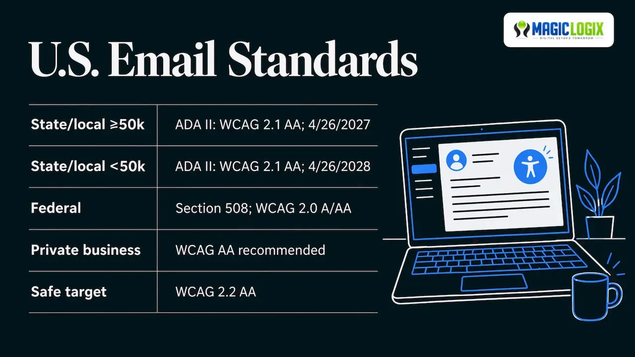
There is no email-specific accessibility law in the United States. The A11Y Collective notes that ADA obligations are not email-specific but extend to digital communications, including marketing email, and that WCAG applies to web content, emails included. Here is how the pieces fit.
WCAG 2.2. The W3C published WCAG 2.2 as a Recommendation. It extends 2.1 and adds criteria such as Target Size (Minimum) and Accessible Authentication. Content that meets 2.2 also meets 2.0 and 2.1, so building to 2.2 AA is the safe target.
ADA Title II (state and local governments). The DOJ’s final rule, effective June 24, 2024, adopts WCAG 2.1 Level AA for state and local government web content and mobile apps. Email Developer reports that a later interim final rule moved the deadlines to April 26, 2027 for entities serving 50,000 or more people, and April 26, 2028 for smaller entities. If you send email for a public entity, confirm the current schedule with the DOJ.
Section 508 (federal agencies and contractors). The Revised 508 Standards incorporate WCAG 2.0 Level A and AA and apply to electronic documents in any format, which includes email and its attachments.
Private businesses. The same source reports that 2025 brought roughly 3,948 to 8,667 web accessibility filings depending on methodology, about 70% aimed at e-commerce. The range comes from differing counting methods, so treat it as a sign of direction, not an exact number. If you send transactional or promotional email at scale, building to WCAG AA is the sensible standard. For legal questions about your specific exposure, talk to your attorney.
Write and structure the content for easy reading
Structure does most of the accessibility work, and it costs nothing in design terms.
Lead with the purpose
Section508.gov advises that the subject line and body state the message’s purpose clearly and concisely in plain language. UW–Madison adds that you should lead with the main idea and avoid acronyms and jargon. Put the one action you want in the first few lines.
Use real headings and lists
Use built-in heading levels in order and use list tools rather than typed dashes. Section508.gov’s email checklist asks for hierarchical headings starting at Heading 1, built-in lists and simple data tables with header rows. In HTML email, UW–Madison suggests correctly nested h1 to h6 headings with the masthead as h1. A screen reader user can jump from heading to heading, so a bold paragraph that only looks like a heading does not help them.
Write descriptive links
“Click here” and “read more” say nothing when a screen reader reads out a list of links. The Section508.gov guidance calls for specific, descriptive link text. Compare:
- Weak: “Click here to register.”
- Better: “Register for the March 12 inventory webinar.”
Make each link unique. Two links that say “Learn more” and go to different pages are confusing in a links list.
Choose readable type and layout
The university and federal guides agree on the basics, with small differences in size:
| Element | Recommendation | Source |
|---|---|---|
| Font style | Legible sans-serif such as Arial, Calibri, Helvetica or Tahoma | Harvard |
| Font size | At least 16px in em or rem units | UW–Madison |
| Alignment | Left-aligned text, short paragraphs | Harvard |
| Columns | One or two column layouts | Harvard |
| Layout tables | Avoid, or add role=“presentation” | Harvard |
Section508.gov’s guidance for government email is 10 to 11 point (13 to 15 pixel) type. Marketing email read on phones is better served by the larger 16px figure, and 16px sits comfortably above the federal minimum.
Images, color, motion and tables
Alt text
Give every meaningful image alt text that says what it shows and why it matters in context. Section508.gov suggests keeping it under 250 characters, ending it with a period so screen readers pause, and marking decorative images as decorative. The University of Chicago advises roughly 125 characters, since some screen readers truncate longer text. Aim for the shorter length and put the key information first.
Never put the whole message in an image. The University of Chicago specifically advises against images of text or flyers as the email body. If a promotion needs a designed graphic, repeat the offer, dates and terms as live text.
Contrast and color
Section508.gov recommends a 4.5:1 or greater contrast ratio and never using color as the only way to convey meaning. A red price with no label, or a link distinguished only by color, fails that second rule. Add an underline, an icon with text, or a label.
Contrast is easy to get wrong with brand colors, especially light gray body text and pale buttons. Check each text and background pair, and check them again in dark mode, where clients may invert colors.
Motion and multimedia
The University of Chicago advises avoiding anything that flashes more than three times per second, autoplaying motion or audio, and providing pause or stop controls. If you use animated GIFs, keep them calm and make sure the key message does not depend on a later frame. Our guide to animations for emails covers how to use motion without losing the message.
Tables
Use tables for data only, with marked header rows. The University of Chicago recommends semantically marked headers and avoiding fixed-width, merged or nested tables. Where you must use layout tables for rendering across email clients, mark them role=“presentation” and keep the reading order sensible.
Mobile, plain-text and attachment considerations
Mobile and zoom
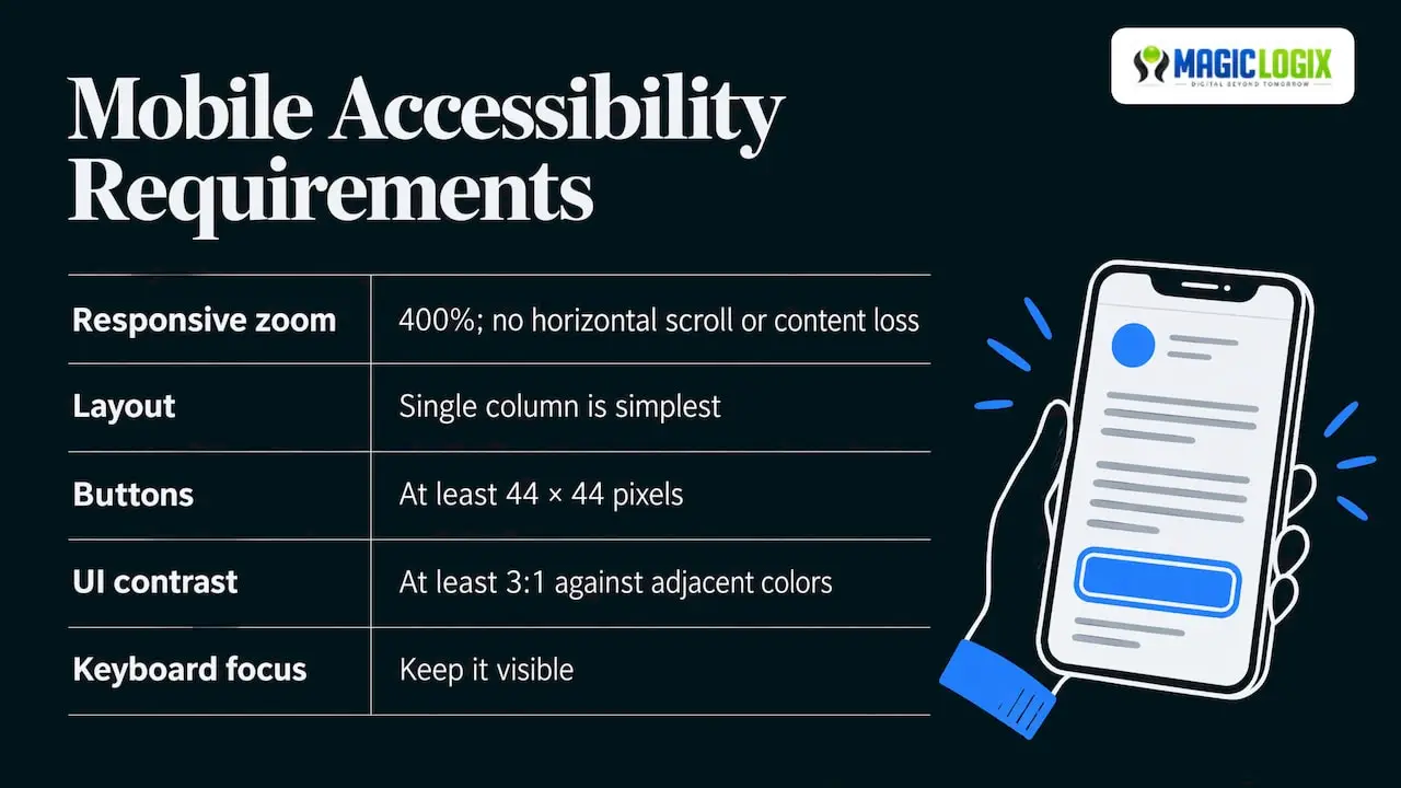
Most accessibility needs overlap with mobile needs. The University of Chicago asks that emails be responsive, require no horizontal scrolling and zoom to 400% without losing content. A single-column layout is the simplest way to get there.
Buttons and links need room for a thumb or a switch device. UC San Diego’s campaign checklist asks for buttons at least 44 by 44 pixels, UI components with at least 3:1 contrast against adjacent colors, and visible keyboard focus. WCAG 2.2 also adds a minimum target size criterion at AA.
HTML and plain text
Section508.gov’s checklist allows plain-text or HTML format and calls for no custom stationery or background images. In a marketing program, that points to a practical approach: send a clean HTML version and a plain-text alternative that carries the same offer, deadlines and links. Read the plain-text version before you send, because the same facts must appear in both.
Attachments
A PDF attached to an email is its own accessibility problem. Section508.gov says public-facing or official attachments must conform to electronic document standards, use unique descriptive file names, and be made accessible in the file, through a linked alternate version such as HTML, or by OCR with added structure. For marketing, the easiest route is usually a web page instead of an attachment.
A pre-send test routine
Automated checkers find missing alt text but cannot tell whether the alt text makes sense. The A11Y Collective notes that automated tools are only a starting point. SendLayer recommends five pre-send tests, each catching a different kind of problem:
- Screen reader. Listen to the email with NVDA on Windows or VoiceOver on Mac and iOS. Check the reading order, link names and image descriptions.
- Images off. Confirm the message and the call to action still make sense.
- Keyboard only. Tab through every link and button. Focus must be visible and the order logical.
- Contrast. Check text and buttons, including in dark mode. A color contrast ratio workflow with instant checks helps you catch near misses such as 4.4:1 before they ship.
- Zoom to 200%. Text should reflow with nothing clipped.
Then send a test and open it in Gmail, Outlook and Apple Mail. UC San Diego asks for testing with NVDA, JAWS or VoiceOver across those clients on desktop, tablet and mobile. The University of Chicago warns that Outlook’s Immersive Reader does not behave like a real screen reader, so do not rely on it as your test.
For free spot checks, MailTester’s checklist mentions WAVE Email and the Axe browser extension, alongside testing in real clients.
A one-page pre-send checklist
- Subject line and first lines state the purpose.
- Headings are in order and lists use real list markup.
- Every link is unique and descriptive.
- Meaningful images have alt text; decorative ones are marked.
- No offer, date or price exists only inside an image.
- Text contrast is 4.5:1 or better; color is never the only signal.
- Buttons are at least 44 by 44 pixels.
- Nothing flashes or autoplays.
- Plain-text version reviewed.
- Five tests run and a test send opened in three clients.
How to measure progress
Treat accessibility as a program with measurable checkpoints, not a one-time fix.
- Template audit: the share of your templates that pass the checklist above. This is the number that matters most, because fixing a template fixes every campaign built from it.
- Defect rate per send: how many issues your pre-send test finds. It should trend toward zero as the template improves.
- Engagement by segment: compare click rates before and after template changes, remembering that other variables move too, so read the result as a signal rather than proof.
- Feedback: invite replies from subscribers who use assistive technology. SendLayer’s Rachel Adnyana notes that feedback from daily assistive technology users surfaces issues no checklist will.
Accessibility also supports inbox performance. Clear structure and clean code sit well with the practices in our guide to email deliverability and bulk sender rules. The same discipline applies to your website, where our WCAG 2.2 AA triage checklist is a quick starting point.
Our perspective: fix the system, not the send
We see email accessibility as a design and operations question more than a compliance one. Most defects come from the template: a hero image carrying the whole offer, low-contrast brand colors, a button built from an image. Repair those once and every campaign inherits the fix.
That is why we start with the template and the workflow that feeds it. Our digital experiences work covers UI/UX design and development, and our marketing automation work covers how campaigns are built and sent. Putting accessibility checks into those two places, instead of into a last-minute review, keeps the process light for busy teams.
We also think accessibility guidance should be held to the same standard as any other marketing advice: tied to official sources, clear about what is established and what is judgment. WCAG and the federal guidance are stable. How a given inbox client renders your code is not, which is why testing in real clients stays on the checklist.
Hassan Bawab
Build accessible email into your marketing system
If your templates need an accessibility pass, or your team wants accessible design built into campaign production, Magic Logix can help. Our UI/UX design services shape layouts, color systems and components that work for every reader, and our marketing automation services cover how campaigns are built and sent. If you want to talk through your current email program, get in touch with Magic Logix and we will walk through it with you. Digital Beyond Tomorrow starts with messages everyone can use.
FAQ
Are marketing emails required to be ADA compliant?
No U.S. rule is written specifically for email. The A11Y Collective notes that ADA obligations extend to digital communications, and WCAG AA is the standard most often used to measure them. Federal agencies and contractors follow Section 508, which uses WCAG 2.0 A and AA. For advice on your own situation, consult an attorney.
What is the most important accessibility rule for email?
Put your message in real text, not in images. This single habit keeps content available to screen readers, to people who block images and to anyone using a magnifier. Contrast, descriptive links and clear headings come next.
What contrast ratio should email text have?
Use at least 4.5:1 for standard text. MailTester’s checklist adds 3:1 for large text. Test in dark mode as well as light.
How do I make an email accessible on mobile?
Use a single-column responsive layout, type of 16px or larger, and buttons at least 44 by 44 pixels. Confirm there is no horizontal scrolling and that text reflows when zoomed. Then open a test send on a phone in your main email apps.
Sources
- Email Accessibility Best Practices | Tulane University
- Creating accessible emails: step-by-step guide | The A11Y Collective
- Web Content Accessibility Guidelines (WCAG) 2.2 | W3C
- ADA Title II web rule | ADA.gov
- Creating accessible HTML emails | Email Developer
- Applicability & Conformance Requirements | Section508.gov
- Accessible Email Messages | Section508.gov
- Checklist for Accessible Email Messages | Section508.gov
- Creating Accessible Emails | Harvard Digital Accessibility Services
- HTML email accessibility | UW–Madison
- Email Accessibility | University of Chicago Center for Digital Accessibility
- Email Campaign Accessibility Checklist | UC San Diego
- Email Accessibility for Transactional Emails | SendLayer
- WCAG 2.2 Email Checklist | MailTester
- Color Contrast Ratio Workflow and Instant Tests | Premium Web Tools