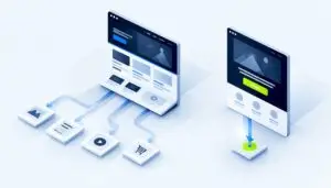
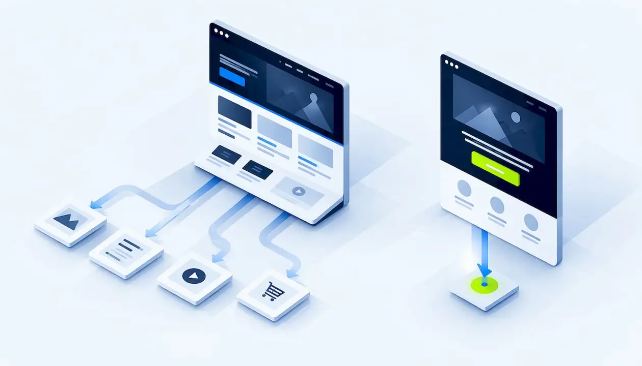
A homepage introduces your whole business and routes every kind of visitor to the right place. A landing page is built for one audience and one action, such as a form fill, a call booking or a purchase. If you are sending paid, email or social traffic to a specific offer, use a landing page. If you are welcoming organic, branded and direct visitors who are still deciding what they need, use the homepage. Most growing businesses need both, and each should do its own job.
At Magic Logix, we build websites and the marketing around them, so this question comes up whenever a campaign is planned. This guide gives you the differences, a decision framework, a way to measure each page, and a clear view of where microsites fit.
TL;DR
- A homepage is the front door of your site: broad, navigation-rich, and made for many visitor types. A landing page is a focused page for one campaign, offer or audience.
- Search Engine Land’s landing page guide describes a landing page as a standalone page built to persuade visitors to take one specific action, while the homepage is a welcome mat that helps people explore.
- Send campaign traffic to a landing page that matches the ad or email. Send brand and organic traffic to the homepage.
- A microsite is a small separate site, usually several pages, for a long campaign, event or audience. A landing page is a single conversion page.
- Judge a homepage by engagement and where it sends people next. Judge a landing page by conversion rate on its one action.
Table of Contents
- What a homepage does
- What a landing page does
- Landing page vs homepage: side-by-side comparison
- Why ad traffic belongs on a landing page
- When to use a landing page
- When your homepage is enough
- Do you need both?
- Landing page vs microsite
- How to build a landing page that converts
- How to measure each page
- Common mistakes
- Our perspective
- Plan your pages with Magic Logix
- FAQ
- Sources
What a homepage does
Your homepage is the page most people expect to find at your root domain, such as yourcompany.com. Its job is orientation. It tells a new visitor who you are, what you offer, and where to go next.
Because it serves everyone, it carries a lot:
- A full navigation menu and footer with links to services, pricing, about, careers, support and contact.
- Several calls to action, for example “Book a call,” “See services” and “Read the blog.”
- Messaging broad enough for customers, job candidates, press and partners.
Visitors reach it from many places: branded search, organic search, direct visits, referrals and social profiles. Some of these people know you well. Others have never heard of you. That mix is why the homepage cannot be tuned to one persona the way a campaign page can.
The homepage also anchors your site structure. It is typically the page other pages link back to, and it usually sits in your sitemap and your search listings as the main entry for your brand name.
What a landing page does
A landing page has a narrower job: get one type of visitor to do one thing. That might be requesting a quote, downloading a guide, registering for a webinar, starting a trial or buying a product.
The design follows from that goal:
- Navigation is usually removed or cut to a logo, so fewer links compete with the main action.
- One call to action, repeated at sensible points down the page.
- Headline and copy that echo the ad, email or post the visitor just clicked.
- Proof close to the action: testimonials, ratings, logos or security badges.
A useful way to think about it: the homepage is a lobby with signs pointing to many rooms. A landing page is the one room you walked into on purpose, with a single door marked “next.”
The term “landing page” can be confusing because any page a visitor first arrives on is technically a landing page, including your homepage. In marketing, though, it means a purpose-built page for a specific campaign or offer.
Landing page vs homepage: side-by-side comparison
| Factor | Homepage | Landing page |
|---|---|---|
| Main purpose | Introduce the brand and route visitors | Convert one audience on one offer |
| Audience | Everyone: customers, candidates, press, partners | One defined segment |
| Navigation | Full menu and footer | Minimal or none |
| Calls to action | Several, for different goals | One, repeated |
| Typical traffic | Organic, branded, direct, referral | Paid ads, email, social, partner links |
| Message | Broad brand story | Matched to the ad, email or post |
| Lifespan | Permanent | Often tied to a campaign or offer |
| Main metric | Engagement, next-page clicks, assisted conversions | Conversion rate on the one action |
| Search role | Brand anchor, often indexed | Sometimes indexed, sometimes kept out of search |
The lines do blur. A small business with one service can run a homepage that behaves much like a landing page, with one clear call to action and a trimmed menu. That is fine. The test is not the label but whether the page has a single job and is built to do it.
Why ad traffic belongs on a landing page
When someone clicks an ad promising a specific thing, they expect to see that thing. A homepage forces them to hunt for it through menus and competing offers. Every extra choice is a chance for them to leave.
This is also a paid-media cost issue. If you pay for each click, a page that loses visitors to distraction wastes budget. Matching the page to the ad’s promise keeps the message consistent from click to conversion. Search Engine Land’s guide says a dedicated page is warranted when a campaign aims to move a specific audience toward a specific action, because it gives you control over the journey through message alignment and design focus.
If you manage campaigns yourself, our guide to optimizing PPC campaigns for return on investment covers the campaign side, and our piece on two-stage ad creative testing shows how to test the ad that feeds the page.
When to use a landing page
Use a landing page when you can name the exact action you want and the exact audience you want it from. Common cases:
- Paid campaigns. Search ads, social ads and display ads each deserve a page matched to their promise.
- Email campaigns. A newsletter promoting a webinar should link to the webinar signup, not your homepage.
- Lead magnets. A checklist, template or report behind a short form.
- Product or service launches. One offer, one page, one measurable result.
- Events and webinars. A time-bound page with a registration form.
- Testing an idea. A single page is a fast, low-cost way to see whether an offer draws interest before you build more.
- Segmented audiences. Separate pages for separate industries, locations or problems, so each message feels written for that visitor.
Example: a local service business
Imagine a home services company running a search ad for “emergency water heater repair.” The landing page opens with that exact phrase, shows service hours, a phone number, a short quote form, a handful of reviews and the service area. There is no menu linking to the careers page or the blog. Compare that with the homepage, which has to explain every service the company offers.
Example: a booking page
A photographer promoting family sessions does not need visitors browsing every service. A focused page such as these Oahu family photography sessions shows how a business can put one type of session, its style and a path to booking in front of the right visitor.

Example: a B2B lead magnet
A software company offers a benchmark report. The landing page states what is inside, who it is for, a three-field form and one download button. Everything else on the page exists to support that single decision.
When your homepage is enough
You do not need a landing page for everything. Your homepage can do the job when:
- You are a new or small business that does one thing, so the homepage already has a single clear goal.
- Your traffic is mostly organic, branded or direct, and visitors are still exploring.
- You cannot yet pinpoint one action to ask for. In that case, make sure the homepage still offers a visible next step so interested visitors can act before their interest fades.
- An existing page, such as a pricing or service page, already converts well for the audience you want to reach.
Long, considered purchases are another case. If your product needs a lot of explanation and has a long sales cycle, a one-screen landing page may be too thin on its own. A deeper service page, a resource hub or a microsite can carry more of the education.
As a business grows and offers more, the homepage gains navigation and becomes the hub, while landing pages take over individual campaigns.
Do you need both?
For most businesses, yes. The homepage handles brand awareness, credibility and exploration. Landing pages handle focused conversion. Together they let you meet a first-time ad visitor and a returning customer with the right page each.
Think of it as a division of labor:
- Homepage: explain who you are, build trust, direct people to the right section.
- Landing pages: take a specific segment through a specific offer to a specific action.
- Service and product pages: go deeper for people who are comparing options.
If you are planning a new site, it is worth designing this structure from the start. Our website design and development work covers the site as a whole, and our guide to website conversion optimization explains how to improve pages once they are live.
Landing page vs microsite
A microsite is a small, separate website, often a few pages, built around one campaign, product, event or audience. It may sit on a subdomain or its own domain. A landing page is a single page, usually part of your main site, built to convert.
| Factor | Landing page | Microsite |
|---|---|---|
| Size | One page | Typically two to five or more pages |
| Goal | One conversion action | Explore, educate, tell a story, build awareness |
| Setup | Fast | Slower, more content to produce |
| Location | Usually on the main site | Often a subdomain or separate domain |
| Best for | Webinar, download, offer, one-off event | Long campaigns, new audiences, annual events, branded communities |
A simple rule: if you want one clear action, build a landing page. If you need to explain a campaign across several content types, a microsite may fit. Keep in mind that each extra page and link on a microsite is another exit before the visitor acts, so a microsite can look richer and still convert worse for a single-action goal.
Microsite campaign strategy
Before committing to a microsite, answer four questions:
- Will the campaign run long enough to justify separate content?
- Does the audience need a different tone or identity from your main brand?
- Do you have enough material for several pages, not just one?
- Who will maintain it after launch?
If you answer yes to most, a microsite is reasonable. If not, a well-built landing page, possibly with a short supporting section, is the leaner choice.
Microsite SEO
Where you put a microsite shapes its search performance. A subfolder on your main domain, such as yourcompany.com/campaign, generally shares your site’s authority. A subdomain is typically treated as a more distinct site, and a separate domain starts from scratch.
Two technical points matter whichever you choose:
- Duplicate content. If microsite pages repeat content from your main site, tell search engines which version you prefer. Google explains that a rel=“canonical” link annotation is a strong signal for which URL should become canonical, and redirects are stronger still.
- Connection to the main site. Link relevant microsite pages back to the main site so visitors and crawlers can move between them.
Campaign-specific landing pages are sometimes deliberately kept out of search results so they do not compete with your main pages. That is a choice to make per page. A page meant to attract organic searchers should be indexable and useful on its own. Our SEO team can help you decide which pages to index and how to structure them.
How to build a landing page that converts
Good landing pages share a handful of habits. Use this as a checklist before launch.
- Pick one goal. Write it in a sentence: “Get qualified visitors to book a 20-minute consultation.” If you cannot, you are not ready to build.
- Match the message. The headline should echo the ad or email. A visitor should never wonder whether they are on the right page.
- Lead with the benefit. Say what the visitor gets and why it matters, in plain words, above the fold, meaning before they scroll.
- Make the call to action obvious. Use contrasting color and action-oriented wording, and repeat it down the page.
- Add proof. Real testimonials, ratings, recognizable logos or security badges. Use only what you can document.
- Remove distractions. Cut the top menu and extra links that lead away from the goal.
- Keep the form short. Ask only for what you need to follow up.
- Check it on a phone. Much campaign traffic arrives on mobile.
- Track the action. Set up conversion tracking before spending on traffic.
- Support the CTA with a line of copy. A button label plus a short explanation of what happens next reduces hesitation.
The psychology behind many of these choices is covered in our article on psychology in design and conversions.
How to measure each page
The two pages answer to different numbers, so do not compare them with one yardstick.
| Page | Primary measures | Questions to ask |
|---|---|---|
| Homepage | Click-through to key pages, engagement, assisted conversions, brand search growth | Do visitors find the right next page quickly? |
| Landing page | Conversion rate on the one action, cost per conversion, form completion rate | Does the message match the traffic source? Where do visitors drop off? |
Set a baseline before you change anything, then test one element at a time, such as the headline, the offer or the form length. Record the period you measured, because seasonality and traffic mix affect results. Treat any benchmark you read online as a rough guide, and make your own past performance the standard you try to beat.
Common mistakes
- Sending every ad to the homepage. It is the most generic page you have.
- Too many calls to action on a landing page. One page, one ask.
- Message mismatch. The ad promises one thing, the page says another.
- Building a landing page for everything. Informational, search-driven content usually belongs in articles and guides, not on a stripped-down conversion page.
- Forgetting the follow-up. A form fill is only useful if someone responds quickly and the next step is clear.
- Neglecting search and AI visibility. If a landing page is meant to be found organically, it needs clear headings, direct answers and consistent information. Our AEO and GEO services focus on making content easier for answer engines and generative search to understand. No one can promise citations or rankings, and platform behavior keeps changing, so treat these as practices to test and refine.
Our perspective
In our work, the homepage-versus-landing-page question is rarely about which page is better. It is about whether each page has a job and whether the traffic reaching it matches that job.
We build the website and the marketing around it as one system. The homepage carries your brand and your structure. Landing pages carry campaigns. When paid media, SEO, content and design are planned together, each page can be built for the visitor who will actually land on it, and the message holds from the first click to the conversion.
That is how we approach Digital Beyond Tomorrow: use data to decide what to build, design to make it clear, and measurement to learn what to change next.
Hassan Bawab
Plan your pages with Magic Logix
If you are deciding how your homepage, campaign pages and microsites should work together, Magic Logix can help with the design, development and marketing behind them. Explore our website design and development services, or see how our digital marketing and paid media work connects ads to the pages they send people to. When you are ready to talk it through, start a consultation with our team.
FAQ
Is a landing page the same as a homepage?
No. A homepage introduces your whole business and guides many kinds of visitors. A landing page is built for one campaign, offer or audience and asks for one action. Any page can be the first page someone sees, but in marketing a landing page means a purpose-built conversion page.
Can my homepage be my landing page?
Sometimes. If your business does one thing and your homepage has one clear call to action, it can serve both roles. Once you run several campaigns or serve different audiences, separate landing pages let you match each message to its traffic.
Should a landing page have navigation?
Usually not. Removing the menu reduces the number of ways to leave before acting. Keep a logo and, if needed, legal links. If visitors need to research before they decide, a fuller page or a microsite may serve them better.
Is a microsite better than a landing page for SEO?
Not automatically. A microsite has more pages that can rank, but a subdomain or separate domain does not automatically inherit your main site’s authority. A subfolder on your main domain usually shares it. Use canonical tags where content overlaps and link the microsite to your main site.
How many landing pages do I need?
One for each distinct campaign, offer or audience you actively promote. Start with your highest-spend or highest-intent campaign, measure it, and add more as you learn what works.
Sources
- What Is a Landing Page? Build Pages That Convert, Search Engine Land
- How to specify a canonical URL with rel=“canonical” and other methods, Google Search Central