
Interactive content marketing means any content that asks for user input, such as a click, a choice, or an answer, and gives something personalized back. It consistently outperforms static content on engagement and, just as important, it hands you first-party and zero-party data you can actually use. This guide walks through formats, planning, production, distribution, measurement, and accessibility so you can run a pilot with confidence.
TL;DR:
- Quizzes and polls are quick to implement and highly effective for boosting engagement and gathering first-party data, especially in social and email campaigns.
- Calculators and configurators require medium to high production effort but significantly increase trust, personalization, and order values in e-commerce settings.
- Interactive content delivers 52.6% more engagement and 53% longer viewing time compared to static content, with data collection helping refine marketing personalization.
- Setting clear objectives and scope, choosing format based on audience and goal, and launching a lean version are key to successful interactive projects.
- Ensuring accessibility through keyboard navigation, screen reader labels, and fallback options is essential for reaching all visitors and maintaining compliance.
Table of Contents
- Types of Interactive Content and When to Use Each
- Why Interactive Content Works: The Evidence Behind the Engagement
- Building a Planning Framework That Keeps Projects on Track
- Choosing the Right Production Path for Your Team
- Getting Your Interactive Content in Front of the Right Audience
- Measuring What Actually Matters
- Making Interactive Experiences Work for Every Visitor
- How We Scope and Measure Interactive Campaigns
- Where Magic Logix Fits Into Your Interactive Content Plan
- Sources
- FAQ
Types of Interactive Content and When to Use Each
Picking a format starts with your goal, not the shiniest tool on the market. A quiz builds awareness and segments an audience at the same time. A calculator earns trust by making an abstract benefit concrete, like showing a prospect their estimated savings. Interactive video adds choose-your-path branching for product tours or training. Polls generate quick, low-commitment engagement on social or in email. Configurators help shoppers customize a product before they buy, which is common in furniture and apparel, as shown in detailed E-commerce Revenue Optimization case studies. Interactive email brings some of that same interactivity, such as carousels and embedded polls, directly into the inbox. Maps work well for local businesses or multi-location brands showing service areas or store inventory.
- Quizzes: low to medium production cost, strong for lead segmentation and top-of-funnel engagement.
- Calculators: medium cost, strong for mid-funnel trust building and comparison shopping.
- Interactive video: medium to high cost, strong for product education and storytelling.
- Polls: low cost, strong for quick engagement on social and in email.
- Configurators: high cost, strong for ecommerce personalization and higher order values.
- Interactive email: low to medium cost, strong for re-engaging subscribers without sending them elsewhere.
Resources like the customer engagement strategy template can help you connect format choice to a broader engagement plan before you commit budget.
Why Interactive Content Works: The Evidence Behind the Engagement
Interactive content works because it asks for a small commitment and rewards it immediately. That active choice holds attention longer than scrolling past a paragraph, and personalization makes the payoff feel relevant to the person making it, not a generic audience.
The numbers back this up. An engagement data analysis cited by the Content Marketing Institute found interactive content saw 52.6% more engagement and that buyers spent 53% more time with it (13 minutes versus 8.5 minutes) compared to static content. That extra time matters because it is time spent absorbing your message instead of someone else’s.
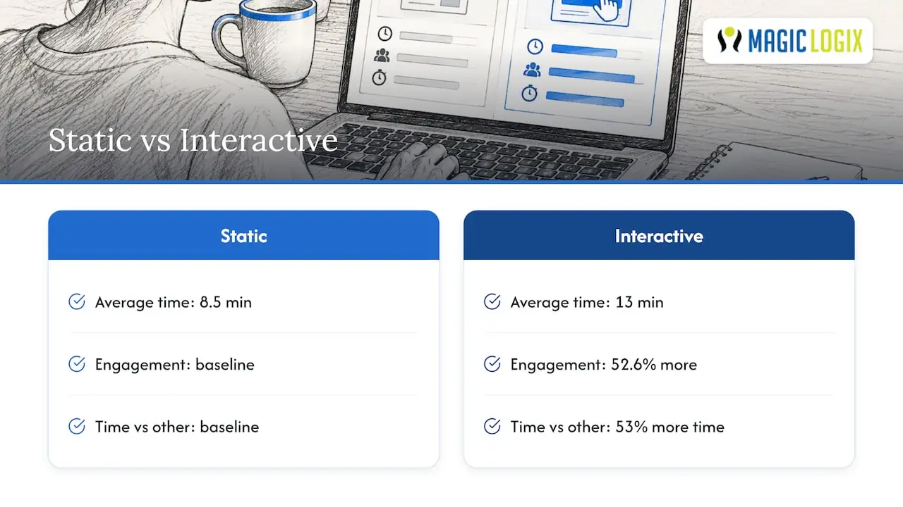
Interactive formats also solve a data problem many marketers face: third-party cookies are disappearing, but a quiz or calculator lets someone tell you directly what they want. That zero-party data, as MarTech describes it, fuels sharper recommendations and personalization than guesswork ever could.
Building a Planning Framework That Keeps Projects on Track
Before you touch a design tool, answer four questions in order. Skipping any one of them is the most common reason interactive projects stall or underperform.
- Set a measurable objective. Decide whether you are driving awareness, engagement, intent, conversion, or retention, since that choice shapes everything downstream.
- Define the value exchange. Be specific about what the user gets (a personalized result, a discount, a useful estimate) in return for their time or data.
- Match the format to the objective and audience. A B2B buyer researching software responds differently to a calculator than a retail shopper browsing on their phone.
- Scope a minimum viable version. Launch a lean version first, test it with a small audience, and instrument the analytics events you need before scaling spend.
Pro Tip: Write your success metric on paper before you brief a designer. It keeps the project from drifting into “looks cool” territory.
A simple format selection matrix, mapping objective to audience to format, keeps your team from defaulting to whatever was built last time. For a more detailed walkthrough of connecting engagement goals to measurable growth, the customer engagement strategy template is a useful companion.
Choosing the Right Production Path for Your Team
Your build path depends on how fast you need to launch and how much customization matters. Off-the-shelf quiz and poll builders get you live in days but limit how deeply you can brand or extend the experience. Interactive video platforms handle branching logic without custom code, which suits training or product tours. Embeddable calculators can often be dropped into an existing page with a short script, keeping the lift light for your web team.
- Off-the-shelf builders: fastest to launch, least flexible, good for a first pilot.
- Low-code platforms: balance speed and customization, suitable for calculators and configurators.
- AMP for Email: enables carousels and in-email forms, though it needs a fallback for clients that do not support it.
- Custom builds: full control and data portability, but the slowest and most expensive path.
Developers commonly shortcut custom builds with vetted GitHub templates and lightweight JavaScript widgets rather than coding a calculator or quiz engine from scratch, which keeps timelines realistic. Platforms worth comparing are covered in The 12 Best Customer Engagement Platforms for 2026.
Getting Your Interactive Content in Front of the Right Audience
An interactive asset buried on a single landing page rarely earns back its production cost. Contextual embedding, meaning placing a calculator right where someone is already comparing options on a product page, performs better than a standalone hub page that requires a separate visit.
- On-site placement: embed contextually on product or service pages, not just a dedicated microsite.
- Email distribution: use AMP elements where supported and build a static fallback image for clients that cannot render them, a tactic MarTech ties to higher opens and clicks when done with proper fallbacks.
- Social promotion: short polls and quiz teasers work well as native posts that link back to the full experience.
- Paid amplification: retarget people who started but did not finish an interactive module, since partial completion signals real interest.
Pairing interactive assets with existing long-form pieces, as discussed in mastering long-form content strategy, gives readers a reason to pause and interact rather than skim past.
Measuring What Actually Matters
Track engagement rate, completion rate, leads captured, average time on the module, and conversion lift against a control group. Those five numbers tell you whether the experience is working or just looking busy.
- Instrument core events: module_open, question_answered, completion, and CTA_clicked, mapped cleanly into your CRM.
- Watch drop-off points: a sharp decline after question two usually means that question is too long or too personal too soon.
- Run a holdout test: show the interactive version to half your audience and the static version to the other half, then compare conversion.
- Tie results back to objective: a quiz built for awareness should be judged on reach and shares, not just leads.
This event taxonomy also feeds personalization efforts described in website personalization examples, since the data your module collects can drive what a returning visitor sees next.
Making Interactive Experiences Work for Every Visitor
An interactive module that only works for a mouse and a fast connection shuts out part of your audience and increases legal exposure. Build with keyboard navigation in mind from the first wireframe, not as a fix after launch.
- Keyboard navigation: every question, button, and result screen should be reachable without a mouse.
- ARIA labeling: screen reader users need clear labels for each interactive element, not just visual cues.
- Captions and contrast: interactive video needs captions, and color choices need enough contrast to be readable.
- Non-interactive fallback: provide a static version of the content for browsers or assistive tools that cannot render the interactive version.
Pro Tip: Test your module with a screen reader before launch, not after a complaint.
Progressive enhancement, building the static fallback first and layering interactivity on top, protects reach without sacrificing the experience for most visitors.
How We Scope and Measure Interactive Campaigns
Most interactive projects fail for the same reason: the team picked a format before deciding what success looks like. Our approach starts with the objective and the measurement plan before any design work begins, then launches a minimum viable version to validate interest before committing to a full build.
That sequence, objective first, exchange second, format third, matters more than which quiz builder you choose. Services like web design, marketing automation, and analytics each play a role at a different stage: design shapes the experience, automation routes the data captured, and analytics proves whether the lift was real or imagined. A practical launch checklist covers goal definition, a lean pilot scope, event instrumentation, and a review point at two to four weeks before scaling spend.
— Hassan
Where Magic Logix Fits Into Your Interactive Content Plan
Running an interactive campaign well means getting the design, the data capture, and the follow-up automation working together, and that is where most in-house teams run short on time rather than ideas. Web design, digital marketing, and marketing automation working together help ensure the quiz or calculator you launch connects directly to the emails and retargeting that follow it.
A typical pilot starts small: one objective, one format, a working build, and a measurement plan you can review within a few weeks before deciding whether to scale. If you want help scoping a pilot interactive project for your own audience, start with our digital marketing services page to see how the pieces fit together.
Sources
For deeper reading, Content Marketing Institute tracks B2B adoption trends, MarTech covers interactive email tactics, and Salesforce explains zero-party data workflows for developers.
- Interactive Content: How Quizzes, Games, and Polls Make for Engaging Results — Content Marketing Institute
FAQ
What is interactive content marketing?
Interactive content marketing is content that requires the user to click, answer, or choose something and then returns a personalized result. It differs from static content by creating a two-way exchange rather than passive reading or viewing.
How much does interactive content improve engagement?
An engagement data analysis cited by the Content Marketing Institute found interactive content saw 52.6% more engagement and 53% longer time spent compared to static content. Results vary by format and audience, so testing your own baseline matters.
What types of interactive content generate the most leads?
Quizzes and calculators tend to generate the most leads because they offer a clear value exchange, such as a personalized result or estimate, in return for contact information. Interactive video and configurators also perform well for products that benefit from visual customization.
How do I measure the success of an interactive campaign?
Track engagement rate, completion rate, leads captured, time on module, and conversion lift against a control group using a holdout test. Instrumenting events like module_open, question_answered, and completion lets you see exactly where visitors drop off.
Is interactive content widely adopted among marketers?
Not yet. CMI research found only 27% of B2B marketers reported using interactive content, which leaves room for brands that adopt it early to stand out.