


You’ve built repeatable playbooks for Google, Meta, and LinkedIn. Those channels feel legible. You know how to structure tests, where to look when performance slips,
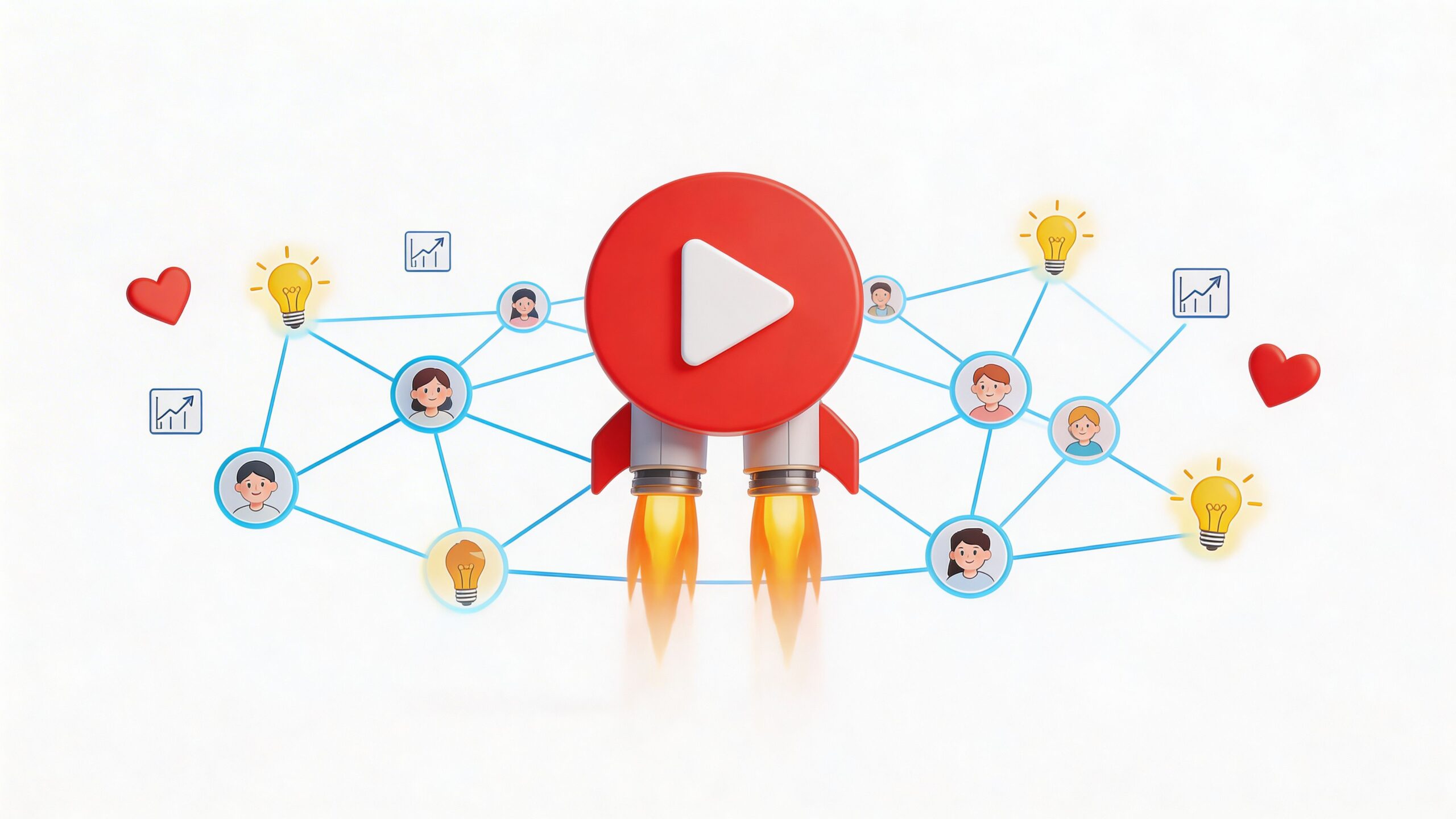
Most videos don’t fail because the idea was bad. They fail because the launch was weak. That’s the part many overlook when they ask what

You launch a paid search campaign, add budget, and expect the math to improve. Instead, the dashboard gets noisier. Click costs creep up. ROAS looks
A consistent pattern shows up in many of the best integrated marketing campaign examples. The campaigns people remember most did not win because they were
Your team launched a campaign for a strong healthcare product. The messaging was polished. The landing page looked credible. Sales expected demos. Then almost nothing
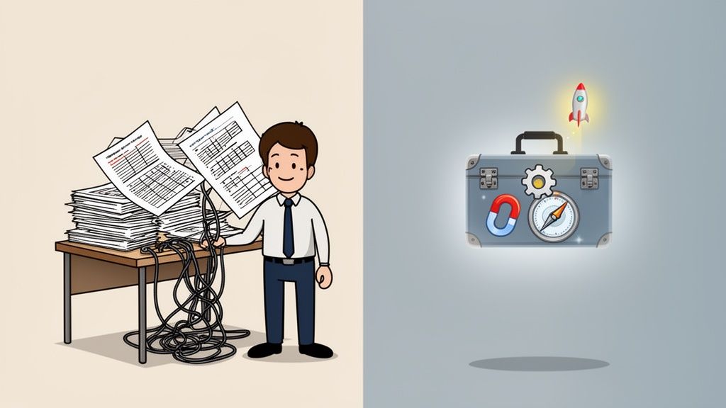
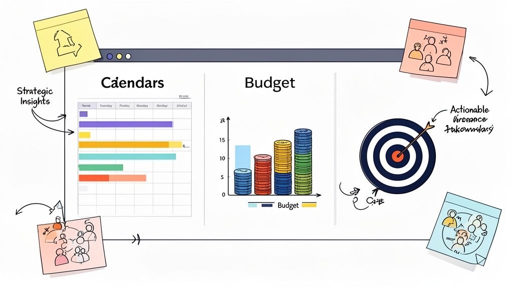
If your business still runs on a patchwork of spreadsheets, text threads, sticky notes, and memory, you are not behind because you lack ambition. You
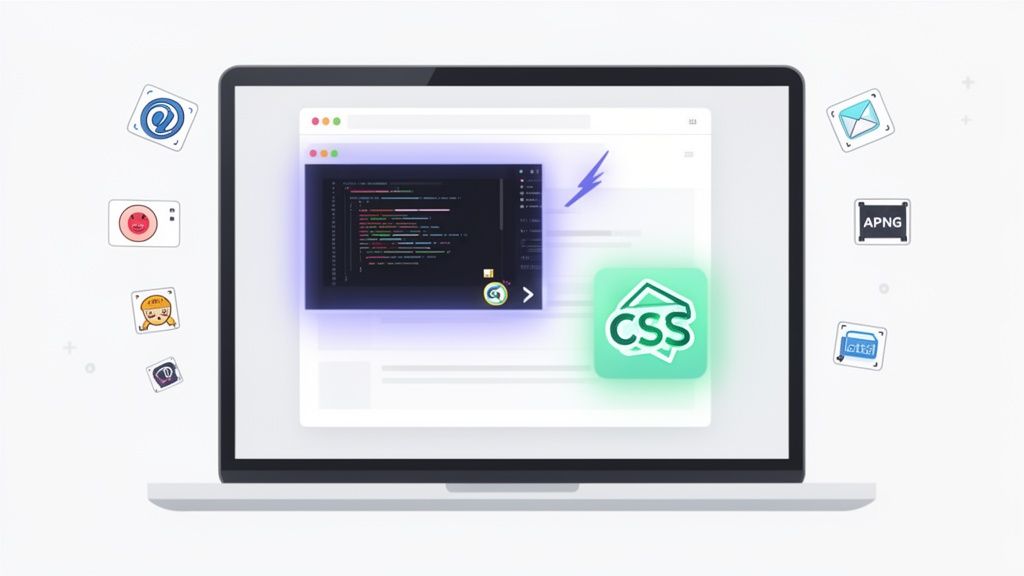
Animations in an email are a double-edged sword. On one hand, a well-placed GIF or a slick CSS effect can stop a subscriber mid-scroll and

In the sprawling Dallas-Fort Worth metroplex, getting noticed can feel impossible. Trying to cut through the noise with traditional advertising is like shouting into the
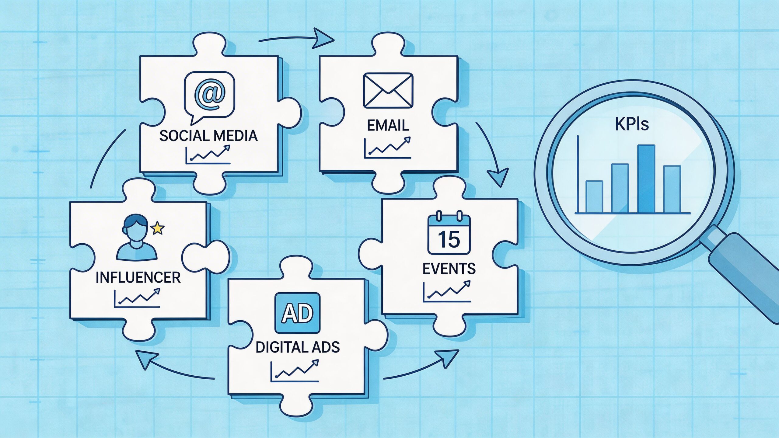
Media planning is more than just allocating budgets; it's the strategic backbone of every successful marketing campaign. Knowing where, when, and how to reach your

B2B marketing segmentation is simply the art of breaking down your massive business audience into smaller, more focused groups. It’s about recognizing that not all

